
Reputation: 32162
How to make a pie chart in CSS
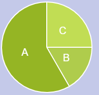
How can I create a pie chart with CSS like the one below?

Upvotes: 43
Views: 100010
Answers (10)

Reputation: 509
I saw some people opting for Google Developers Tool, its very tough and it also uses JS and you only want CSS. So here is the most easy way, Pure CSS, made by using background gradient.
.pie {
  width: 400px;
  height: 400px;
  background-image: conic-gradient(orange 64%, blue 64%, blue 81%, black 81%);
  border-radius: 50%
}
<div class="pie"></div>Upvotes: 50

Reputation: 10002
You can use conic-gradient and it is good when you need something simple. But it will not look great.
You will get a smoother pie chart with clip-path and transform. You only need to have a bit of logic to flip colors and transforms when the value is more then 50%.
.smooth-pie-2 {
  clip-path: circle(50%);
  position: relative;
  display: block;
  width: 100px;
  height: 100px;
  background-color: #005744;
  box-sizing: border-box;
}

.smooth-pie-2 .after,
.smooth-pie-2 .before {
  position: absolute;
  display: none;
  width: 100px;
  height: 100px;
  background-color: #00AF89;
  box-sizing: border-box;
}

@supports(clip-path: circle(50%)) {
  .smooth-pie-2 .after,
  .smooth-pie-2 .before {
    display: block;
  }
}


/* just for demo */

main {
  display: flex;
  gap: 2em;
  font-family: sans-serif;
  margin: 0 2em;
}

section {
  display: flex;
  gap: 1em;
  flex-flow: column;
  font-family: sans-serif;
}
<main>
<section>
<h2>Smooth</h2>
<!-- x <= 50% -->
<div class="smooth-pie-2" style="width: 100px; height: 100px; background-color: #005744;" title="33%">
<div class="before" style="transform: rotate(0.33turn) translatex(50px); background-color: #00AF89;"></div>
<div class="after" style="transform: translatex(-50px); background-color: #00AF89;"></div>
</div>
<!-- x > 50% -->
<div class="smooth-pie-2" style="width: 100px; height: 100px; background-color: #00AF89;" title="66%">
<div class="before" style="transform: translatex(50px); background-color: #005744;"></div>
<div class="after" style="transform: rotate(0.66turn) translatex(-50px); background-color: #005744;"></div>
</div>
</section>
<section>
<h2>Gradient</h2>
<div style="width: 100px; height: 100px; border-radius: 50%; border: 1px solid #00000080; background-image: conic-gradient(#005744 33%, #00AF89 0%);"></div>
</section>
</main>Upvotes: 1

Reputation: 8243
Often Creating charts with pure css is not the best way. it's better to use canvas or external libraries.
Here is a pie chart without using external libraries, using html5 canvas (fiddle) :
var canvas = document.getElementById("can");
var ctx = canvas.getContext("2d");
var lastend = 0;
var data = [60,210,90];
var myTotal = 0;
var myColor = ['#afcc4c', '#95b524','#c1dd54'];
var labels = ['B', 'A', 'C'];

for(var e = 0; e < data.length; e++)
{
  myTotal += data[e];
}

// make the chart 10 px smaller to fit on canvas
var off = 10
var w = (canvas.width - off) / 2
var h = (canvas.height - off) / 2
for (var i = 0; i < data.length; i++) {
  ctx.fillStyle = myColor[i];
  ctx.strokeStyle ='white';
  ctx.lineWidth = 2;
  ctx.beginPath();
  ctx.moveTo(w,h);
  var len =  (data[i]/myTotal) * 2 * Math.PI
  var r = h - off / 2
  ctx.arc(w , h, r, lastend,lastend + len,false);
  ctx.lineTo(w,h);
  ctx.fill();
  ctx.stroke();
  ctx.fillStyle ='white';
  ctx.font = "20px Arial";
  ctx.textAlign = "center";
  ctx.textBaseline = "middle";
  var mid = lastend + len / 2
  ctx.fillText(labels[i],w + Math.cos(mid) * (r/2) , h + Math.sin(mid) * (r/2));
  lastend += Math.PI*2*(data[i]/myTotal);
}
html, body{
background: #c4c9e9
} <canvas id="can" width="200" height="200" />fiddle (code is written based on this solution)
But it's better to use libraries for drawing charts. in apex-charts there is an option called sparkline, which helps you to remove the extra stuffs and draw a minimal and clean chart.
Here is a clean donut chart using apex-charts library. (Extra stuffs are removed with sparkline option):
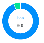
var options = {
  series: [620, 40],
  labels: ['Finished', 'Unfinished'],
  chart: {
    type: 'donut',
    sparkline: {
      enabled: true,
    }
  },
  plotOptions: {
    pie: {
      donut: {
        labels: {
          show: true,
          total: {
            showAlways: false,
            show: true,
            label: 'Total'
          }
        }
      }
    }
  },
};
var chart = new ApexCharts(document.querySelector("#chart"), options);
chart.render();
Upvotes: 3
Reputation: 7161
Building on the example of Aaditya Pandey this is a very small solution that is easy to use, with only CSS:
.pie {
  width: 200px;
  height: 200px;
  background-image: conic-gradient(orange 50%, blue 50% 75%, red 75% 90%, green 90%);
  border-radius: 50%
}
<div class="pie"></div>Upvotes: 2

Reputation: 31
The easiest way to do it using only HTML and CSS is by using the following code:
.graph {
  display: flex;
  position: relative;
  justify-content: center;
  align-items: center;
  margin: 50px 0;
  width: 150px;
  text-align: center;
}

.pie {
  width: 150px;
  aspect-ratio:1;
  position:absolute;
}
.pie:before,
.pie:after {
  content:"";
  position:absolute;
  border-radius:50%;
}
.pie:before {
  inset:0;
  background: radial-gradient(farthest-side,var(--c) 98%,#0000) top/var(--b) var(--b) no-repeat,
          conic-gradient(var(--c) calc(var(--p)*1%),#0000 0);
}
.no-round:before {
  background-size:0 0,auto;
}
.no-round:after {
  content:none;
}
<div style="display: flex; justify-content: center">
<div style="display: flex; flex-flow: wrap; justify-content: space-around; max-width: 400px; width: 100%">
<div class="graph" title="some title to display on hover">
<div class="pie no-round" style="--p:83;--c:#FC4819;--b:15px"></div>
<div class="pie no-round" style="--p:11;--c:#0089B0;--b:15px; rotate: 0.83turn"></div>
<div class="pie no-round" style="--p:6;--c:#23B032;--b:15px;rotate: 0.94turn"></div>
</div>
</div>
</div>You can add as many slices as you want to, just by adding a new div class='pie no-round' inside the div class='graph'.
The --p attribute in the div pie block is going to set it's size, and the rotate is going to set it's starting point. So for example, if you want a chart with 2 slices, one with 60% and another with 40%, the first will have --p:60, and the second will have: --p:40;rotate:0.60turn.
If you want 3 slices (50%, 40%, 10%), you have to sum the first 2 values to set the correct rotate attribute for the third one, the result would like like this:
First pie: --p:50
Second pie: --p:40;rotate:0.50turn
Third pie: --p:10;rotate:0.90turn # 0.90 being 50 + 40
You can customize from there, you can probably add the labels inside each slice like this:
.graph {
  display: flex;
  position: relative;
  justify-content: center;
  align-items: center;
  margin: 50px 0;
  width: 150px;
  text-align: center;
}

.label {
  position: absolute;
  color: white;
  padding-top: 5%;
  padding-left: 5%;
  font-size: 0.8rem;
}

.pie {
  width: 150px;
  aspect-ratio:1;
  position:absolute;
}
.pie:before,
.pie:after {
  content:"";
  position:absolute;
  border-radius:50%;
}
.pie:before {
  inset:0;
  background: radial-gradient(farthest-side,var(--c) 98%,#0000) top/var(--b) var(--b) no-repeat,
          conic-gradient(var(--c) calc(var(--p)*1%),#0000 0);
}
.no-round:before {
  background-size:0 0,auto;
}
.no-round:after {
  content:none;
}
<div style="display: flex; justify-content: center">
<div style="display: flex; flex-flow: wrap; justify-content: space-around; max-width: 400px; width: 100%">
<div class="graph" title="some title to display on hover">
<div class="pie no-round" style="--p:83;--c:#FC4819;--b:15px"><strong class="label">83%</strong></div>
<div class="pie no-round" style="--p:11;--c:#0089B0;--b:15px; rotate: 0.83turn"><strong class="label" style="rotate: -0.83turn">11%</strong></div>
<div class="pie no-round" style="--p:6;--c:#23B032;--b:15px;rotate: 0.94turn"><strong class="label" style="rotate: -0.94turn">6%</strong></div>
</div>
<div class="graph" title="some title to display on hover">
<div class="pie no-round" style="--p:100;--c:#FC4819;--b:15px"></div>
<div class="pie no-round" style="--p:0;--c:#23B032;--b:15px; rotate: 0.100turn"></div>
<h4 style="max-width: 100px">0% Releases Distributed</h4>
</div>
</div>
</div>You can add a center label if you want, b doing something like this:
.graph {
  display: flex;
  position: relative;
  justify-content: center;
  align-items: center;
  margin: 50px 0;
  width: 150px;
  text-align: center;
}

.pie {
  width: 150px;
  aspect-ratio:1;
  position:absolute;
}
.pie:before,
.pie:after {
  content:"";
  position:absolute;
  border-radius:50%;
}
.pie:before {
  inset:0;
  background: radial-gradient(farthest-side,var(--c) 98%,#0000) top/var(--b) var(--b) no-repeat,
          conic-gradient(var(--c) calc(var(--p)*1%),#0000 0);
  -webkit-mask:radial-gradient(farthest-side,#0000 calc(99% - var(--b)),#000 calc(100% - var(--b)));
  mask:radial-gradient(farthest-side,#0000 calc(99% - var(--b)),#000 calc(100% - var(--b)));
}
.no-round:before {
  background-size:0 0,auto;
}
.no-round:after {
  content:none;
}
<div style="display: flex; flex-flow: wrap; justify-content: space-around; max-width: 400px; width: 100%">
<div class="graph" title="some title to display on hover">
<div class="pie no-round" style="--p:83;--c:#FC4819;--b:15px"></div>
<div class="pie no-round" style="--p:11;--c:#0089B0;--b:15px; rotate: 0.83turn"></div>
<div class="pie no-round" style="--p:6;--c:#23B032;--b:15px;rotate: 0.94turn"></div>
<h4 style="max-width: 100px">6% something</h4>
</div>
<div class="graph" title="some title to display on hover">
<div class="pie no-round" style="--p:100;--c:#FC4819;--b:15px"></div>
<div class="pie no-round" style="--p:0;--c:#23B032;--b:15px; rotate: 0.100turn"></div>
<h4 style="max-width: 100px">0% something else</h4>
</div>
</div>Upvotes: 2
Reputation: 1873
I tried some of the answers and they seemed to me too complicated and hard-to-adopt with dynamic data set. I do not need data to be printed inside the chart, so I ended up with simplest solution:
<div style="
        border-radius: 100%;
        width: 150px;
        aspect-ratio: 1;
        background: conic-gradient(blue 0deg 172deg, red 172deg 249deg, yellow 249deg 313deg, green 313deg 333deg, lightgreen 333deg 347deg, gold 347deg 360deg, pink 360deg 360deg
            );
    "></div>
It does not require css classes, can be embedded into any html, and the string inside conic-gradient can easily be constructed from list of values.
Hope it would be useful as a simple way to construct a pie chart.
Upvotes: 5

Reputation: 431
I found this solution on CodePen. You can change value in data-attributes which was what I was looking for:
/*
  make each pie piece a rectangle twice as high as it is wide.
  move the transform origin to the middle of the left side.
  Also ensure that overflow is set to hidden.
*/
  .pie {
        position:absolute;
        width:100px;
        height:200px;
        overflow:hidden;
        left:150px;
        -moz-transform-origin:left center;
        -ms-transform-origin:left center;
        -o-transform-origin:left center;
        -webkit-transform-origin:left center;
        transform-origin:left center;
    }
/*
  unless the piece represents more than 50% of the whole chart.
  then make it a square, and ensure the transform origin is
  back in the center.

  NOTE: since this is only ever a single piece, you could
  move this to a piece specific rule and remove the extra class
*/
    .pie.big {
        width:200px;
        height:200px;
        left:50px;
        -moz-transform-origin:center center;
        -ms-transform-origin:center center;
        -o-transform-origin:center center;
        -webkit-transform-origin:center center;
        transform-origin:center center;
    }
/*
  this is the actual visible part of the pie.
  Give it the same dimensions as the regular piece.
  Use border radius make it a half circle.
  move transform origin to the middle of the right side.
  Push it out to the left of the containing box.
*/
    .pie:BEFORE {
        content:"";
        position:absolute;
        width:100px;
        height:200px;
        left:-100px;
        border-radius:100px 0 0 100px;
        -moz-transform-origin:right center;
        -ms-transform-origin:right center;
        -o-transform-origin:right center;
        -webkit-transform-origin:right center;
        transform-origin:right center;

    }
 /* if it's part of a big piece, bring it back into the square */
    .pie.big:BEFORE {
        left:0px;
    }
/*
  big pieces will also need a second semicircle, pointed in the
  opposite direction to hide the first part behind.
*/
    .pie.big:AFTER {
        content:"";
        position:absolute;
        width:100px;
        height:200px;
        left:100px;
        border-radius:0 100px 100px 0;
    }
/*
  add colour to each piece.
*/
    .pie:nth-of-type(1):BEFORE,
    .pie:nth-of-type(1):AFTER {
        background-color:blue;
    }
    .pie:nth-of-type(2):AFTER,
    .pie:nth-of-type(2):BEFORE {
        background-color:green;
    }
    .pie:nth-of-type(3):AFTER,
    .pie:nth-of-type(3):BEFORE {
        background-color:red;
    }
    .pie:nth-of-type(4):AFTER,
    .pie:nth-of-type(4):BEFORE {
        background-color:orange;
    }
/*
  now rotate each piece based on their cumulative starting
  position
*/
    .pie[data-start="30"] {
        -moz-transform: rotate(30deg); /* Firefox */
        -ms-transform: rotate(30deg); /* IE */
        -webkit-transform: rotate(30deg); /* Safari and Chrome */
        -o-transform: rotate(30deg); /* Opera */
        transform:rotate(30deg);
    }
    .pie[data-start="60"] {
        -moz-transform: rotate(60deg); /* Firefox */
        -ms-transform: rotate(60deg); /* IE */
        -webkit-transform: rotate(60deg); /* Safari and Chrome */
        -o-transform: rotate(60deg); /* Opera */
        transform:rotate(60deg);
    }
    .pie[data-start="100"] {
        -moz-transform: rotate(100deg); /* Firefox */
        -ms-transform: rotate(100deg); /* IE */
        -webkit-transform: rotate(100deg); /* Safari and Chrome */
        -o-transform: rotate(100deg); /* Opera */
        transform:rotate(100deg);
    }
/*
  and rotate the amount of the pie that's showing.

  NOTE: add an extra degree to all but the final piece,
  to fill in unsightly gaps.
*/
    .pie[data-value="30"]:BEFORE {
        -moz-transform: rotate(31deg); /* Firefox */
        -ms-transform: rotate(31deg); /* IE */
        -webkit-transform: rotate(31deg); /* Safari and Chrome */
        -o-transform: rotate(31deg); /* Opera */
        transform:rotate(31deg);
    }
    .pie[data-value="40"]:BEFORE {
        -moz-transform: rotate(41deg); /* Firefox */
        -ms-transform: rotate(41deg); /* IE */
        -webkit-transform: rotate(41deg); /* Safari and Chrome */
        -o-transform: rotate(41deg); /* Opera */
        transform:rotate(41deg);
    }
    .pie[data-value="260"]:BEFORE {
        -moz-transform: rotate(260deg); /* Firefox */
        -ms-transform: rotate(260deg); /* IE */
        -webkit-transform: rotate(260deg); /* Safari and Chrome */
        -o-transform: rotate(260deg); /* Opera */
        transform:rotate(260deg);
    }
/*
NOTE: you could also apply custom classes (i.e. .s0 .v30)
but if the CSS3 attr() function proposal ever gets implemented,
then all the above custom piece rules could be replaced with
the following:

.pie[data-start] {
   transform:rotate(attr(data-start,deg,0);
}
.pie[data-value]:BEFORE {
   transform:rotate(attr(data-value,deg,0);
}
*/
<!-- for each piece of the pie chart create one div and give it a data-value attribute that represents the amount (in degrees) that represents its total visible portion, and a data-start attribute that matches the amount rotation for the starting (the cumulative value amount of all the previous pieces). --> <div class="pie" data-start="0" data-value="30"></div> <div class="pie highlight" data-start="30" data-value="30"></div> <div class="pie" data-start="60" data-value="40"></div> <div class="pie big" data-start="100" data-value="260"></div>
Upvotes: 0

Reputation: 1154
I find this the easiest CSS-only solution. Somewhat simplified below.
    .pieContainer {
      height: 150px;
      position: relative;
    }

    .pieBackground {
      position: absolute;
      width: 150px;
      height: 150px;
      border-radius: 100%;
      box-shadow: 0px 0px 8px rgba(0,0,0,0.5);
    }

    .pie {
      transition: all 1s;
      position: absolute;
      width: 150px;
      height: 150px;
      border-radius: 100%;
      clip: rect(0px, 75px, 150px, 0px);
    }

    .hold {
      position: absolute;
      width: 150px;
      height: 150px;
      border-radius: 100%;
      clip: rect(0px, 150px, 150px, 75px);
    }

    #pieSlice1 .pie {
      background-color: #1b458b;
      transform:rotate(30deg);
    }

    #pieSlice2 {
      transform: rotate(30deg);
    }

    #pieSlice2 .pie {
      background-color: #0a0;
      transform: rotate(60deg);
    }

    #pieSlice3 {
      transform: rotate(90deg);
    }

    #pieSlice3 .pie {
      background-color: #f80;
      transform: rotate(120deg);
    }

    #pieSlice4 {
      transform: rotate(210deg);
    }

    #pieSlice4 .pie {
      background-color: #08f;
      transform: rotate(10deg);
    }

    #pieSlice5 {
      transform: rotate(220deg);
    }

    #pieSlice5 .pie {
      background-color: #a04;
      transform: rotate(70deg);
    }

    #pieSlice6 {
      transform: rotate(290deg);
    }

    #pieSlice6 .pie {
      background-color: #ffd700;
      transform: rotate(70deg);
    }

    .innerCircle {
      position: absolute;
      width: 120px;
      height: 120px;
      background-color: #444;
      border-radius: 100%;
      top: 15px;
      left: 15px;
      box-shadow: 0px 0px 8px rgba(0,0,0,0.5) inset;
      color: white;
    }
    .innerCircle .content {
      position: absolute;
      display: block;
      width: 120px;
      top: 30px;
      left: 0;
      text-align: center;
      font-size: 14px;
    }
<div class="pieContainer">
<div class="pieBackground"></div>
<div id="pieSlice1" class="hold"><div class="pie"></div></div>
<div id="pieSlice2" class="hold"><div class="pie"></div></div>
<div id="pieSlice3" class="hold"><div class="pie"></div></div>
<div id="pieSlice4" class="hold"><div class="pie"></div></div>
<div id="pieSlice5" class="hold"><div class="pie"></div></div>
<div id="pieSlice6" class="hold"><div class="pie"></div></div>
<div class="innerCircle"><div class="content"><b>Data</b><br>from 16<sup>th</sup> April, 2014</div></div>
</div>Upvotes: 30

Reputation: 206
Oh my! Have you seen Google Chart Tools?
https://google-developers.appspot.com/chart/interactive/docs/gallery/piechart
This is stupid easy to implement, but my problem with it is the "external api" part. If google decides to can this or google goes down, bye bye chart! But as far as beauty and the selection of other charts, google charts is kinda a cool find.
Upvotes: 10

Reputation: 2188
As far as I'm aware this is no (yet) possible with css3. However the new html5 canvas element provides everything you want. It can easily be accessed and used over javascript. A small tutorial on the basic usage can be found here.
An other question on stackoverflow even was on the same topic. See "HTML5 Canvas pie chart". (There is "Graphing Data in the HTML5 Canvas Element Part IV Simple Pie Charts" in the first answer to a tutorial about pie charts using canvas elements)
Upvotes: 2
Related Questions
- Creating a static pie chart with CSS
- Percent pie chart with css only
- CSS Only Pie Chart - How to add spacing/padding between slices?
- Responsive Design - Pie Chart
- What is the simplest way to create a pie chart?
- How to draw pie chart on my project
- CSS - how to create circle pie canvas like this?
- how to draw a configurable pie chart in css
- Create a section of a pie chart in css
- Pie Chart using CSS3