
Reputation: 57
horizontal scrolling responsive nav menu
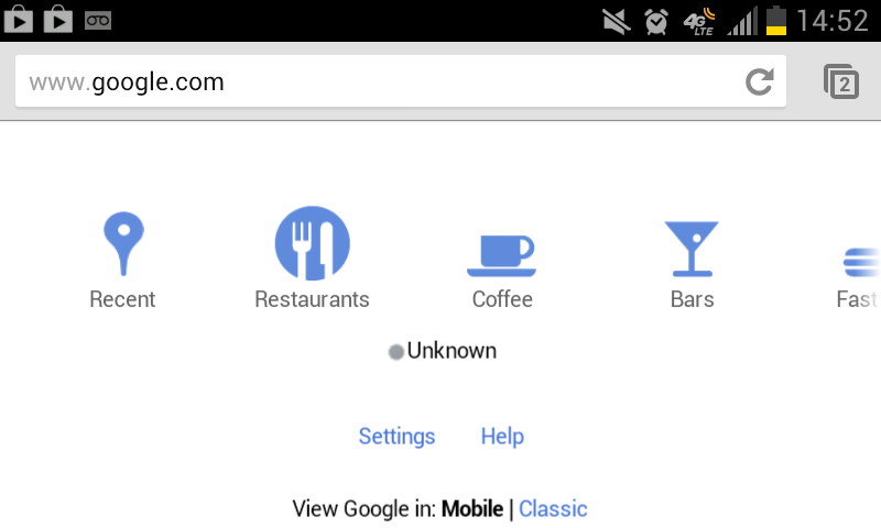
I'm trying to copy a portion of google's mobile site.
http://www.imgur.com/9DdQz.png
The area near the bottom of their site has their "places" menu, where you can scroll horizontally through different options using your fingers, then tap on the icon you'd like.
The features I'd like to copy are the horizontal scrolling, along with keeping the page set to a specific width so the window doesn't just re-size, thereby negating the scrolling feature.
I've tried to get a copy of the code used for creating this using the Android Remote Debugging tool for Chrome, but I can't find the specific code for this part of the website, I think it must load via a separate .js file. I've also done enough google searches that the prospect of trying another search string is on the same level as bashing my head into a brick wall in an attempt to redecorate my place of work. In short, I'm lost, out of my depth, and asking for help. Any pointers or help would be greatly appreciated.
Thanks in advance.
Upvotes: 4
Views: 6038
Answers (1)

Reputation: 2295
<div id="scrollcontainer" >
    <div id="scrollplane" >
         <a class="nav" href="?">Link 1</a>
         <a class="nav" href="?">Link 2</a>
         <a class="nav" href="?">Link 3</a>
    </div>
    </div>
CSS:
#scrollcontainer {
        width: 100%;
        overflow-x: auto;
        overflow-y: hidden;
        height: // some height
}

#scrollplane {
 height: // less than scroll container ;
 width: // greater than scroll container;
}
I would then suggest styling your links positioned relatively across the scroll plane. this should achieve the desired effec on a mobile browser but will reveal a scroll bar on a desktop
Upvotes: 4
Related Questions
- Mobile nav menu
- Responsive horizontal menu for mobile
- Mobile-menu not scrollable
- Responsive Horizontal Scrolling Menu
- How to get a nav menu bar to scroll horizontally
- Scrollable menu in mobile css
- To responsive horizontal, scrolling navigation bar
- Mobile menu doesn't scroll
- CSS: horizontal scroll in mobile navigation
- Responsive horizontal menu