
Reputation: 12665
Signal specific points in matplotlib
Having a basic chart like the following:
import matplotlib.pyplot as plt
import numpy as np

y = np.array([1,2,3,4,5,6])
f, ax = plt.subplots()
ax.plot(y)
plt.show()
... is there any way to create a little arrow, let's say, into the obs-points "3" and "5"? I have this need because I work with financial series and I would like to highlight with small arrows the points in which some events happened (according to a list of boolean occurrencies True/False). So, in the case I've asked above, the occurrency list would be [False, False, True, False, True, False] but I guess for this it's enough to multiply the vector by the original array so that I would get the markers at the right height.
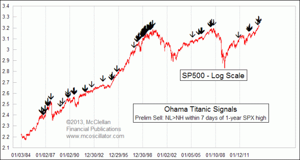
Here is a more complex web example to give the visual idea. Thanks in advance
Upvotes: 1
Views: 1173
Answers (1)

Reputation: 53698
In matplotlib you can use text annotations to annotate your graph suitably. The code below shows a simple example where I have annotated the third point in your linear plot. Obviously if you were to do this in your own code you could provide a more intelligent way of picking x,y coordinations of the arrow point and the text.
import matplotlib.pyplot as plt
import numpy as np

y = np.array([1,2,3,4,5,6])

f, ax = plt.subplots()

ax.plot(y, linestyle='None', marker='o')


for i in [2, 3, 4]:
    ax.annotate('', xy=(i-1, i), xytext=(i-1,i+0.5),
                arrowprops=dict(facecolor='black',
                                width=1,
                                shrink=0.1))

plt.margins(0.1)
plt.show()
EDIT I have modified the code to remove the text annotation to an empty string.

Upvotes: 2
Related Questions
- How to plot multiple signals in a single subplot
- How to highlight one point in a matplotlib plot
- Adjust xrange depending on where signal is
- How to mark specific data points in matplotlib graph
- How to find all the peaks in a signal correctly?
- Python ASK signal plot
- Matplotlib Indicate Point on X and Y Axis
- Intelligent Peak Detection Method
- matplotlib only show points
- Matplotlib - Draw points that satisfy condition