
Reputation: 185
How to better create stacked bar graphs with multiple variables from ggplot2?
I often have to make stacked barplots to compare variables, and because I do all my stats in R, I prefer to do all my graphics in R with ggplot2. I would like to learn how to do two things:
First, I would like to be able to add proper percentage tick marks for each variable rather than tick marks by count. Counts would be confusing, which is why I take out the axis labels completely.
Second, there must be a simpler way to reorganize my data to make this happen. It seems like the sort of thing I should be able to do natively in ggplot2 with plyR, but the documentation for plyR is not very clear (and I have read both the ggplot2 book and the online plyR documentation.
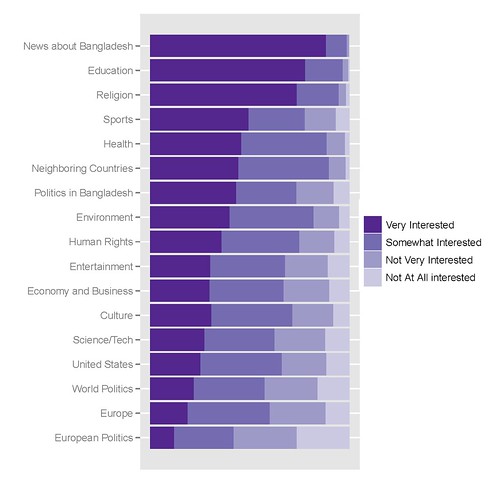
My best graph looks like this, the code to create it follows:
The R code I use to get it is the following:
library(epicalc)

### recode the variables to factors ###
recode(c(int_newcoun, int_newneigh, int_neweur, int_newusa, int_neweco, int_newit, int_newen, int_newsp, int_newhr, int_newlit, int_newent, int_newrel, int_newhth, int_bapo, int_wopo, int_eupo, int_educ), c(1,2,3,4,5,6,7,8,9, NA),
c('Very Interested','Somewhat Interested','Not Very Interested','Not At All interested',NA,NA,NA,NA,NA,NA))

### Combine recoded variables to a common vector
Interest1<-c(int_newcoun, int_newneigh, int_neweur, int_newusa, int_neweco, int_newit, int_newen, int_newsp, int_newhr, int_newlit, int_newent, int_newrel, int_newhth, int_bapo, int_wopo, int_eupo, int_educ)


### Create a second vector to label the first vector by original variable ###
a1<-rep("News about Bangladesh", length(int_newcoun))
a2<-rep("Neighboring Countries", length(int_newneigh))
[...]
a17<-rep("Education", length(int_educ))


Interest2<-c(a1, a2, a3, a4, a5, a6, a7, a8, a9, a10, a11, a12, a13, a14, a15, a16, a17)

### Create a Weighting vector of the proper length ###
Interest.weight<-rep(weight, 17)

### Make and save a new data frame from the three vectors ###
Interest.df<-cbind(Interest1, Interest2, Interest.weight)
Interest.df<-as.data.frame(Interest.df)

write.csv(Interest.df, 'C:\\Documents and Settings\\[name]\\Desktop\\Sweave\\InterestBangladesh.csv')

### Sort the factor levels to display properly ###

Interest.df$Interest1<-relevel(Interest$Interest1, ref='Not Very Interested')
Interest.df$Interest1<-relevel(Interest$Interest1, ref='Somewhat Interested')
Interest.df$Interest1<-relevel(Interest$Interest1, ref='Very Interested')

Interest.df$Interest2<-relevel(Interest$Interest2, ref='News about Bangladesh')
Interest.df$Interest2<-relevel(Interest$Interest2, ref='Education')
[...]
Interest.df$Interest2<-relevel(Interest$Interest2, ref='European Politics')

detach(Interest)
attach(Interest)

### Finally create the graph in ggplot2 ###

library(ggplot2)
p<-ggplot(Interest, aes(Interest2, ..count..))
p<-p+geom_bar((aes(weight=Interest.weight, fill=Interest1)))
p<-p+coord_flip()
p<-p+scale_y_continuous("", breaks=NA)
p<-p+scale_fill_manual(value = rev(brewer.pal(5, "Purples")))
p
update_labels(p, list(fill='', x='', y=''))
I'd very much appreciate any tips, tricks or hints.
Upvotes: 9
Views: 6600
Answers (5)

Reputation: 21
You don't need prop.tables or count etc to do the 100% stacked bars. You just need +geom_bar(position="stack")
Upvotes: 2

Reputation: 44658
Your second problem can be solved with melt and cast from the reshape package
After you've factored the elements in your data.frame called you can use something like:
install.packages("reshape")
library(reshape)

x <- melt(your.df, c()) ## Assume you have some kind of data.frame of all factors
x <- na.omit(x) ## Be careful, sometimes removing NA can mess with your frequency calculations

x <- cast(x, variable + value ~., length)
colnames(x) <- c("variable","value","freq")
## Presto!
ggplot(x, aes(variable, freq, fill = value)) + geom_bar(position = "fill") + coord_flip() + scale_y_continuous("", formatter="percent")
As an aside, I like to use grep to pull in columns from a messy import. For example:
x <- your.df[,grep("int.",df)] ## pulls all columns starting with "int_"
And factoring is easier when you don't have to type c(' ', ...) a million times.
for(x in 1:ncol(x)) {
df[,x] <- factor(df[,x], labels = strsplit('
Very Interested
Somewhat Interested
Not Very Interested
Not At All interested
NA
NA
NA
NA
NA
NA
', '\n')[[1]][-1]
}
Upvotes: 2

Reputation: 6738
Your first question: Would this help?
geom_bar(aes(y=..count../sum(..count..)))
Your second question; could you use reorder to sort the bars? Something like
aes(reorder(Interest, Value, mean), Value)
(just back from a seven hour drive - am tired - but I guess it should work)
Upvotes: 1

Reputation: 5457
If I am understanding you correctly, to fix the axis labeling problem make the following change:
# p<-ggplot(Interest, aes(Interest2, ..count..))
p<-ggplot(Interest, aes(Interest2, ..density..))
As for the second one, I think you would be better off working with the reshape package. You can use it to aggregate data into groups very easily.
In reference to aL3xa's comment below...
library(ggplot2)
r<-rnorm(1000)
d<-as.data.frame(cbind(r,1:1000))
ggplot(d,aes(r,..density..))+geom_bar()
Returns...
alt text http://www.drewconway.com/zia/wp-content/uploads/2010/04/density.png
The bins are now densities...
Upvotes: 1

Reputation: 36110
About percentages insted of ..count.. , try:
ggplot(mtcars, aes(factor(cyl), prop.table(..count..) * 100)) + geom_bar()
but since it's not a good idea to shove a function into the aes(), you can write custom function to create percentages out of ..count.. , round it to n decimals etc.
You labeled this post with plyr, but I don't see any plyr in action here, and I bet that one ddply() can do the job. Online plyr documentation should suffice.
Upvotes: 1
Related Questions
- Struggle with creating stacked barchart in ggplot2
- Stacked bar plot with ggplot2
- Making a stacked bar plot for multiple variables - ggplot2 in R
- Stacked bar plot using R and ggplot
- Advanced stacked bar chart ggplot2
- Multiple Stacked Bar Charts with ggplot()
- Stacked bar chart across multiple columns
- Stacked bar graph in ggplot2
- Creating a stacked bar plot with ggplot2
- Quick help creating a stacked bar chart (ggplot2)