
Reputation: 211
CSS: How can I remove the extra white space caused by a line break in a link?
Edit 2: My time is short, so I will be using dippas' suggestion of using an actual image instead of a background. I'm keeping this question open just in case someone has a better solution. Thank you for all the help!
Original Question/Problem:
I have been Googling for the solution for an hour now, to no avail!
I am formatting a site to responsive and several long links that contain a background image aren't breaking correctly. I've tried float: left, display: block, display: inline-block and none of them work. The closest thing I got to a fix is setting it to display: inline, but I would rather have the background image to the side instead of right next to the last word.
This is my first time personally consulting this website (I have used your solutions to get out of ruts many times before, so thank you!), so I cannot post images, but here's a rough fiddle example (Edit: here's a new fiddle since the other one had a defined div width):
http://jsfiddle.net/2e28fanq/22/
(I want to get rid of that extra space between the arrow and "Educational")
CSS:
a {
    display: block;
    float: left;
    width: auto;
    font-size: 1.5em;
    padding-right: 40px;
    background: url('Arrow-Right.png') 100% 50% no-repeat;
}
Here is a crude illustration of what I need it to do:
Register for a FREE Educational >
Webinar
And what it's doing instead:
Register for a FREE Educational          >
Webinar
Seeing as it happens in JSFiddle, too, I doubt it has anything to do with the rest of my code. I cannot link to the site in question due to confidentiality/contract reasons, but I hope someone here can help me out with what I am able to provide. Thanks!
Upvotes: 20
Views: 15390
Answers (4)

Reputation: 33218
One simple solution is to use word-break: break-all:
.wrap {
  width: 425px;
  padding: 15px;
  border: 1px solid #000;
}

a {
  display: block;
  float: left;
  width: auto;
  font-size: 1.5em;
  padding-right: 40px;
  background: url('https://cdn0.iconfinder.com/data/icons/Tabs_Color_Social/40/Arrow-Right.png') 100% 50% no-repeat;
  word-break: break-all;
}
<div class="wrap"> <a href="#">Register for a FREE Educational Webinar</a>
<div style="clear:both;"></div>
</div>This works for a long text too:
.wrap {
  width: 425px;
  padding: 15px;
  border: 1px solid #000;
}

a {
  display: block;
  float: left;
  width: auto;
  font-size: 1.5em;
  padding-right: 40px;
  background: url('https://cdn0.iconfinder.com/data/icons/Tabs_Color_Social/40/Arrow-Right.png') 100% 50% no-repeat;
  word-break: break-all;
}
<div class="wrap"> <a href="#">Register for a FREE Educational Webinar asdasd asd asd asda as Register for a FREE Educational Webinar asdasd asd asd asda as </a>
<div style="clear:both;"></div>
</div>Upvotes: 3

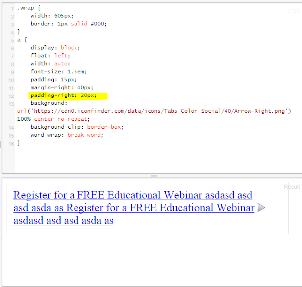
Reputation: 164
Change the padding: 15px; to the anchor. Add margin-right: 40px;.
UPDATE:
background-clip not neccesary...
.wrap {
    width: 425px;
    border: 1px solid #000;
}
a {
    display: block;
    float: left;
    width: auto;
    font-size: 1.5em;
    padding: 15px;
    margin-right: 40px;
    padding-right: 40px;
    background: url('https://cdn0.iconfinder.com/data/icons/Tabs_Color_Social/40/Arrow-Right.png') 100% center no-repeat;
    background-clip: border-box;
    word-wrap: break-word;
}


See: http://jsfiddle.net/abrhmcc/75ybzLnz/3/
Change the width of wrap to make tests.
The padding-right:40px; is to avoid text and arrow overlaping, you can change it to reduce the distance between the arrow and the text.
Upvotes: 1

Reputation: 971
That extra space isn't a bug coming from nowhere.
It appears simply because you set the background position to be at 100% 50%, which means 100% from the left and 50% from the top. Since the width of your a is 425px (because the parent's width is 425px and the child is display: block, which takes 100% of available width) and your arrow is sticking to the right end, there will obviously be a gap between the right side of the text and the left side of the image.
If the background-position-x value were not 100%, or the width of the parent was not 425px, things would be different, as shown in the below two examples.
Upvotes: 2

Reputation: 7720
do you mean like this?
HTML
<div class="wrap">
    <a href="#">Register for a FREE Educational Webinar</a>
</div>
and CSS
.wrap {
    display:inline;
    width:auto;
    padding: 15px;
    border: 1px solid #000;
}
a {
    width: auto;
    font-size: 1.5em;
    padding-right: 40px;
    background: url('https://cdn0.iconfinder.com/data/icons/Tabs_Color_Social/40/Arrow-Right.png') 100% 50% no-repeat;
}
Upvotes: 0
Related Questions
- Trim whitespace in link with css
- non-breaking space in link
- How to prevent a line break in a html link?
- how to make the space between a multi-line link clickable
- How to stop multi-word links being placed together on a new line, instead splitting them up like regular text?
- How can I force a line break before a long link?
- How to force a link on a new line?
- Horizontal Space between links in HTML/CSS
- How do I remove the space between links?
- remove space between links with css