
Reputation: 6237
How can I create an editable dropdownlist in HTML?
I'd like to create a text field with a dropdown list that lets the user choose some predefined values. The user should also be able to type a new value or select a predefined one from a dropdown list. I know that I can use two widgets for that but in my app it would be more ergonomnic if it was unified in a one widget.
Is there a standard widget or do I have to use a third party javascript?
How about browser portability?
Upvotes: 75
Views: 224282
Answers (12)

Reputation: 149
Simple HTML + Javascript approach without CSS
function editDropBox() {
    let cSelect = document.getElementById('changingList');
    let holder  = document.getElementById('selectHolder');

    if(cSelect != null) {
        // if not edit option selected -> just exit
        if(cSelect.value != "-99") {
            return false;
        }

        let optionsSavehouse = [];

        let optionsArray = Array.from(cSelect.options);

        const arrayLength = optionsArray.length;
        for (let o = 0; o < arrayLength; o++) {
            const option = optionsArray[o];
            let  oVal = option.value;

            if(oVal > 0) {
                let localParams = [];
                localParams.push(option.text);
                localParams.push(option.value);
                //localParams.push(option.selected); // if needed
                optionsSavehouse.push(localParams);
            }
        }

        let hidden = ("<input id='hidden_select_options' type='hidden' value='" + JSON.stringify(optionsSavehouse) + "' />");

        if(holder != null) {
            // here temporarily 'input' field, which you can change as you wish, add classes, styles, increase size etc.
            holder.innerHTML = (hidden + "<input size='10' type='text' id='tempInput' name='name_temp_input' onchange='restoreDropBox()'>");
            document.getElementById('tempInput').focus();
            return true;
        }
    }
    return false;
}

function restoreDropBox() {
    let holder = document.getElementById('selectHolder');
    let cInput = document.getElementById('tempInput');
    let hOptions = document.getElementById('hidden_select_options');

    if(holder != null) {

        let optionsArray = [];

        if(hOptions != null) {
            optionsArray = JSON.parse(hOptions.value);
        }

        let selectListString = "<select id='changingList' onchange='editDropBox();'>\n";

        let arrayLength = optionsArray.length;
        for (let o = 0; o < arrayLength; o++) {
            let option = optionsArray[o];
            selectListString += ("<option value='" + option[1] + "'>" + option[0] + "</option>\n");
        }

        if(cInput != null) {
            // do not forget change 'value' for new element for something
            // what will fit your purpose
            let nextElementValue = (arrayLength + 1);
            selectListString += ("<option value='" + nextElementValue + "' selected>" + cInput.value + "</option>\n");
        }

        selectListString += ("<option value='-99'>- Edit -</option>\n</select>");
        holder.innerHTML = selectListString;
    }
}
<div id="selectHolder">
<select id="changingList" onchange="editDropBox();">
<option value="1">Apple</option>
<option value="2">Banana</option>
<option value="3">Cherry</option>
<option value="4">Dewberry</option>
<option value="-99">- Edit -</option>
</select>
</div>Upvotes: 0

Reputation: 1681
You can accomplish this by using the <datalist> tag in HTML5.
<input type="text" name="product" list="productName" />
<datalist id="productName">
  <option value="Pen">Pen</option>
  <option value="Pencil">Pencil</option>
  <option value="Paper">Paper</option>
</datalist>
If you double click on the input text in the browser a list with the defined option will appear.
Upvotes: 158

Reputation: 1
<input type="murillo" name="murillo"/>
    <datalist id="null">
        <option value="password">null</option>
        <option value="email-address">null</option>

    </datalist>
Upvotes: 0

Reputation: 411
Very simple implementation (only basic functionality) based on CSS and one line of JavaScript code.
.dropdown {
  position: relative;
  width: 200px;
}

.dropdown select {
  width: 100%;
}

.dropdown > * {
  box-sizing: border-box;
  height: 1.5em;
}

.dropdown input {
  position: absolute;
  width: calc(100% - 20px);
}
<div class="dropdown">
<input type="text" />
<select onchange="this.previousElementSibling.value=this.value; this.previousElementSibling.focus()">
<option>This is option 1</option>
<option>Option 2</option>
</select>
</div>Please note: it uses previousElementSibling() which is not supported in older browsers (below IE9)
Upvotes: 21

Reputation: 17196
HTML doesn't have a built-in editable dropdown list or combobox, but I implemented a mostly-CSS solution in an article.
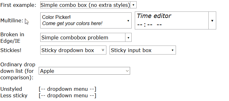
You can see a full demo here but in summary, write HTML like this:
<span class="combobox withtextlist">
  <input value="Fruit">
  <span tabindex="-1" class="downarrow"></span>
  <select size="10" class="sticky">
    <option>Apple</option>
    <option>Banana</option>
    <option>Cherry</option>
    <option>Dewberry</option>
  </select>
</span>
And use CSS like this to style it (this is designed for both comboboxes, which have a down-arrow ▾ button, and dropdown menus which open when clicked and may be styled differently):
/* ------------------------------------------ */
/* ----- combobox / dropdown list styling     */
/* ------------------------------------------ */
.combobox {
  /* Border slightly darker than Chrome's <select>, slightly lighter than FireFox's */
  border: 1px solid #999;
  padding-right: 1.25em; /* leave room for ▾ */
}
.dropdown, .combobox {
  /* "relative" and "inline-block" (or just "block") are needed
     here so that "absolute" works correctly in children */
  position: relative;
  display: inline-block;
}
.combobox > .downarrow, .dropdown > .downarrow {
  /* ▾ Outside normal flow, relative to container */
  display: inline-block;
  position: absolute;
  top: 0;
  bottom: 0;
  right: 0;
  width: 1.25em;

  cursor: default;
  nav-index: -1; /* nonfunctional in most browsers */

  border-width: 0px;          /* disable by default */
  border-style: inherit; /* copy parent border */
  border-color: inherit; /* copy parent border */
}
/* Add a divider before the ▾ down arrow in non-dropdown comboboxes */
.combobox:not(.dropdown) > .downarrow {
  border-left-width: 1px;
}
/* Auto-down-arrow if one is not provided */
.downarrow:empty::before {
  content: '▾';
}
.downarrow::before, .downarrow > *:only-child {
  text-align: center;

  /* vertical centering trick */
  position: relative;
  top: 50%;
  display: block; /* transform requires block/inline-block */
  transform: translateY(-50%);
}
.combobox > input {
  border: 0
}
.dropdown > *:last-child,
.combobox > *:last-child {
  /* Using `display:block` here has two desirable effects:
     (1) Accessibility: it lets input widgets in the dropdown to
         be selected with the tab key when the dropdown is closed.
     (2) It lets the opacity transition work.
     But it also makes the contents visible, which is undesirable
     before the list drops down. To compensate, use `opacity: 0`
     and disable mouse pointer events. Another side effect is that
     the user can select and copy the contents of the hidden list,
     but don't worry, the selected content is invisible. */
  display: block;
  opacity: 0;
  pointer-events: none;

  transition: 0.4s; /* fade out */
  position: absolute;
  left: 0;
  top: 100%;
  border: 1px solid #888;
  background-color: #fff;
  box-shadow: 1px 2px 4px 1px #666;
  box-shadow: 1px 2px 4px 1px #4448;
  z-index: 9999;
  min-width: 100%;
  box-sizing: border-box;
}
/* List of situations in which to show the dropdown list.
   - Focus dropdown or non-last child of it => show last-child
   - Focus .downarrow of combobox => show last-child
   - Stay open for focus in last child, unless .less-sticky
   - .sticky last child stays open on hover
   - .less-sticky stays open on hover, ignores focus in last-child */
.dropdown:focus > *:last-child,
.dropdown > *:focus ~ *:last-child,
.combobox > .downarrow:focus ~ *:last-child,
.combobox > .sticky:last-child:hover,
.dropdown > .sticky:last-child:hover,
.combobox > .less-sticky:last-child:hover,
.dropdown > .less-sticky:last-child:hover,
.combobox > *:last-child:focus:not(.less-sticky),
.dropdown > *:last-child:focus:not(.less-sticky) {
  display: block;
  opacity: 1;
  transition: 0.15s;
  pointer-events: auto;
}
/* focus-within not supported by Edge/IE. Unsupported selectors cause
   the entire block to be ignored, so we must repeat all styles for
   focus-within separately. */
.combobox > *:last-child:focus-within:not(.less-sticky),
.dropdown > *:last-child:focus-within:not(.less-sticky) {
  display: block;
  opacity: 1;
  transition: 0.15s;
  pointer-events: auto;
}
/* detect Edge/IE and behave if though less-sticky is on for all
   dropdowns (otherwise links won't be clickable) */
@supports (-ms-ime-align:auto) {
  .dropdown > *:last-child:hover {
    display: block;
    opacity: 1;
    pointer-events: auto;
  }
}
/* detect IE and do the same thing. */
@media all and (-ms-high-contrast: none), (-ms-high-contrast: active) {
  .dropdown > *:last-child:hover {
    display: block;
    opacity: 1;
    pointer-events: auto;
  }
}
.dropdown:not(.sticky) > *:not(:last-child):focus,
.downarrow:focus, .dropdown:focus {
  pointer-events: none; /* Causes second click to close */
}
.downarrow:focus {
  outline: 2px solid #8BF; /* Edge/IE can't do outline transparency */
  outline: 2px solid #48F8;
}

/* ---------------------------------------------- */
/* Optional extra styling for combobox / dropdown */
/* ---------------------------------------------- */
*, *:before, *:after {
  /* See https://css-tricks.com/international-box-sizing-awareness-day/ */
  box-sizing: border-box;
}
.combobox > *:first-child {
  display: inline-block;
  width: 100%;
  box-sizing: border-box; /* so 100% includes border & padding */
}
/* `.combobox:focus-within { outline:...}` doesn't work properly
   in Firefox because the focus box is expanded to include the
   (possibly hidden) drop list. As a workaround, put focus box on
   the focused child. It is barely-visible so that it doesn't look
   TOO ugly if the child isn't the same size as the parent. It
   may be uglier if the first child is not styled as width:100% */
.combobox > *:not(:last-child):focus {
  outline: 2px solid #48F8;
}
.combobox {
  margin: 5px;
}
You also need some JavaScript to synchronize the list with the textbox:
function parentComboBox(el) {
    for (el = el.parentNode; el != null && Array.prototype.indexOf.call(el.classList, "combobox") <= -1;)
        el = el.parentNode;
    return el;
}
// Uses jQuery
$(".combobox.withtextlist > select").change(function() {
  var textbox = parentComboBox(this).firstElementChild;
  textbox.value = this[this.selectedIndex].text;
});
$(".combobox.withtextlist > select").keypress(function(e) {
  if (e.keyCode == 13) // Enter pressed
    parentComboBox(this).firstElementChild.focus(); // Closes the popup
});
Upvotes: 3

Reputation: 10107
The best way to do this is probably to use a third party library.
There's an implementation of what you're looking for in jQuery UI jQuery UI and in dojo dojo. jQuery is more popular, but dojo allows you to declaratively define widgets in HTML, which sounds more like what you're looking for.
Which one you use will depend on your style, but both are developed for cross browser work, and both will be updated more often than copy and paste code.
Upvotes: 17

Reputation: 281
This can be achieved with the help of plain HTML, CSS and JQuery. I have created a sample page:
$(document).ready(function(){

    $(".editableBox").change(function(){
        $(".timeTextBox").val($(".editableBox option:selected").html());
    });
});
.editableBox {
width: 75px;
height: 30px;
}
.timeTextBox {
width: 54px;
margin-left: -78px;
height: 25px;
border: none;
}<script src="https://ajax.googleapis.com/ajax/libs/jquery/2.1.1/jquery.min.js"></script>
<div class="wrapper">
<select class="editableBox">
<option value="1">01:00</option>
<option value="2">02:00</option>
<option value="3">03:00</option>
<option value="4">04:00</option>
<option value="5">05:00</option>
<option value="6">06:00</option>
<option value="7">07:00</option>
<option value="8">08:00</option>
<option value="9">09:00</option>
<option value="10">10:00</option>
<option value="11">11:00</option>
<option value="12">12:00</option>
<option value="13">13:00</option>
<option value="14">14:00</option>
<option value="15">15:00</option>
<option value="16">16:00</option>
<option value="17">17:00</option>
<option value="18">18:00</option>
<option value="19">19:00</option>
<option value="20">20:00</option>
<option value="21">21:00</option>
<option value="22">22:00</option>
<option value="23">23:00</option>
<option value="24">24:00</option>
</select>
<input class="timeTextBox" name="timebox" maxlength="5"/>
</div>Upvotes: 28

Reputation: 2283
ComboBox with TextBox (For Pre-defined Values as well as User-defined Values.)
ComboBox with TextBox (Click Here)
Upvotes: 5

Reputation: 987
A little CSS and you are done fiddle
<div style="position: absolute;top: 32px; left: 430px;" id="outerFilterDiv">
<input name="filterTextField" type="text" id="filterTextField" tabindex="2"  style="width: 140px;
    position: absolute; top: 1px; left: 1px; z-index: 2;border:none;" />
        <div style="position: absolute;" id="filterDropdownDiv">
<select name="filterDropDown" id="filterDropDown" tabindex="1000"
    onchange="DropDownTextToBox(this,'filterTextField');" style="position: absolute;
    top: 0px; left: 0px; z-index: 1; width: 165px;">
    <option value="-1" selected="selected" disabled="disabled">-- Select Column Name --</option>
</select>
Upvotes: 1
Reputation:
A combobox is unfortunately something that was left out of the HTML specifications.
The only way to manage it, rather unfortunately, is to roll your own or use a pre-built one. This one looks quite simple. I use this one for an open-source app although unfortunately you have to pay for commercial usage.
Upvotes: 1

Reputation: 20281
The <select> tag only allows the use of predefined entries. The typical solution to your problem is to have one entry labeled 'Other' and a disabled edit field (<input type="text"). Add some JavaScript to enable the edit field only when 'Other' is selected.
It may be possible to somehow create a dropdown that allows direct editing, but IMO that is not worth the effort. If it was, Amazon, Google or Microsoft would be doing it ;-) Just get the job done with the least complicated solution. It as faster (your boss may like that) and usually easier to maintain (you may like that).
Upvotes: 10

Reputation: 1325387
I am not sure there is a way to do it automatically without javascript.
What you need is something which runs on the browser side to submit your form back to the server when they user makes a selection - hence, javascript.
Also, ensure you have an alternate means (i.e. a submit button) for those who have javascript turned off.
A good example: Combo-Box Viewer
I had even a more sophisticated combo-box yesterday, with this dhtmlxCombo , using ajax to retrieve pertinent values amongst large quantity of data.
Upvotes: 1
Related Questions
- ASP.NET MVC editable dropdownlist box (combobox)
- Editable Combo Box Javascript and HTML
- How can I create an editable combo box in HTML/Javascript?
- Editable 'Select' element
- HTML select dropdown list
- HTML Dropdown list with user input field
- Need "Editable Dropdown"
- How to create a editable dropdown list ? with AJAX
- How can I create an editable combobox?
- Is an editable select box the right way?