
Reputation: 786
How to make the sections to fit the size of a div
I do have a container div with a set of sections. The sections are displayed as boxes with list of links
 <div class="section-tree">
 <section class="section">
   <h3>
     <a href="something"> header </a>
   </h3>
 <ul>
   <li> <a href="something"> bla bla</a> </li>
   <li> <a href="something"> bla bla</a> </li>
 </ul>
 </section>
and so on... let's say 9 sections like this with different number of li.
The css code for the .section-tree .section {
display: inline-block;
margin: 0 0 30px;
vertical-align: top;
width: 49%;
border: 1px solid #D1D3D7;
-webkit-border-radius:3px;
-moz-border-radius:3px;
border-radius:3px;
margin: 0 0 10px 5px;
padding: 0px 0px 20px 25px;
Now it looks like this:

I want it to fit the size like this:

I have no idea how to do achieve it. I tried to incorporate the FlexBox but I did not work or I did not use it correctly. I am not that skilled in CSS best practices and this is probably very common. Please, give me some advice, thanks!
Upvotes: 0
Views: 1067
Answers (4)

Reputation: 57
<div class="section-tree">
 <section class="section">
   <h3>
     <a href="something"> header </a>
       <a href="something"> header </a>
   </h3>
 <ul>
   <li> <a href="something"> bla bla</a> </li>
   <li> <a href="something"> bla bla</a> </li>
 </ul>
     <div class="clear"></div>
 </section>
</div>
css
.section-tree{
    border:1px solid #000;
    padding:5px;
}
section h3,
section ul{
    display:block;
    float:left;
    width:30%;
    position:relative;
}
.clear{
    clear:both;
}
section h3 a,
section li a{
    border:1px solid #000;
    width:100%;
    display:block;
    margin-bottom:10px;
}
There is the link of jsfiddle work example http://jsfiddle.net/Prasadau/az4dpjnq/ or you use this cool plugin http://gridster.net/
Upvotes: 0

Reputation: 450
Separate the div as columns and try with this:
HTML
<div class="column1">
 <section class="section">
   <h3>
     <a href="something"> header </a>
   </h3>
 <ul>
   <li> <a href="something"> bla bla</a> </li>
   <li> <a href="something"> bla bla</a> </li>
 </ul>
 </section>
     <section class="section">
   <h3>
     <a href="something"> header </a>
   </h3>
 <ul>
   <li> <a href="something"> bla bla</a> </li>
   <li> <a href="something"> bla bla</a> </li>
     <li> <a href="something"> bla bla</a> </li>
     <li> <a href="something"> bla bla</a> </li>

 </ul>
 </section>
     <section class="section">
   <h3>
     <a href="something"> header </a>
   </h3>
 <ul>
   <li> <a href="something"> bla bla</a> </li>
   <li> <a href="something"> bla bla</a> </li>
 </ul>
 </section>
</div>
<div class="column2">
 <section class="section">
   <h3>
     <a href="something"> header </a>
   </h3>
 <ul>
   <li> <a href="something"> bla bla</a> </li>
   <li> <a href="something"> bla bla</a> </li>
     <li> <a href="something"> bla bla</a> </li>
     <li> <a href="something"> bla bla</a> </li>
 </ul>
 </section>
     <section class="section">
   <h3>
     <a href="something"> header </a>
   </h3>
 <ul>
   <li> <a href="something"> bla bla</a> </li>
   <li> <a href="something"> bla bla</a> </li>
     <li> <a href="something"> bla bla</a> </li>
     <li> <a href="something"> bla bla</a> </li>

 </ul>
 </section>
     <section class="section">
   <h3>
     <a href="something"> header </a>
   </h3>
 <ul>
   <li> <a href="something"> bla bla</a> </li>
   <li> <a href="something"> bla bla</a> </li>
 </ul>
 </section>
</div>
CSS
.column1{
    width: 50%;
    float:left;
}

.column2{
  width: 50%;
    float:left;
}

.section {
display: block;
border: solid 1px #ccc;
border-radius:3px;
padding: 0px 0px 20px 25px;

}
Solution here: Fiddle
Upvotes: 0

Reputation: 167172
This layout is called Masonry!
Masonry is a JavaScript grid layout library. It works by placing elements in optimal position based on available vertical space, sort of like a mason fitting stones in a wall. You’ve probably seen it in use all over the Internet.
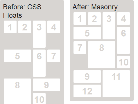
CSS Floats vs. Masonry
http://www.redbourn.org.uk/pub/System/JQueryMasonry/jQuery-Masonry.jpg
Upvotes: 1
Reputation: 128
try using style in css like
float:right;
 float:left;
with fixed width. hope it helps
Upvotes: 0
Related Questions
- How can I adjust DIV width to contents
- Making a Div fit its content
- HTML use width and height dimensions for sections
- How to fit Content into Div Container
- Can't get section divs together
- How do I get rid of a margin in CSS so my sections fit
- Section not as large as content inside
- Making section the correct size in HTML5
- HTML fitting divs in divs
- section is smaller than contents