Reputation:
CSS design - rainbow
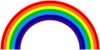
I want to create a rainbow using only CSS only. Below is an image of what is required.
Here is my code (so far):
* {
  margin: 0;
  padding: 0;
}
#r {
  height: 80vw;
  width: 80vw;
  background-color: #f00;
  position: absolute;
  z-index: 1;
}
#o {
  height: 76vw;
  width: 76vw;
  background-color: #fe6230;
  position: absolute;
  top: 2vw;
  left: 2vw;
  z-index: 2;
}
#y {
  height: 72vw;
  width: 72vw;
  background-color: #fef600;
  position: absolute;
  top: 4vw;
  left: 4vw;
  z-index: 3;
}
#g {
  height: 68vw;
  width: 68vw;
  background-color: #00bc00;
  position: absolute;
  top: 6vw;
  left: 6vw;
  z-index: 4;
}
#b {
  height: 64vw;
  width: 64vw;
  background-color: #0048fe;
  position: absolute;
  top: 8vw;
  left: 8vw;
  z-index: 5;
}
#i {
  height: 60vw;
  width: 60vw;
  background-color: #000083;
  position: absolute;
  top: 10vw;
  left: 10vw;
  z-index: 6;
}
#v {
  height: 56vw;
  width: 56vw;
  background-color: #30009b;
  position: absolute;
  top: 12vw;
  left: 12vw;
  z-index: 7;
}
<div id="r">
</div>
<div id="o">
</div>
<div id="y">
</div>
<div id="g">
</div>
<div id="b">
</div>
<div id="i">
</div>
<div id="v">
</div>The problem with my code is that I am unable to curve it (like in a real rainbow). I also need to hide half of this rainbow.
Upvotes: 6
Views: 5139
Answers (3)

Reputation: 24559
I thought i'd add just some of the rainbow designs found while going through codepen for your inspiration (note I did not make these, it's more for reference than anything)
option 1
@import "http://fonts.googleapis.com/css?family=Racing+Sans+One";

@-moz-keyframes spin {
    from {
      -moz-transform: rotate(0deg);
    }

    to {
      -moz-transform: rotate(360deg);
    }
}

@-webkit-keyframes spin {
  from {
    -webkit-transform: rotate(0deg);
  }

  to {
    -webkit-transform: rotate(360deg);
  }
}

@keyframes spin {
  from {
    transform: rotate(0deg);
  }

  to {
    transform: rotate(360deg);
  }
}

#rainbow {
  height: 290px;
  overflow: hidden;
  margin: 0 auto;
  position: relative;
  width: 580px;
  -moz-transition: height 500ms ease-in-out;
  -webkit-transition: height 500ms ease-in-out;
  transition: height 500ms ease-in-out;
}

#rainbow.reveal {
  height: 600px;
}

#rainbow li {
  position: absolute;
  height: 100%;
  text-indent: -9999px;
  opacity: 0.8;
}

#rainbow .ribbon {
  border-radius: 50%;
  border-style: solid;
  border-width: 40px;
  position: absolute;
  left: inherit;
  top: inherit;
  -moz-animation: spin;
  -moz-animation-duration: 2s;
  -moz-animation-timing-function: ease-in-out;
  -moz-animation-iteration-count: infinite;
  -moz-animation-direction: alternate;
  -moz-animation-fill-mode: forwards;
  -webkit-animation: spin;
  -webkit-animation-duration: 2s;
  -webkit-animation-timing-function: ease-in-out;
  -webkit-animation-iteration-count: infinite;
  -webkit-animation-direction: alternate;
  -webkit-animation-fill-mode: forwards;
  animation: spin;
  animation-duration: 2s;
  animation-timing-function: ease-in-out;
  animation-iteration-count: infinite;
  animation-direction: alternate;
  animation-fill-mode: forwards;
}

#rainbow .red {
  left: 0;
  top: 0;
}

#rainbow .red .ribbon {
  border-color: red;
  height: 500px;
  width: 500px;
  clip: rect(0px, 580px, 290px, 0px);
  -moz-animation-delay: 0s;
  -webkit-animation-delay: 0s;
  animation-delay: 0s;
}

#rainbow .orange {
  left: 20px;
  top: 20px;
}

#rainbow .orange .ribbon {
  border-color: orange;
  height: 420px;
  width: 420px;
  clip: rect(0px, 500px, 250px, 0px);
  -moz-animation-delay: 1s;
  -webkit-animation-delay: 1s;
  animation-delay: 1s;
}

#rainbow .yellow {
  left: 40px;
  top: 40px;
}

#rainbow .yellow .ribbon {
  border-color: yellow;
  height: 340px;
  width: 340px;
  clip: rect(0px, 420px, 210px, 0px);
  -moz-animation-delay: 2s;
  -webkit-animation-delay: 2s;
  animation-delay: 2s;
}

#rainbow .green {
  left: 60px;
  top: 60px;
}

#rainbow .green .ribbon {
  border-color: green;
  height: 260px;
  width: 260px;
  clip: rect(0px, 340px, 170px, 0px);
  -moz-animation-delay: 3s;
  -webkit-animation-delay: 3s;
  animation-delay: 3s;
}

#rainbow .blue {
  left: 80px;
  top: 80px;
}

#rainbow .blue .ribbon {
  border-color: blue;
  height: 180px;
  width: 180px;
  clip: rect(0px, 260px, 130px, 0px);
  -moz-animation-delay: 4s;
  -webkit-animation-delay: 4s;
  animation-delay: 4s;
}

#rainbow .indigo {
  left: 100px;
  top: 100px;
}

#rainbow .indigo .ribbon {
  border-color: indigo;
  height: 100px;
  width: 100px;
  clip: rect(0px, 180px, 90px, 0px);
  -moz-animation-delay: 5s;
  -webkit-animation-delay: 5s;
  animation-delay: 5s;
}

#rainbow .violet {
  left: 120px;
  top: 120px;
}

#rainbow .violet .ribbon {
  border-color: violet;
  height: 20px;
  width: 20px;
  clip: rect(0px, 100px, 50px, 0px);
  -moz-animation-delay: 6s;
  -webkit-animation-delay: 6s;
  animation-delay: 6s;
}

.cta {
  cursor: pointer;
  color: #622AF0;
  font-family: 'Racing Sans One', cursive;
  font-size: 18px;
  display: block;
  text-align: center;
  margin-bottom: 5px;
}

body {
  background: #DFFAFF;
}
<ul id="rainbow">
<li class="red">
<strong class="ribbon">Red</strong>
</li>
<li class="orange">
<strong class="ribbon">Orange</strong>
</li>
<li class="yellow">
<strong class="ribbon">Yellow</strong>
</li>
<li class="green">
<strong class="ribbon">Green</strong>
</li>
<li class="blue">
<strong class="ribbon">Blue</strong>
</li>
<li class="indigo">
<strong class="ribbon">Indigo</strong>
</li>
<li class="violet">
<strong class="ribbon">Violet</strong>
</li>
</ul>
<script src="http://code.jquery.com/jquery-1.9.1.js"></script>option 2
body {
			background-color: #A7BACB;
			margin: 0;
			padding: 0;
		}

		html {
			position: relative;
			height: 100%;
			background: #F9FEFF;
		}
		.rainbow {
			width: 500px;
			height: 240px;
			margin: 20% auto 0 auto;
			position: absolute;
			left: 50%;
			margin-left: -250px;
			bottom:0;
		}
		.rainbow p {
			text-indent: -9000px;
			margin: 0;
			position: absolute;
			bottom: 0;
			width: 100%;
			-webkit-border-top-left-radius: 600px 560px;
			-webkit-border-top-right-radius: 600px 560px;
			-moz-border-radius-topleft: 600px 560px;
			-moz-border-radius-topright: 600px 560px;
		}
		.rainbow p:nth-child(1),
		.rainbow .r {
			background-color: #FF0000; /* red */
			height: 240px;
			width: 500px;
		}
		.rainbow p:nth-child(2),
		.rainbow .o {
			background-color: #FF9900; /* orange */
			height: 220px;
			width: 460px;
			left: 20px;
		}
		.rainbow p:nth-child(3),
		.rainbow .y {
			background-color: #FFFF00; /* yellow */
			height: 200px;
			width: 420px;
			left: 40px;
		}
		.rainbow p:nth-child(4),
		.rainbow .g {
				   background-color: #2ECE0C;/* green */
				height: 180px;
				width: 380px;
				left: 60px;
		}
		.rainbow p:nth-child(5),
		.rainbow .b {
				background-color: #0000FF; /* blue */
				height: 160px;
				width: 340px;
				left: 80px;
		}
		.rainbow p:nth-child(6),
		.rainbow .i {
				   background-color: #6600FF; /* indigo */
				height: 140px;
				width: 300px;
				left: 100px;
		}
		.rainbow p:nth-child(7),
		.rainbow .v {
				  background-color: #8B00FF; /* violet */
				height: 120px;
				width: 260px;
				left: 120px;
		}
		.rainbow p:nth-last-of-type(1),
		.rainbow p:last-child {
				background-color: #F9FEFF;
				height: 100px;
				width: 220px;
				left: 140px;
		}
<div class="rainbow">
<p class="r">red</p>
<p class="o">orange</p>
<p class="y">yellow</p>
<p class="g">green</p>
<p class="b">blue</p>
<p class="i">indigo</p>
<p class="v">violet</p>
<p>the end</p>
</div>option 3 (box shadow idea)
div {
  width: 50%;
  margin: 40px auto;
  text-align: center;
}
.rainbow {
  background-color: #000;
  display: block;
  font-family: Georgia;
  font-size: 14px;
  padding: 80px;
  margin-top: 160px;
  border-radius: 80px;
  box-shadow:
    0 0 0 20px violet,
    0 0 0 40px indigo,
    0 0 0 60px blue,
    0 0 0 80px green,
    0 0 0 100px yellow,
    0 0 0 120px orange,
    0 0 0 140px red;
  width: 0;
}
<div>
<a class="rainbow"></a>
</div>option 4 (using border colors)
body{
  background: #9ecdef;
}
.rainbow {
  width: 600px;
  height: 300px;
  overflow: hidden;
  position: absolute;
  top: calc(50% - 150px);
  left: calc(50% - 300px);
}
.border{
  border-style: solid;
  border-width: 10px;
  border-left-color: transparent;
  border-bottom-color: transparent;
  border-radius: 50%;
}
.red {
  width: calc(100% - 20px);
  height: calc(200% - 20px);
  border-top-color: #f00;
  border-right-color: #f00;
  animation: rotate 2s ease-in-out;
  -webkit-animation: rotate 2s ease-in-out;
  transform: rotate(-45deg);
  -webkit-transform: rotate(-45deg);
}
.size{
  width: calc(100% - 20px);
  height: calc(100% - 20px);
}
.orange{
  border-top-color: #ff4500;
  border-right-color: #ff4500;
}
.yellow{
  border-top-color: #ff0;
  border-right-color: #ff0;
}
.green{
  border-top-color: #0f0;
  border-right-color: #0f0;
}
.blue{
  border-top-color: #00f;
  border-right-color: #00f;
}
.cyan{
  border-top-color: #0ff;
  border-right-color: #0ff;
}
.purple{
  border-top-color: #8a2be2;
  border-right-color: #8a2be2;
}
@keyframes rotate {
  from{-webkit-transform: rotate(-225deg);}
  to{-webkit-transform: rotate(-45deg);}
}

@-webkit-keyframes rotate {
  from{-webkit-transform: rotate(-225deg);}
  to{-webkit-transform: rotate(-45deg);}
}
<div class="rainbow">
<div class="red border">
<div class="orange border size">
<div class="yellow border size">
<div class="green border size">
<div class="blue border size">
<div class="cyan border size">
<div class="purple border size">
</div>
</div>
</div>
</div>
</div>
</div>
</div>
</div>Upvotes: 4

Reputation: 23002
This could be done using a single div element with a :pseudo-element and box-shadow.
div {
  position: relative;
  width: 300px;
  height: 150px;
  background: white;
  overflow: hidden;
  transform: scale(2);
  margin-left: 130px;
  margin-top: -50px;
}
div:after {
  position: absolute;
  content: '';
  width: 100px;
  height: 100px;
  top: 100px;
  left: 50px;
  border-radius: 50%;
  box-shadow: 0 0 0 5px #4200AB, 0 0 0 10px #000095, 0 0 0 15px #00ABFF, 0 0 0 20px #00C800, 0 0 0 25px #FFF800, 0 0 0 30px #FF7642, 0 0 0 35px #E40000;
}<div></div>Example using vh / vw units.
Looks awful in the snippet here because of the viewport ratio, better viewed on CodePen.
div {
  position: relative;
  width: 95vw;
  height: 45vw;
  overflow: hidden;
  background: transparent;
  transform: translate(-50vw, -16.666vw);
  top: 8vw;
  left: 50vw;
}
div:after {
  position: absolute;
  content: '';
  width: 50%;
  height: 100%;
  top: 25vw;
  left: 25vw;
  border-radius: 50%;
  box-shadow: 0 0 0 2vw #4200AB, 0 0 0 4vw #000095, 0 0 0 6vw #00ABFF, 0 0 0 8vw #00C800, 0 0 0 10vw #FFF800, 0 0 0 12vw #FF7642, 0 0 0 14vw #E40000;
}
body {
  margin: 0;
}<div></div>Upvotes: 13

Reputation: 89780
Here is a slightly different approach using radial-gradient. The approach is pretty much self explanatory as the gradient background is applied in an elliptical manner with multiple color stops (one for each color + white at the beginning and end).
Note: The browser support is much better for box-shadow than it is for radial-gradients and hence the answer posted by chipChocolate.py is probably the best for now.
This one can also support vw/vh units and can adapt the appearance accordingly.
.rainbow {
  height: 25vw;
  width: 50vw;
  background: -webkit-radial-gradient(50% 110%, ellipse, white 35%, violet 35%, violet 40%, indigo 40%, indigo 45%, blue 45%, blue 50%, green 50%, green 55%, yellow 55%, yellow 60%, orange 60%, orange 65%, red 65%, red 70%, white 70%);
  background: -moz-radial-gradient(50% 110%, ellipse, white 35%, violet 35%, violet 40%, indigo 40%, indigo 45%, blue 45%, blue 50%, green 50%, green 55%, yellow 55%, yellow 60%, orange 60%, orange 65%, red 65%, red 70%, white 70%);
  background: radial-gradient(ellipse at 50% 110%, white 35%, violet 35%, violet 40%, indigo 40%, indigo 45%, blue 45%, blue 50%, green 50%, green 55%, yellow 55%, yellow 60%, orange 60%, orange 65%, red 65%, red 70%, white 70%);
}
<div class="rainbow"></div>Upvotes: 7