
Reputation: 206
Change the style of an item in a NavigationView
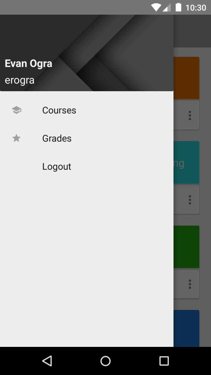
I have a DrawerLayout with a NavigationView (Support Design Library) inside. I have been able to set the header and add items to the view but I would like to have some items have smaller text, no icon, etc... I can't figure out where I would specify the new attributes. In my drawer.xml, where the other items are, I don't know which attributes could change it.
Any advice is appreciated!
I have two items with an intended look and the last item, Logout, I want to make smaller and have a divider overhead of it.
layout/activity_main.xml
<!-- A DrawerLayout is intended to be used as the top-level content view using match_parent for both width and height to consume the full space available. -->
<android.support.v4.widget.DrawerLayout xmlns:android="http://schemas.android.com/apk/res/android"
    xmlns:tools="http://schemas.android.com/tools"
    xmlns:app="http://schemas.android.com/apk/res-auto"
    android:id="@+id/drawer_layout"
    android:layout_width="match_parent"
    android:layout_height="match_parent"
    android:fitsSystemWindows="true"
    tools:context=".MainActivity">

    <!-- As the main content view, the view below consumes the entire
         space available using match_parent in both dimensions. -->
    <LinearLayout
        android:orientation="vertical"
        android:id="@+id/container"
        android:layout_width="match_parent"
        android:layout_height="match_parent" >

    </LinearLayout>

    <android.support.design.widget.NavigationView
        android:id="@+id/navigation"
        android:layout_width="wrap_content"
        android:layout_height="match_parent"
        android:layout_gravity="start"
        app:headerLayout="@layout/fragment_navdrawer_header"
        app:menu="@menu/drawer"/>

</android.support.v4.widget.DrawerLayout>
menu/drawer.xml
<?xml version="1.0" encoding="utf-8"?>
<menu xmlns:android="http://schemas.android.com/apk/res/android">
    <group android:checkableBehavior="single">
        <item
            android:id="@+id/navigation_item_1"
            android:icon="@drawable/ic_action_social_school"
            android:title="Courses"/>
        <item
            android:id="@+id/navigation_item_2"
            android:icon="@drawable/ic_action_action_grade"
            android:title="Grades"/>
        <item
            android:id="@+id/navigation_logout"
            android:title="Logout"
           />
    </group>
</menu>
Upvotes: 1
Views: 1951
Answers (1)
Reputation: 129
Heres how your activity_main.xml should be. Toolbar is commented out, but if you need it please uncomment and add a toolbar layout. Add logout button and separator view at the bottom of the page and style them as it looks just like in the items in the list view.
    <android.support.v4.widget.DrawerLayout

    xmlns:android="http://schemas.android.com/apk/res/android"
    android:id="@+id/DrawerLayout"
    android:layout_width="match_parent"
    android:layout_height="match_parent"
    android:elevation="7dp">


    <LinearLayout
        android:layout_width="match_parent"
        android:layout_height="match_parent"
        android:orientation="vertical">


    /*    <include
            android:id="@+id/tool_bar"
            layout="@layout/tool_bar">
        </include> */

        <TextView
            android:layout_width="wrap_content"
            android:layout_height="wrap_content"
            android:text="Hello World" />

    </LinearLayout>


    <android.support.v7.widget.RecyclerView
        android:id="@+id/RecyclerView"
        android:layout_width="320dp"
        android:layout_height="match_parent"
        android:layout_gravity="left"

        android:background="#ffffff"
        android:scrollbars="vertical">

    </android.support.v7.widget.RecyclerView>

//devider

  <View
                android:layout_width="match_parent"
                android:layout_height="2dp"
                android:alpha="0.2"
                android:background="@android:color/white" />
//logout button
  <TextView
        android:layout_width="wrap_content"
        android:layout_height="wrap_content"
        android:paddingLeft="12dp"
        android:paddingTop="4dp"
        android:textAppearance="?android:attr/textAppearanceMedium"
        android:text="Medium Text"
        android:id="@+id/txtLogout" />

</android.support.v4.widget.DrawerLayout>
Instead of drawer.xml add new item_row layout. This for each row in recyclerView
<?xml version="1.0" encoding="utf-8"?>
<LinearLayout xmlns:android="http://schemas.android.com/apk/res/android"
    android:layout_width="wrap_content"
    android:paddingTop="8dp"
    android:paddingBottom="8dp"
    android:layout_height="wrap_content"
    android:background="#ffffff"
    android:orientation="horizontal">


    <ImageView
        android:layout_width="wrap_content"
        android:layout_height="wrap_content"
        android:id="@+id/rowIcon"
        android:paddingLeft="16dp"
        android:src="@drawable/ic_launcher"/>

    <TextView
        android:layout_width="wrap_content"
        android:layout_height="wrap_content"
        android:paddingLeft="12dp"
        android:paddingTop="4dp"
        android:textAppearance="?android:attr/textAppearanceMedium"
        android:text="Medium Text"
        android:id="@+id/rowText" />

</LinearLayout>
This here is just a sketch of how your drawers should look like, but you can redesign your header to show images and every thing. Here below are couple of great link that explains this in detail.
How To Make Material Design Navigation Drawer With Header View
Android Getting Started with Material Design
Hope this helps
Upvotes: 1
Related Questions
- NavigationView(Change Color of Selected Item)
- Customize NavigationView item
- How do I edit the uppermost navigation bar's color in xml?
- How to change title color of menu's enclosing item in NavigationView's xml files
- Android - Change the background color of a single item in the NavigationView
- Java android NavigationView change color icon in item
- Change navigation bar color, Android
- How to change color of navigation content in android
- change Item text color of NavigationView
- Setting Navigation View MenuItem style programmatically