
Reputation: 87
Bootstrap 3 Vertical Alignment Across Multiple Rows and Columns
I am new to Bootstrap. I just started a project and came across a challenge regarding vertical alignment with Bootstrap's grid system. Hopefully this community of experts will be able to shed some light and assist with a solution.
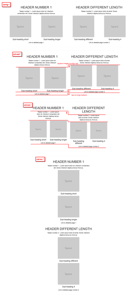
To better illustrate the issue, I have taken 4 screenshots (links attached at the bottom) for each of the lg, md, sm, and xs scenarios. I hope the images make sense to you.
The problem is, while the lg scenario looks great and everything is aligned properly, as the viewport changes, the content of the 2 columns start to show misalignment.
Here is the HTML markup:
<div class="container">
        <div class="row row-centered">
            <div class="col-sm-6 col-md-6 col-lg-6">

                <div class="row row-centered">
                    <div class="hidden-xs hidden-sm hidden-md hidden-lg"></div>
                    <div class="col-xs-12 col-sm-12 col-md-12 col-lg-12">
                        <h2>HEADER NUMBER 1</h2>
                    </div>
                    <div class="hidden-xs hidden-sm hidden-md hidden-lg"></div>
                </div>

                <div class="row row-centered">
                    <div class="col-xs-2 col-sm-2 col-md-2 col-lg-2"></div>
                    <div class="col-xs-8 col-sm-8 col-md-8 col-lg-8">
                        <div>
                            <p>Teaser number 1 - Lorem ipsum dolor sit, interdum consectetur elit. Donec interdum dapibus lectus rhoncus.</p>
                        </div>
                    </div>
                    <div class="col-xs-2 col-sm-2 col-md-2 col-lg-2"></div>
                </div>

                <div class="row row-centered">
                    <div class="col-sm-6 col-md-6 col-lg-6">
                        <img class="img-responsive" src="http://placehold.it/200x200&text=Square" alt="">
                        <h4>Sub-heading short</h4>
                    </div>
                    <div class="col-sm-6 col-md-6 col-lg-6">
                        <img class="img-responsive" src="http://placehold.it/200x200&text=Square" alt="">
                        <h4>Sub-heading longer</h4>
                    </div>
                </div>
                <div class="row row-centered">
                    <div class="col-lg-12">
                        <div>
                            <p>Link to detailed page 1</p>
                        </div>
                    </div>
                </div>
            </div>

            <div class="col-sm-6 col-md-6 col-lg-6">

                <div class="row row-centered">
                    <div class="hidden-xs hidden-sm hidden-md hidden-lg"></div>
                    <div class="col-xs-12 col-sm-12 col-md-12 col-lg-12">
                        <h2>HEADER DIFFERENT LENGTH</h2>
                    </div>
                    <div class="hidden-xs hidden-sm hidden-md hidden-lg"></div>
                </div>

                <div class="row row-centered">
                    <div class="col-xs-2 col-sm-2 col-md-2 col-lg-2"></div>
                    <div class="col-xs-8 col-sm-8 col-md-8 col-lg-8">
                        <div>
                            <p>Teaser number 2 - Lorem ipsum dolor sit amet. Donec interdum dapibus lectus eu rhoncus.</p>
                        </div>
                    </div>
                    <div class="col-xs-2 col-sm-2 col-md-2 col-lg-2"></div>
                </div>

                <div class="row row-centered">
                    <div class="col-sm-6 col-md-6 col-lg-6">
                        <img class="img-responsive" src="http://placehold.it/200x200&text=Square" alt="">
                        <h4>Sub-heading different</h4>
                    </div>
                    <div class="col-sm-6 col-md-6 col-lg-6">
                        <img class="img-responsive" src="http://placehold.it/200x200&text=Square" alt="">
                        <h4>Sub-heading 4</h4>
                    </div>
                </div>
                <div class="row row-centered">
                    <div class="col-lg-12">
                        <div>
                            <p>Link to detailed page number 2</p>
                        </div>
                    </div>
                </div>
            </div>
        </div>
    </div>
I have not incorporated any custom CSS yet except for the .row-centered, which is as simple as this:
.row-centered {
text-align:center;}
What should I do to fix the problem? Thank you very much!
Here are the screenshots: Example
Upvotes: 0
Views: 1809
Answers (1)

Reputation: 2762
Topgun, Hi there. To get this to stay inline with each other.
My approach is to adjust the title font size at 2 media breakpoints.
You can change this to suit what suits you, I went just a little smaller to show the effect here.
I also at a breakpoint add the height value to main text part you have too.
I used min-height here rather than a fixed height. Because when they stack on a small screen the text need room to expand down.
Your code had lost of extra divs and seemed like lots of hidden block padders.
I went through this and removed a lot just to pull it back to what is only needed here for this demo.
Go through the code and see the difference.
What I also added here was col-xs-12 into your img class.
As you will see now when resized down to a small screen size the image goes full width and does not stay to the left with a big space to the right.
To center the text you just need to use the class of text-center once in each of the 2 rows.
Hope that this gets you started for how you want it to look now.
Here is the Fiddle.
<!DOCTYPE html>
<html lang="en">
  <head>
    <meta charset="utf-8">
    <meta http-equiv="X-UA-Compatible" content="IE=edge">
    <meta name="viewport" content="width=device-width, initial-scale=1">

    <meta name="description" content="">
    <meta name="author" content="">
    <link rel="icon" href="../../favicon.ico">

    <title>Starter Template for Bootstrap</title>

    <!-- Bootstrap core CSS -->
    <link rel="stylesheet" href="https://maxcdn.bootstrapcdn.com/bootstrap/3.3.5/css/bootstrap.min.css">

<style>
body {
  padding-top: 50px;
}
.spacer {
  margin-top: 2%;
  margin-bottom: 2%;
}

@media(max-width:1200px) {
.adjust-fontsize{
    font-size:2em;
    font-weight: 700;
    font-weight: 600;
}
}
@media(max-width:992px) {
.adjust-fontsize{
    font-size:1.0em;
}
.row-height{
    min-height:70px;
}
}
</style>

</head>

<body>

    <nav class="navbar navbar-inverse navbar-fixed-top ">
      <div class="container">
        <div class="navbar-header">
          <button type="button" class="navbar-toggle collapsed" data-toggle="collapse" data-target="#navbar" aria-expanded="false" aria-controls="navbar">
            <span class="sr-only">Toggle navigation</span>
            <span class="icon-bar"></span>
            <span class="icon-bar"></span>
            <span class="icon-bar"></span>
          </button>
          <a class="navbar-brand " href="#">Project name</a>
        </div>
        <div id="navbar" class="collapse navbar-collapse">
          <ul class="nav navbar-nav navbar-right">
            <li class="active"><a href="#">Home</a></li>
            <li><a href="#about">About</a></li>
            <li><a href="#contact">Contact</a></li>
          </ul>
        </div><!--/.nav-collapse -->
      </div>
    </nav>

<div class="container col-lg-12 spacer"></div>

    <div class="container col-xs-12 col-sm-12 col-md-12 col-lg-12">

        <div class="col-xs-12 col-sm-6 col-md-6 col-lg-6 text-center">

            <div class="row col-lg-12">
                <h2 class="adjust-fontsize">HEADER NUMBER 1</h2>
            </div>
            <div class="row col-lg-12 row-height">
                <p>Teaser number 1 - Lorem ipsum dolor sit, interdum consectetur elit.
                Donec interdum dapibus lectus rhoncus.
                </p>
            </div>

            <div class="row col-lg-12">
                <div class="col-xs-12 col-sm-6">
                    <img class="col-xs-12 img-responsive" src="http://placehold.it/200x200&text=Square" alt="">
                    <h4>Sub-heading short</h4>
                </div>
                <div class="col-xs-12 col-sm-6">
                    <img class="col-xs-12 img-responsive" src="http://placehold.it/200x200&text=Square" alt="">
                    <h4>Sub-heading longer</h4>
                </div>
            </div>
            <div class="row col-xs-12">
                <p>Link to detailed page 1</p>
            </div>
        </div>


        <div class=" col-xs-12 col-sm-6 col-md-6 col-lg-6 text-center">
            <div class="row col-lg-12">
                <h2 class="adjust-fontsize">HEADER DIFFERENT LENGTH</h2>
            </div>
            <div class="row col-xs-12 row-height">
                <div class="col-xs-12">
                    <p>Teaser number 2 - Lorem ipsum dolor sit amet.
                    <br>Donec interdum dapibus lectus eu rhoncus.
                    </p>
                </div>
            </div>

            <div class="row col-lg-12">
                <div class="col-xs-12 col-sm-6">
                    <img class="col-xs-12 img-responsive" src="http://placehold.it/200x200&text=Square" alt="">
                    <h4>Sub-heading different</h4>
                </div>
                <div class="col-xs-12 col-sm-6">
                    <img class="col-xs-12 img-responsive" src="http://placehold.it/200x200&text=Square" alt="">
                    <h4>Sub-heading 4</h4>
                </div>
            </div>
            <div class="row col-xs-12">
                <p>Link to detailed page number 2</p>
            </div>
        </div>

    </div><!-- /.container -->


    <!-- Bootstrap core JavaScript
    ================================================== -->
    <!-- Placed at the end of the document so the pages load faster -->
    <script src="https://ajax.googleapis.com/ajax/libs/jquery/1.11.2/jquery.min.js"></script>
    <script src="https://maxcdn.bootstrapcdn.com/bootstrap/3.3.5/js/bootstrap.min.js"></script>

</body>
</html>
Upvotes: 1
Related Questions
- Bootstrap row vertical align
- Twitter bootstrap 3 - vertical align columns in a row [middle]
- Vertical align entire row in Bootstrap 3
- Align multiple elements across bootstrap columns in the same row
- Column alignment in Bootstrap
- Bootstrap vertical align (to all columns) in row with multiple elements
- Horizontally Aligning Bootstrap 3.3.5 Columns inside a row in Wordpress
- Vertical alignment in column content in Bootstrap 3
- Vertically align content of Bootstrap 3 column
- Vertically align divs across bootstrap columns