
Reputation: 2691
Kendo Grid Filterable cell
I have a requirement in which I have to show two dropdown list in the Filterable cell of kendo grid. These two dropdown lists would filter two different columns in the kendo grid.
One thought I had is having template which would be some kendo container like some panel probably, and then add two dropdowns to that container.
Is this even possible? If yes how to achieve this?
Here is my kendo grid definition.
ctrl.mainGridOptions = {
    dataSource: ctrl.gridDataSource,
    columns: [
                {
                    title: 'Col1-Col2',
                    field: 'Col1',
                    width: 200,
                    template: kendo.template($("#col1").html()),
                    filterable: { cell: { template: ctrl.coonetemplate, showOperators: false } }
                },
                {
                    field: 'Col3',
                    width: 150,
                    title: 'Col3',
                    template: kendo.template($("#col3").html()),
                    filterable: { cell: { template: ctrl.colthreeTemplate, showOperators: false } }
                }
         ]
      }
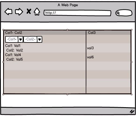
Here is a mockup of what I want to achieve.
Upvotes: 2
Views: 5122
Answers (3)

Reputation: 1
You have a column bound to a field that contains a JSON object, and you're using a template to display a specific property or a computed value from the JSON. However, the default filtering does not work because the filter looks for the entire object rather than the displayed value.
Solution
To make filtering work:
- Define a custom
valueGetterfunction to extract the field value. - Use the
filterable.celloption to provide a custom filter logic for that column.
Implementation
Here is an example:
JSON Data Example
public gridData = [
  { id: 1, name: { firstName: 'John', lastName: 'Doe' }, age: 30 },
  { id: 2, name: { firstName: 'Jane', lastName: 'Smith' }, age: 25 },
];
Kendo Grid Configuration
<kendo-grid [data]="gridData" [filterable]="true">
  <!-- Other columns -->

  <kendo-grid-column title="Full Name" [filterable]="true">
    <ng-template kendoGridCellTemplate let-dataItem>
      {{ dataItem.name.firstName + ' ' + dataItem.name.lastName }}
    </ng-template>
    <ng-template kendoGridFilterCellTemplate let-filter let-column="column">
      <input kendoTextBox
             [(ngModel)]="columnFilterValue"
             (ngModelChange)="onFilterChange(column, filter)"
             placeholder="Filter by full name"
      />
    </ng-template>
  </kendo-grid-column>
</kendo-grid>
Component Logic
import { Component } from '@angular/core';
import { CompositeFilterDescriptor, FilterDescriptor } from '@progress/kendo-data-query';

@Component({
  selector: 'my-app',
  template: `<kendo-grid [data]="filteredData" [filter]="filter"> </kendo-grid>`,
})
export class AppComponent {
  public gridData = [
    { id: 1, name: { firstName: 'John', lastName: 'Doe' }, age: 30 },
    { id: 2, name: { firstName: 'Jane', lastName: 'Smith' }, age: 25 },
  ];
  public filter: CompositeFilterDescriptor = { logic: 'and', filters: [] };
  public filteredData = this.gridData;

  public columnFilterValue: string = '';

  onFilterChange(column: any, filter: CompositeFilterDescriptor): void {
    const filterValue = this.columnFilterValue.toLowerCase();
    this.filter = {
      logic: 'and',
      filters: [
        {
          field: 'name',
          operator: (item: any) => {
            const fullName = item.name.firstName + ' ' + item.name.lastName;
            return fullName.toLowerCase().includes(filterValue);
          },
        } as FilterDescriptor,
      ],
    };

    // Filter the data
    this.filteredData = this.gridData.filter((item) =>
      this.filter.filters[0].operator(item)
    );
  }
}
Upvotes: 0

Reputation: 1761
Kendo Grid filterable cell with custom options column wise and by using this solution it also overwrites general filters settings in case specific column requirement. ASP.NET MVC C#.
columns.Bound(c => c.columnName)
    .Format("{0}%")
    .Filterable(ftb => ftb
        .Cell(cell => cell.ShowOperators(true))
        .Extra(false)
        .Operators(op => op
            .ForNumber(fn => fn
                .Clear()
                .IsEqualTo(CommonResource.GridFilter_IsEqualTo)
            )
        )
    )
    .Title("Column Name");
Upvotes: 0

Reputation: 46
There are a few different parts to this.
First, if you want to have multiple filter controls for different pieces of data, you should define a column for each one. Then, put a template on the first column to have it display the data for two columns. Use the attributes option to set a colspan=2. Then, use the attributes option on the second columns to set style="display:none".
The second part is getting the dropdowns. I generally prefer to use the values option to accomplish this. The code below uses this for the OrderID column. The other alternative was the approach you were on, which is to use the cell template. The code below uses this on the ShipName column.
<div id="example">
    <div id="grid"></div>
    <script>
        $(document).ready(function() {
            $("#grid").kendoGrid({
                dataSource: {
                    type: "odata",
                    transport: {
                        read: "http://demos.telerik.com/kendo-ui/service/Northwind.svc/Orders"
                    },
                    schema: {
                        model: {
                            fields: {
                                OrderID: { type: "string" },
                                Freight: { type: "number" },
                                ShipName: { type: "string" },
                                OrderDate: { type: "date" },
                                ShipCity: { type: "string" }
                            }
                        }
                    },
                    pageSize: 20,
                    serverPaging: true,
                    serverFiltering: true,
                },
                height: 550,
                filterable: {
                    mode: "row"
                },
                pageable: true,
                columns: [
                {
                    field: "OrderID",
                    width: 150,
                    attributes: {
                        colspan: 2
                    },
                    values: [
                        {text: "10248", value: "one"},
                        {text:"10249", value: "two"}
                    ],
                    template: '#:OrderID# (#:ShipName#)',
                    filterable: {
                        cell: {
                            operator: "eq",
                            showOperators: false
                        }
                    }
                },
                {
                    attributes: {
                        style: "display:none"
                    },
                    field: "ShipName",
                    width: 200,
                    title: "Ship Name",
                    filterable: {
                        cell: {
                            template: function(args) {
                                args.element.kendoDropDownList({
                                    dataSource: args.dataSource,
                                    dataTextField: "ShipName",
                                    dataValueField: "ShipName",
                                    valuePrimitive: true
                                });
                            },
                            operator: "eq",
                            showOperators: false
                        }
                    }
                },
                {
                    field: "Freight",
                    width: 255,
                    filterable: false
                }]
            });
        });
    </script>
</div>
Upvotes: 2
Related Questions
- Kendo Grid Filter customaization
- Kendo Grid - Customize Filter Row
- Filtering Kendo Grid Array Column
- KendoUI Grid Custom Filter UI
- Kendo UI grid filter cell that contains an array
- Pre-filtering in a Kendo grid
- Kendo UI Grid - custom filter
- KendoUI Grid Filtering Issues
- Kendo declarative grid and making filterable.extra 'false'
- kendo grid is not filtered properly