
Reputation: 187
Hiding and managing navbar elements on small screen
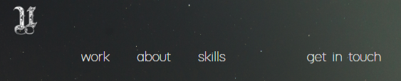
This is what my current navbar looks like on big screen:

And this is what it looks like on small screen(phone)
What i would like to happen is, make the U logo on top left disappear and make the "get in touch" get closer with rest of the elements (I used pull-right class to make get in touch move to the right on big screen) and instead of the navbar being in the center, i would like it to be spread 100% horizontally so it's easier to click them

Here's my code right now:
http://www.bootply.com/G30iN5Ai4u
I tried using the .hidden-xs class to hide the logo but it didn't work
Upvotes: 2
Views: 6345
Answers (2)

Reputation: 2432
Try : http://www.bootply.com/sGWCci6pBi
use bootstrap utility classes :
- visible-xs-block : visible only in mobile devices
- visible-sm-block : visible only in smaller devices like 'tablet'
- visible-md-block : visible only in medium devices like 'desktop'
- visible-lg-block : visible only in large devices like 'desktop'
Other examples can be found : https://github.com/twbs/bootstrap/issues/8883
@eratzlaff says :
- Quick Fix or possible work around.
- hidden-sm hidden-md = visible-lg
- hidden-sm hidden-lg = visible-md
- hidden-md hidden-lg = visible-sm
Code example:
<nav class="navbar navbar-transparent">
        <div class="container-fluid">
            <div class="navbar-header">
                <a class="navbar-brand" href="./index.html"><img src="./images/logo.png" class="img-responsive logo"></a>
            </div>
                <ul class="nav navbar-nav navbar-firstnav">
                    <li><a href="#work">work</a></li>
                    <li><a href="#about">about</a></li>
                    <li><a href="#skills">skills</a></li>
                    <li class="visible-xs-block"><a href="#contact">get in touch</a></li>
                    <li class="pull-right visible-lg-block visible-md-block visible-sm-block"><a href="#contact">get in touch</a>
                </li></ul>
            </div>
        </nav>
Upvotes: 5

Reputation: 158
The HTML code has a non opened div closing tag.
Otherwise the class hidden-xs must be applied to the navbar-header div:
    <nav class="navbar navbar-transparent">
        <div class="container-fluid">
            <div class="navbar-header hidden-xs">
                <a class="navbar-brand" href="./index.html"><img src="./images/logo.png" class="img-responsive logo"></a>
            </div>
            <ul class="nav navbar-nav navbar-firstnav">
                <li><a href="#work">work</a></li>
                <li><a href="#about">about</a></li>
                <li><a href="#skills">skills</a></li>
                <li class="pull-right"><a href="#contact">get in touch</a>
            </ul>
        </div>
    </nav>
Upvotes: 0
Related Questions
- Center a position:fixed element
- Get the size of the screen, current web page and browser window
- Selecting and manipulating CSS pseudo-elements such as ::before and ::after using javascript (or jQuery)
- In CSS Flexbox, why are there no "justify-items" and "justify-self" properties?
- What is the difference between "screen" and "only screen" in media queries?
- Hiding elements in responsive layout?
- HTML/CSS - Problem with aligning elements in navbar
- How do I change Bootstrap 3 column order on mobile layout?
- AngularJS ngClass conditional