
Reputation: 2833
Different legends and fill colours for facetted ggplot?
Sorry for not included any example data for my problem. I couldn’t find a way to easily produce an example shape file. Hopefully, experienced users of ggplot can see what I’d like to do from the description below.
I’ve got:
A
data.frameX with information about sample plots (plotid,var1,var2,var3,var4, …)A polygon shapefile
Ywith spatial information for the sample plots
Importation of the shapefile Y (with maptools) and fortifying as data.frame Z (ggplot2) works fine. melting X to X_melted works equally fine. merge-ing Z and X_melted to mapdf works as well.
That means that now we have a data.frame in long form with spatial information and var1, var2, var3, …
Now I want to plot this data frame like this:
pl1 <- ggplot(mapdf,aes(long,lat),group=group)
pl1 <- pl1 + geom_polygon(aes(group=group,fill=value),colour="black")
pl1 <- pl1 + facet_grid(variable ~ .)
pl1 <- pl1 + coord_equal(ratio = 1)
pl1
The result is a nice plot with one panel for each variable. The maps of the panels are identical, but fill colour varies with the values of the variables. Up to now, everything works like a charm… with one problem:
The variables have different min and max values. For example var1 goes from 0 to 5, var2 from 0 to 400, var3 from 5 to 10, etc. In that example, the legend for the fill colour goes from 0 to 400. var2 is nicely drawn, but var1 and var3 are basically in the same colour.
Is there a way I could use a different legend for each panel of the facet? Or is this simply not (yet) possible with facet_wrap or facet_grid in ggplot?
I could make individual plots for each variable and join them with viewports, but there a plenty of variables and this would be a lot of work.
Or is there maybe another package or method I could use to accomplish what I’d like to do?
And help would be very much appreciated. :)
Edit:
With the help of the ggplot2-package description, I constructed an example that illustrates my problem:
ids <- factor(c("1.1", "2.1", "1.2", "2.2", "1.3", "2.3"))
values <- data.frame(
id = ids,
val1 = cumsum(runif(6, max = 0.5)),
val2 = cumsum(runif(6, max = 50))
)
positions <- data.frame(
id = rep(ids, each = 4),
x = c(2, 1, 1.1, 2.2, 1, 0, 0.3, 1.1, 2.2, 1.1, 1.2, 2.5, 1.1, 0.3,
0.5, 1.2, 2.5, 1.2, 1.3, 2.7, 1.2, 0.5, 0.6, 1.3),
y = c(-0.5, 0, 1, 0.5, 0, 0.5, 1.5, 1, 0.5, 1, 2.1, 1.7, 1, 1.5,
2.2, 2.1, 1.7, 2.1, 3.2, 2.8, 2.1, 2.2, 3.3, 3.2)
)

values <- melt(values)
datapoly <- merge(values, positions, by=c("id"))

p <- ggplot(datapoly, aes(x=x, y=y)) + geom_polygon(aes(fill=value, group=id),colour="black")
p <- p + facet_wrap(~ variable)
p
The panel on the right illustrates different values for var2 on the map. On the panel on the left however, all polygons have the same colour. This is logical, because only one colour gradient is used for all panels. Could I use a different colour gradient for each panel?
Upvotes: 20
Views: 9591
Answers (5)

Reputation: 37913
Revisiting this question more than 10 years later, the excellent ggnewscale package solves the problem of having multiple colour scales. Caveat is that you'd need two seperate layers for your facet data, so you'd have to break it up a bit. The order in which new scales are added to the plot matters, so I recommend the order 'layer - scale - new_scale - layer - scale'. Subsequent new scales should repeat the 'new_scale - layer - scale' pattern.
library(ggplot2)
library(ggnewscale)

ids <- factor(c("1.1", "2.1", "1.2", "2.2", "1.3", "2.3"))
values <- data.frame(
  id = ids,
  val1 = cumsum(runif(6, max = 0.5)),
  val2 = cumsum(runif(6, max = 50))
)
positions <- data.frame(
  id = rep(ids, each = 4),
  x = c(2, 1, 1.1, 2.2, 1, 0, 0.3, 1.1, 2.2, 1.1, 1.2, 2.5, 1.1, 0.3,
        0.5, 1.2, 2.5, 1.2, 1.3, 2.7, 1.2, 0.5, 0.6, 1.3),
  y = c(-0.5, 0, 1, 0.5, 0, 0.5, 1.5, 1, 0.5, 1, 2.1, 1.7, 1, 1.5,
        2.2, 2.1, 1.7, 2.1, 3.2, 2.8, 2.1, 2.2, 3.3, 3.2)
)

values <- reshape2::melt(values)
#> Using id as id variables
datapoly <- merge(values, positions, by=c("id"))

ggplot(datapoly, aes(x=x, y=y)) +
  geom_polygon(aes(fill=value, group=id),
               data = ~ subset(., variable == "val1"),
               colour="black") +
  scale_fill_distiller(palette = "Reds") +
  new_scale_fill() +
  geom_polygon(aes(fill=value, group=id),
               data = ~ subset(., variable == "val2"),
               colour="black") +
  scale_fill_distiller(palette = "Greens") +
  facet_wrap(~ variable)
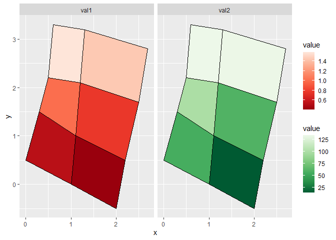
Created on 2021-02-12 by the reprex package (v1.0.0)
Upvotes: 6

Reputation: 17348
With grid goodness
align.plots <- function(..., vertical=TRUE){
#http://ggextra.googlecode.com/svn/trunk/R/align.r
  dots <- list(...)
  dots <- lapply(dots, ggplotGrob)
  ytitles <- lapply(dots, function(.g) editGrob(getGrob(.g,"axis.title.y.text",grep=TRUE), vp=NULL))
  ylabels <- lapply(dots, function(.g) editGrob(getGrob(.g,"axis.text.y.text",grep=TRUE), vp=NULL))
  legends <- lapply(dots, function(.g) if(!is.null(.g$children$legends))
                    editGrob(.g$children$legends, vp=NULL) else ggplot2:::.zeroGrob)

  gl <- grid.layout(nrow=length(dots))
  vp <- viewport(layout=gl)
  pushViewport(vp)
  widths.left <- mapply(`+`, e1=lapply(ytitles, grobWidth),
                        e2= lapply(ylabels, grobWidth), SIMPLIFY=F)
  widths.right <- lapply(legends, function(g) grobWidth(g) + if(is.zero(g)) unit(0, "lines") else unit(0.5, "lines")) # safe margin recently added to ggplot2
  widths.left.max <- max(do.call(unit.c, widths.left))
  widths.right.max <- max(do.call(unit.c, widths.right))

  for(ii in seq_along(dots)){
    pushViewport(viewport(layout.pos.row=ii))
    pushViewport(viewport(x=unit(0, "npc") + widths.left.max - widths.left[[ii]],
                          width=unit(1, "npc") - widths.left.max + widths.left[[ii]] -
                                                 widths.right.max + widths.right[[ii]],
                          just="left"))
    grid.draw(dots[[ii]])
  upViewport(2)
  }
}


p <- ggplot(datapoly[datapoly$variable=="val1",], aes(x=x, y=y)) + geom_polygon(aes(fill=value, group=id),colour="black")
p1 <- ggplot(datapoly[datapoly$variable=="val2",], aes(x=x, y=y)) + geom_polygon(aes(fill=value, group=id),colour="black")
align.plots( p,p1)
Upvotes: 4

Reputation: 103898
Currently there can be only one scale per plot (for everything except x and y).
Upvotes: 16

Reputation: 7731
At the risk of stating the obvious, it seems like you should be coloring by percents instead of raw values. Then your transformed values and your legend go from 0 to 1.
Upvotes: 2

Reputation: 44638
Perhaps a little unorthodox, but you could try factoring your "value". For example:
p <- ggplot(datapoly, aes(x=x, y=y)) + geom_polygon(aes(fill=factor(value), group=id),colour="black")
p <- p + facet_wrap(~ variable)
p
ggplot2 uses factors to create legends. So if you could add a column that takes "value" and breaks it into factored ranges, you could replace "value" with the ranges.
Create a column, like "f":
    id variable        value   x    y f
1  1.1     val1   0.09838607 2.0 -0.5 0.09-0.13
2  1.1     val1   0.09838607 1.0  0.0 0.09-0.13
3  1.1     val1   0.09838607 1.1  1.0 0.09-0.13
4  1.1     val1   0.09838607 2.2  0.5 0.09-0.13
25 2.1     val1   0.13121347 1.0  0.0 0.13-0.20
...
Then use:
p <- ggplot(datapoly, aes(x=x, y=y)) + geom_polygon(aes(fill=f, group=id),colour="black")
p <- p + facet_wrap(~ variable)
p
You'd have to specify the categories that you want, which could be time consuming. But at least the graph would come out how you want it to. Basically, you'd be recoding the data into another column. Here are some examples:
http://www.statmethods.net/management/variables.html
Upvotes: 1
Related Questions
- Add additional facet to ggplot with conditional fill aesthetic
- Add different visualisation to individual facets of ggplot in R
- Using R how to plot and color with multiple facet
- How to add legend in ggplot for each facet?
- ggplot2 facets set plot colors
- Changing colour schemes between facets
- Colour text in facet by legend color in R ggplot2
- Ggplot2: changing fill color in each facet
- ggplot2: use different colors in different facets
- Modify legend in facetted plot, ggplot2