
Reputation: 822
How to plot multiple asterisks for significance in ggplot facet plot?
I have created a facet plot in ggplot2 with multiple data sets presented in each figure as line charts. Some of the data points are significant according to a statistical test (p ≤ 0.05). I would like to indicate this on the plot with an asterisk above the data points that are significant.I found this example of having asterisks displayed above the significant values
The color of the asterisk should correspond to the color of the data set used in the plot. And when there are multiple significant data sets for that point on the x-axis then the asterisks should be stacked vertically so they do not obscure each other by overlapping.
In my input data I have an additional column with the p-value. Could anyone point me towards the way to do this ggplot2 (if it is possible at all) or help me with the code.
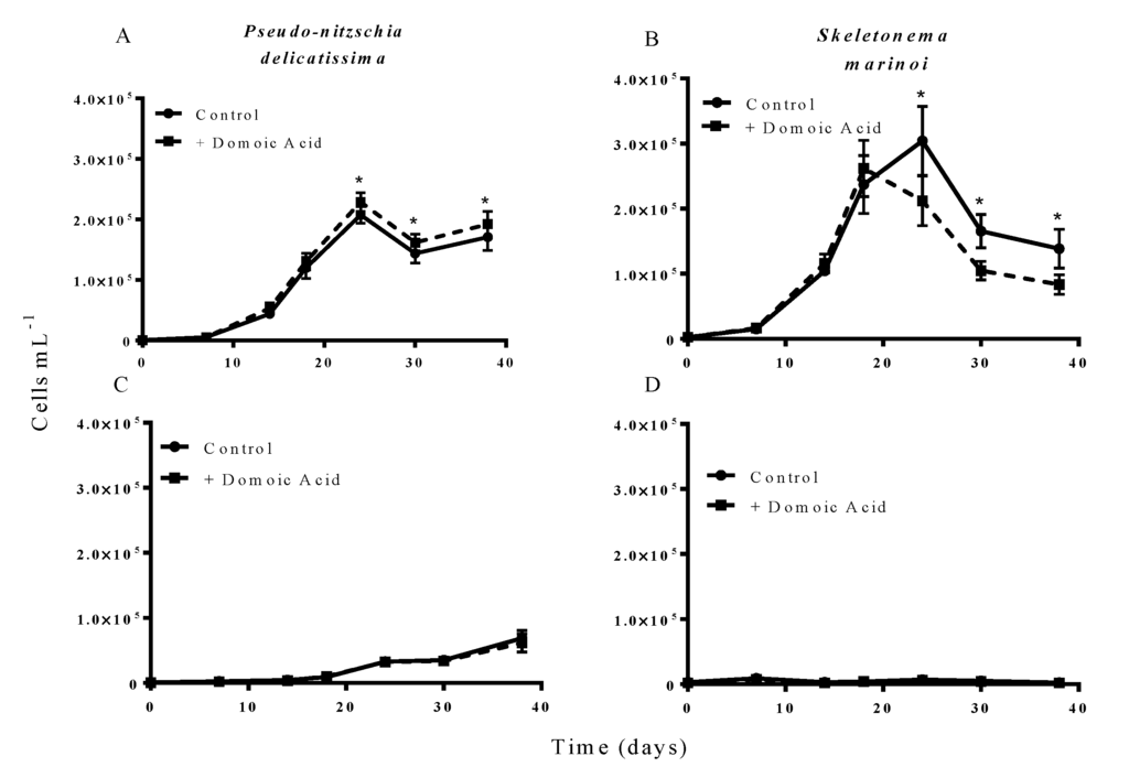
My current plot (legend is cropped off the right hand side to make the rest of the figure larger here):

My current code:
ggplot(MyData,aes( x = DAF, y = Mvalue ,group=Species, colour = Species)) + geom_line(size=1.3) + xlab("Frequencies") + ylab("Score") + theme(axis.text.x=element_text(angle = -45, hjust = 0, size = 6)) + theme(axis.text.y=element_text( size = 6)) + facet_wrap(~Variant) + geom_point()
Example of input data for 2 of the 9 datasets (the rest would continue below). For this data the asterisks for significance (p ≤ 0.05) would be for lines 6,7,8,10,14 & 19 based on the value in the final column being ≤ 0.05 :
1   Species Variant DAF Mvalue  pvalue
2   Tom 5' UTR  0.1-0.19    -1.6026346186   NA
3   Tom 5' UTR  0.2-0.29    1.1646939405    NA
4   Tom 5' UTR  0.3-0.39    0.0003859956    9.84E-01
5   Tom 5' UTR  0.4-0.49    0.0226744644    3.28E-01
6   Tom 5' UTR  0.5-0.59    0.1163627387    3.22E-05
7   Tom 5' UTR  0.6-0.69    0.1614562558    6.33E-06
8   Tom 5' UTR  0.7-0.79    0.221583632 4.29E-06
9   Tom 5' UTR  0.8-0.89    0.1231280752    1.42E-01
10  Tom 5' UTR  0.9-0.99    0.5765076152    9.13E-03
11  Tom 5' UTR  1   5.8105310419    1.87E-13
12  Jerry   5' UTR  0.1-0.19    -0.1371122871   NA
13  Jerry   5' UTR  0.2-0.29    -0.0539638465   4.30E-01
14  Jerry   5' UTR  0.3-0.39    0.1666681074    1.45E-02
15  Jerry   5' UTR  0.4-0.49    0.0081950639    9.19E-01
16  Jerry   5' UTR  0.5-0.59    -0.1204254909   1.82E-01
17  Jerry   5' UTR  0.6-0.69    0.1017622151    3.15E-01
18  Jerry   5' UTR  0.7-0.79    0.1293398031    3.16E-01
19  Jerry   5' UTR  0.8-0.89    0.2944195851    4.52E-02
20  Jerry   5' UTR  0.9-0.99    -0.2956980914   2.12E-01
21  Jerry   5' UTR  1   0.0746902715    7.63E-01
If it is much simpler I could replace the p-value column with a 0 or a 1 indicating if the value is significant.
I tried to show my previous work and some example input data. Let me know if I can improve my question. Thank you for your suggestions.
Here is a dput() output of a subset of the data as requested:
structure(list(Species = structure(c(2L, 2L, 2L, 2L, 2L, 2L,
2L, 2L, 2L, 2L, 2L, 2L, 2L, 2L, 2L, 2L, 2L, 2L, 2L, 2L, 2L, 2L,
2L, 2L, 2L, 2L, 2L, 2L, 2L, 2L, 2L, 2L, 2L, 2L, 2L, 2L, 2L, 2L,
2L, 2L, 1L, 1L, 1L, 1L, 1L, 1L, 1L, 1L, 1L, 1L, 1L, 1L, 1L, 1L,
1L, 1L, 1L, 1L, 1L, 1L, 1L, 1L, 1L, 1L, 1L, 1L, 1L, 1L, 1L, 1L,
1L, 1L, 1L, 1L, 1L, 1L, 1L, 1L, 1L, 1L), .Label = c("Jerry",
"Tom"), class = "factor"), Variant = structure(c(2L, 2L, 2L,
2L, 2L, 2L, 2L, 2L, 2L, 2L, 1L, 1L, 1L, 1L, 1L, 1L, 1L, 1L, 1L,
1L, 3L, 3L, 3L, 3L, 3L, 3L, 3L, 3L, 3L, 3L, 4L, 4L, 4L, 4L, 4L,
4L, 4L, 4L, 4L, 4L, 2L, 2L, 2L, 2L, 2L, 2L, 2L, 2L, 2L, 2L, 1L,
1L, 1L, 1L, 1L, 1L, 1L, 1L, 1L, 1L, 3L, 3L, 3L, 3L, 3L, 3L, 3L,
3L, 3L, 3L, 4L, 4L, 4L, 4L, 4L, 4L, 4L, 4L, 4L, 4L), .Label = c("3' UTR",
"5' UTR", "Missense", "Stop gained"), class = "factor"), DAF = structure(c(1L,
2L, 3L, 4L, 5L, 6L, 7L, 8L, 9L, 10L, 1L, 2L, 3L, 4L, 5L, 6L,
7L, 8L, 9L, 10L, 1L, 2L, 3L, 4L, 5L, 6L, 7L, 8L, 9L, 10L, 1L,
2L, 3L, 4L, 5L, 6L, 7L, 8L, 9L, 10L, 1L, 2L, 3L, 4L, 5L, 6L,
7L, 8L, 9L, 10L, 1L, 2L, 3L, 4L, 5L, 6L, 7L, 8L, 9L, 10L, 1L,
2L, 3L, 4L, 5L, 6L, 7L, 8L, 9L, 10L, 1L, 2L, 3L, 4L, 5L, 6L,
7L, 8L, 9L, 10L), .Label = c("0.1-0.19", "0.2-0.29", "0.3-0.39",
"0.4-0.49", "0.5-0.59", "0.6-0.69", "0.7-0.79", "0.8-0.89", "0.9-0.99",
"1"), class = "factor"), Mvalue = c(-1.6026346186, 1.1646939405,
0.0003859956, 0.0226744644, 0.1163627387, 0.1614562558, 0.221583632,
0.1231280752, 0.5765076152, 5.8105310419, -0.0251257018, -0.022586792,
0.0089090304, 0.037280128, 0.0745842692, 0.0831538898, 0.0762765259,
0.1750634419, 0.2095647328, NA, -0.0139837967, -0.0218524964,
-0.023889027, -0.0042744306, 0.0949525873, 0.087866945, 0.1379730494,
0.2719542633, 0.4726727792, NA, 0.0201430038, 0.1304518218, -0.0948886785,
-0.2329137983, -0.0901357588, 0.0504128137, -0.2308377878, 0.4422620731,
NA, NA, -0.1371122871, -0.0539638465, 0.1666681074, 0.0081950639,
-0.1204254909, 0.1017622151, 0.1293398031, 0.2944195851, -0.2956980914,
0.0746902715, -0.005168038, 0.0403712226, -0.0034692714, -0.0049252304,
-0.0089669044, -0.0604522846, 0.1061225099, 0.0180975445, -0.1843156999,
-0.1920104157, 0.2228406046, 0.0532141252, 0.0670815638, -0.1197784096,
-0.235101482, -0.1920644059, -0.2493575855, -0.1564613691, -0.2600385981,
0.069079018, 0.0503810571, 0.4346052688, 0.1300533982, 0.0662828745,
-0.4627398332, -1.081459609, -0.7693678877, -0.4865007276, -0.0230373639,
0.4693415234), pvalue = c(NA, NA, 0.984, 0.328, 3.22e-05, 6.33e-06,
4.29e-06, 0.142, 0.00913, 1.87e-13, NA, NA, 0.354, NA, 1.93e-07,
7.29e-06, 0.00288, 2.48e-05, 0.1, 0.791, 0.124, NA, 0.131, 0.824,
4.11e-05, 0.00354, 0.000711, 3.1e-05, 0.0122, 0.871, 0.73, 0.0963,
0.367, NA, 0.574, 0.799, 0.442, 0.267, 0.319, 0.98, NA, 0.43,
0.0145, 0.919, 0.182, 0.315, 0.316, 0.0452, 0.212, 0.763, 0.824,
0.096, 0.896, 0.868, 0.779, 0.124, 0.0261, 0.761, NA, NA, 6.44e-22,
0.0407, 0.0162, NA, NA, NA, NA, NA, NA, 0.481, 0.809, 0.0236,
0.573, 0.801, 0.172, NA, 0.186, 0.449, 0.975, 0.513)), .Names = c("Species",
"Variant", "DAF", "Mvalue", "pvalue"), class = "data.frame", row.names = c(NA,
-80L))
Upvotes: 1
Views: 4579
Answers (2)

Reputation: 4761
One way that could work:
The dataset containing the position of the asterisks, that is the points for which p-value is significant
library(dplyr)
df_asterisk=MyData%>%
  filter(pvalue<0.05)
Another dataframe that contains values for which more than 1 p-value is significant. A new column id is added to differenciate the different group.
Id_group=df_asterisk%>%
  group_by(Variant,DAF)%>%
  filter(n()>1)%>%
  mutate(id=data.table::rleid(Mvalue))
Mvalue is used for the position of the *, we change it in the dataframe used for the mapping. I used the value of the column id created previously to differentiate the asterisk (no overlapping). A simpler approach could be to ignore this step and add a random component to the mapping (and redraw if not satisfactory).
df_asterisk[with(df_asterisk, duplicated(interaction(Variant, DAF))|duplicated(interaction(Variant, DAF), fromLast = T)),]$Mvalue<-(df_asterisk[with(df_asterisk, duplicated(interaction(Variant, DAF))|duplicated(interaction(Variant, DAF), fromLast = T)),]$Mvalue) + Id_group$id/4
Plot:
ggplot(MyData,aes( x = DAF, y = Mvalue ,group=Species, colour = Species)) +
  geom_line(size=1.3) +
  xlab("Frequencies") +
  ylab("Score")  +
  theme(axis.text.x=element_text(angle = -45, hjust = 0, size = 6)) +
  theme(axis.text.y=element_text( size = 6)) +
  geom_point()+
  geom_text(data=df_asterisk,aes(x=DAF,y=Mvalue),label="*",size=5,nudge_y=1)+
  facet_wrap(~Variant)
I change a datapoint to have 2 signifcant p-values in DAF for 5' to see how it looked.

Upvotes: 2

Reputation: 1500
Here is the solution. It works with 2 Species as in your example, but should work with more species.
library(data.table)
MyData <- data.table(MyData)
MyData$signif <- ifelse(MyData$pvalue < 0.05,1,0)
To determine when there is more than 1 significative value on the same point
MyData[, temp:=cumsum(signif), by=c("Variant", "DAF")]
The loop create the asterisk "y value", based on the point "y value" + 0.5. When there is a n significative point, it increment the nth point "y value" by n*0.5.
for (i in 1:length(levels(MyData$Species))) {
  MyData[temp == i , y_ast:=max(Mvalue, na.rm=TRUE)+(i*0.5), by=c("DAF", "Variant")]
}


ggplot(MyData,aes( x = DAF, y = Mvalue ,group=Species, colour = Species)) +
  geom_line(size=1) + xlab("Frequencies") + ylab("Score")  +
  theme(axis.text.x=element_text(angle = -45, hjust = 0, size = 6)) +
  theme(axis.text.y=element_text( size = 6)) +
  facet_wrap(~Variant) +
  geom_point()+
  geom_point(data = MyData[MyData$signif ==1, ],aes(x=DAF, y=y_ast),shape = "*", size=8, show.legend = FALSE)

If you want to show the asterisks on the trend as I suggest, just replace y=y_ast by y=Mvalue in the last line.
PS: I use data.table as I'm used to, but y_ast value can be calculate using the R base package or dplyr for instance
Upvotes: 3
Related Questions
- putting significance levels over various facets
- add significance asterisk manually in ggplot2
- How to add an Asterix (significance) above specific bars in faceted bar graph (ggplot R)
- How can I add asterisks for the significant p-values in ggplot?
- How to annotate R-sq and p-value on facet_grid plots in R?
- Adding significance levels in faceted plots with two results in the same x axis
- How do I annotate p-values onto a faceted bar plots on R?
- How can I add significant brackets between facets of a faceted R plot using ggplot?
- automaticly add p-values to facet plot
- faceting plots with individual statistic symbols