
Reputation: 2041
Plotting differences with ggplot2
I have an R dataframe (named frequency) like this:
word    author  proportion
a   Radicals    1.679437e-04
aa  Radicals    2.099297e-04
aaa Radicals    2.099297e-05
abbe    Radicals    NA
aboow   Radicals    NA
about   Radicals    NA
abraos  Radicals    NA
ytterst Conservatives   5.581042e-06
yttersta    Conservatives   5.581042e-06
yttra   Conservatives   2.232417e-05
yttrandefrihet  Conservatives   5.581042e-06
yttrar  Conservatives   2.232417e-05
I want to plot document differences using ggplot2. Something like this
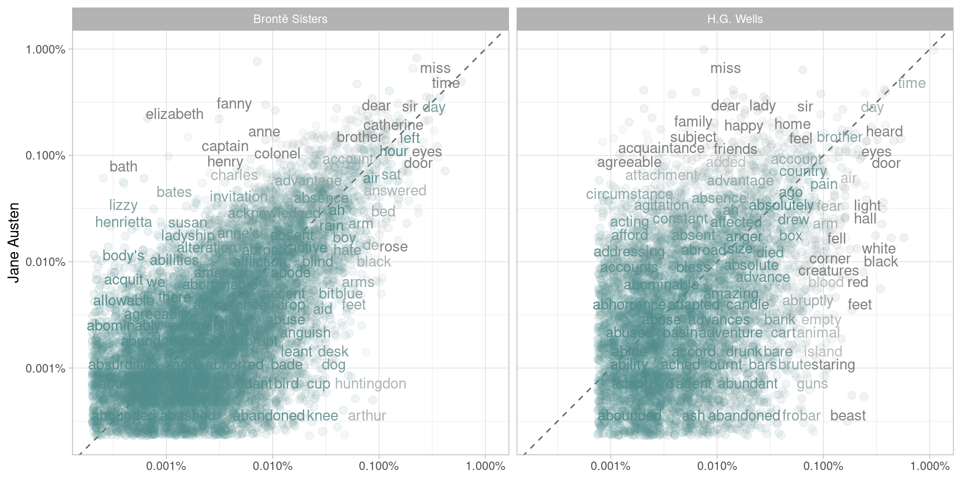
I have the code below, but my plot ends up empty.
library(scales)
ggplot(frequency, aes(x = proportion, y = `Radicals`, color = abs(`Radicals` - proportion))) +
    geom_abline(color = "gray40", lty = 2) +
    geom_jitter(alpha = 0.1, size = 2.5, width = 0.3, height = 0.3) +
    geom_text(aes(label = word), check_overlap = TRUE, vjust = 1.5) +
  scale_x_log10(labels = percent_format()) +
  scale_y_log10(labels = percent_format()) +
  scale_color_gradient(limits = c(0, 0.001), low = "darkslategray4", high = "gray75") +
  facet_wrap(~author, ncol = 2) +
  theme(legend.position="none") +
  labs(y = "Radicals", x = NULL)
Upvotes: 0
Views: 653
Answers (2)

Reputation: 11663
If what you are wanting to do is make a plot comparing the frequency of one "author" (like, say, Conservatives) on the x-axis and one "author" (perhaps the Radicals) on the y-axis, you need to spread your dataframe (from the tidyr package) so that you can plot it that way.
library(tidyverse)
library(scales)

frequency %>%
  spread(author, proportion) %>%
  ggplot(aes(Conservatives, Radicals)) +
  geom_abline(color = "gray40", lty = 2) +
  geom_point() +
  geom_text(aes(label = word), check_overlap = TRUE, vjust = 1.5) +
  scale_x_log10(labels = percent_format()) +
  scale_y_log10(labels = percent_format())
Upvotes: 1

Reputation: 312
Your plot ends up empty because there isn't a column 'Radicals'. if you're trying to narrow to only Radicals and then plot that you should do something like
radical_frequecy <- subset(frequency, author == 'Radicals')
then you can do
 library(scales)
 ggplot(radical_frequency, aes(x = proportion, y = author, color = abs(`Radicals` - proportion))) +
geom_abline(color = "gray40", lty = 2) +
geom_jitter(alpha = 0.1, size = 2.5, width = 0.3, height = 0.3) +
geom_text(aes(label = word), check_overlap = TRUE, vjust = 1.5) +
   scale_x_log10(labels = percent_format()) +
   scale_y_log10(labels = percent_format()) +
   scale_color_gradient(limits = c(0, 0.001), low = "darkslategray4", high = "gray75") +
   theme(legend.position="none") +
   labs(y = "Radicals", x = NULL)
(I took out facet wrap since you've already narrowed to Radicals. You could add that back in and then do the first bit of code if you did y=author and facet_wrap(~author, ncol = 2)
basically, tl:dr your error is caused by trying to create an axis from a variable not a column
Upvotes: 2
Related Questions
- Plotting multiple columns against one column in ggplot2 (additional question)
- Plotting data using ggplot
- Plotting multiple columns against one column in ggplot2
- Visualise differences between factor levels using ggplot
- Tidy evaluation programming and ggplot2
- plot one set of columns against another set using ggplot2
- Plotting by ggplot in R
- working with ggplot2
- Difference plot
- Difference between two lines ggplot2