
Reputation: 2022
How do I make nested x-labels like a JMP variability plot, but using ggplot2
I love the JMP variability plot. (link) It is a powerful tool.
The example the plot has 2 x-axis labels, one for part-number and one for operator.

Here the JMP variability plot displays more than 2 levels of variables. The following splits by oil amount, batch size, and popcorn type. It can take some work to find the right sequence to show strongest separation, but this is an excellent tool for communication of information.

How does one do this, the multiple-level x-labels, with R using the ggplot2 library?
The best that I can find is this (link, link), which separates based on cylinder count, but does not make the x-axis labels.
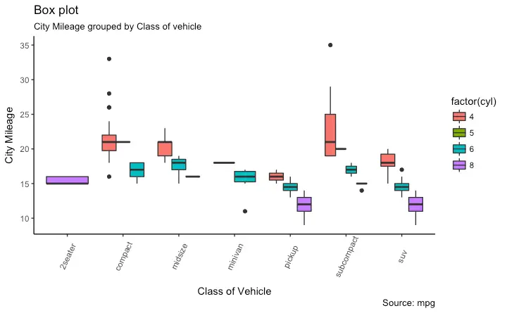
My example code is this:
#reproducible
set.seed(2372064)

#data (I'm used to reading my own, not using built-in)
data(mtcars)
attach(mtcars)

#impose factors as factors
fact_idx <- c(2,8:11)
for(i in fact_idx){
     mtcars[,i] <- as.factor(mtcars[,i])
}

#boxplot
p <- ggplot(mtcars, aes(gear, mpg, fill=cyl)) +
     geom_boxplot(notch = TRUE)
p
The plot this gives is:

How do I make the x-axis lables indicate both gears and cylinders?
In jmp I get this:

Upvotes: 6
Views: 4238
Answers (2)

Reputation: 56
You could try "multi-categorical axes" in Plotly with the maximal 2 levels in x-axis. here is the example code from https://plotly.com/python/categorical-axes/:
import plotly.graph_objects as go
fig = go.Figure()
fig.add_trace(go.Bar(
  x = [['First', 'First', 'Second', 'Second'],
       ["A", "B", "A", "B"]],
  y = [2, 3, 1, 5],
  name = "Adults",
))

fig.add_trace(go.Bar(
  x = [['First', 'First', 'Second', 'Second'],
       ["A", "B", "A", "B"]],
  y = [8, 3, 6, 5],
  name = "Children",
))
fig.update_layout(title_text="Multi-category axis")
fig.show()

Upvotes: 1

Reputation: 81
You could use R-package VCA which comes with function varPlot implementing variability charts similar to JMP. There are multiple examples provided in the help. Your example would look like this:
library(VCA)
dat <- mtcars[order(mtcars$cyl, mtcars$gear),]

# default
varPlot(mpg~cyl/gear, dat)
# nicely formatted
varPlot(mpg~cyl/gear, dat,
        BG=list(var="gear", col=paste0("gray", c(90,80,70)),
                col.table=T),
        VLine=list(var="cyl"), Mean=NULL,
        MeanLine=list(var=c("cyl", "gear"), col=c("blue", "orange"),
                      lwd=c(2,2)),
        Points=list(pch=16, cex=1))
Upvotes: 8
Related Questions
- ggplot box plot by group with labels on each box
- How to Display Categorical Groups for x-axis Label of Multiple Box plots in ggplot2
- Plotting variability of an outcome variable among many group categories
- Grouped box plot
- Creating boxplot in R with ggplot2 with different x-axis groups
- Need support with formatting x-axis group labels to not overlap
- r - How to properly add labels to ggplot2 horizontal boxplots
- Label boxes in ggplot2 boxplot
- Add multiple labels on ggplot2 boxplot
- Generate ggplot2 boxplot with different colours for multiple groups