
Reputation: 43
display:inline-block: first div is shorter than second; filling in that space
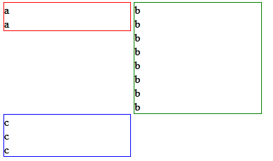
I have three divs: a, b, and c. They are each 48% wide and displayed as inline blocks. This style will be applied to several pages. Div a will always be shorter than div b. This creates a gap between the bottom of a and the top of c. (Divs a and b will be slightly different heights on each page, but a will always be shorter. Because of the inconsistent heights, I don't feel I can reliably use margin-top:-10px for example.)
How it is:
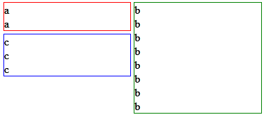
How I want it:
edit
Mobile:
/edit
CSS
div {
     width:48%;
     box-sizing:border-box;
     display:inline-block;
     border:1px solid;
     vertical-align:top;
}

@media only screen and (max-width: 600px) {
     div {
          width:100%;
     }
}
HTML
<div style="border-color:red;">a<br>a</div>
<div style="border-color:green;">b<br>b<br>b<br>b<br>b<br>b<br>b<br>b</div>
<div style="border-color:blue;">c<br>c<br>c<br></div>
The media query allows the three divs will be stacked in one column on smaller screen sizes. That's why the divs need to be in this order.
Upvotes: 4
Views: 670
Answers (2)

Reputation: 2176
A bit tricky due the dual layout. Keeping the same html layout you have it can be done with a selector for the elements and another for the "b" item (a class, or :nth-child(2) or ...) dealing with float and margin.
(change media with in the code snippet to check the layout change)
div{display:inline-block;width:48%;border:1px solid red;float:left;clear:left}
div.b{clear:none;float:right;margin-right:2%}
@media only screen and (max-width: 200px) {
div {
width:100%;float:none;clear:both;
}
div.b{margin-right:0;float:none;clear:both;}
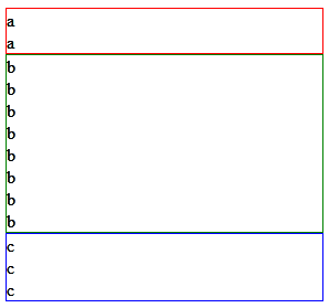
}<div class="a">a<br/>a<br/>a<br/>a</div>
<div class="b">b<br/>b<br/>b<br/>b<br/>b<br/>b<br/>b<br/>b<br/>b<br/>b<br/>b<br/>b<br/></div>
<div class="c">c<br/>c<br/>c<br/>c</div>Upvotes: 1

Reputation: 3798
set the min-height to them all to be equal in length.
div {
     width:48%;
     min-height:300px;
     box-sizing:border-box;
     display:inline-block;
     border:1px solid;
     vertical-align:top;
}
Upvotes: 0
Related Questions
- display: inline-block is not placing my div on the same line as the previous div
- display: inline-block leaves gap with respect to height after div element
- display: inline-block; weird spacing behavior
- Space on top of second div using display: inline-block
- CSS Layout using inline-block leaving gap in parent div
- Display inline block has a gap above the second div
- Display:inline-block not allocating the space properly
- Why the second div moves to another line even if both of them are set to display:inline-block?
- CSS: Inline-Display: Using DIV why am I getting space on 2nd DIV?
- How to eliminate spacing between divs using display:inline-block?