
Reputation: 1279
Status by duration bar visualisation
I have data about a thing which periodically happens, and it either succeeds or fails.
I would like to visualise this in a bar, so for example it may pass at 11am, then fail at 2pm, then pass again at 3pm. I'd like this in a single horizontal bar, with red for failing and green for passing... I cannot think quite where to start with this!
So far I've got this but it really just isn't at all close:
tm1 <- as.POSIXct("2018-03-24 11:00:00")
tm2 <- as.POSIXct("2018-03-24 14:00:00")
tm3 <- as.POSIXct("2018-03-24 15:00:00")

testData <- data.frame(
  time = c(tm1, tm2, tm3),
  status = c("pass", "fail", "pass"),
  thing = c("a", "a", "a"),
  timeSinceLast = c(0, tm2-tm1, tm3-tm2)
  )

ggplot(testData, aes(x = timeSinceLast, y = thing, fill=status)) + geom_bar(stat = "identity")
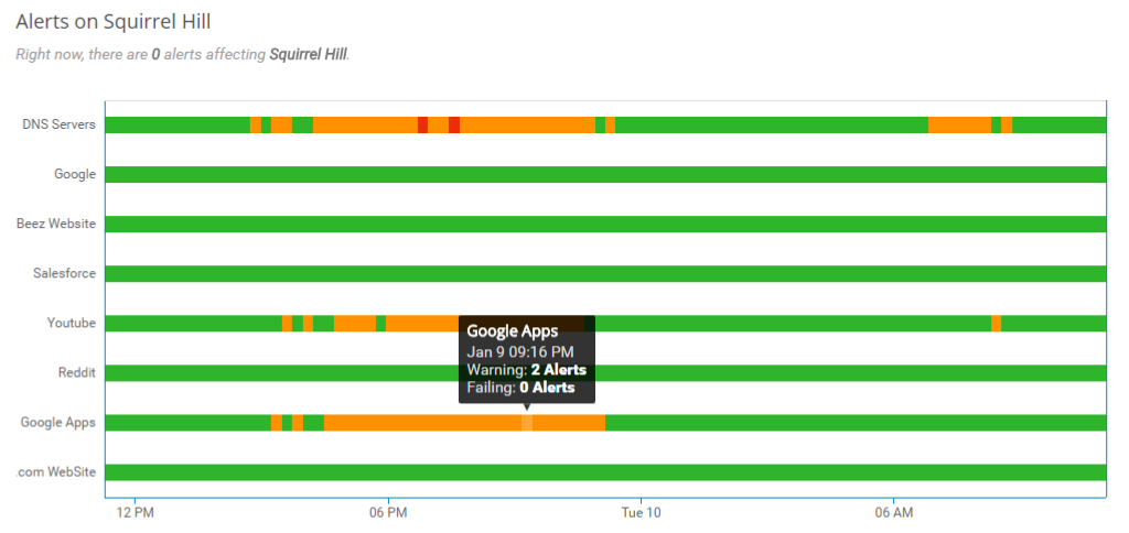
And I'd like it to look a bit like this, but with only red and green and only one row: https://netbeez.net/wp-content/uploads/2017/01/pub_dash_screenshot_alert_lane_graph.png
Upvotes: 1
Views: 73
Answers (1)

Reputation: 3494
I hope that geom_raster() gets you started. I don't know how your data looks exactly, but I think it will be easiest if you code for each hour (or whatever) whether the event is positive or negative.
library(ggplot2)
tm1 <- as.POSIXct("2018-03-24 11:00:00")
tm3 <- as.POSIXct("2018-03-25 11:00:00")
x <- seq(tm1, tm3, by = 60^2)

set.seed(123)
df <- data.frame(x = x,
                 y = 0,
                 z = factor(sample(2, length(x), replace = T)))
head(df)
#>                     x y z
#> 1 2018-03-24 11:00:00 0 1
#> 2 2018-03-24 12:00:00 0 2
#> 3 2018-03-24 13:00:00 0 1
#> 4 2018-03-24 14:00:00 0 2
#> 5 2018-03-24 15:00:00 0 2
#> 6 2018-03-24 16:00:00 0 1

ggplot(df, aes(x, y, fill = z)) +
  geom_raster() +
  ylim(-10, 10) +
  scale_fill_manual(values = 2:3)

Upvotes: 1
Related Questions
- ggplot2 - How to plot length of time using geom_bar?
- Plot the sum of a single column in R
- plotting length of time for each task
- R: ggplot with durations
- ggplot2: plotting non-contiguous time durations as a bar chart
- Grouped bar chart with time duration on y axis in r
- R ggplot2: bar chart of a time series
- Visualizing stop over duration of marked individuals in R using ggplot
- ggplot bar chart for time series
- Time series visualization for start, end, duration in R