
Reputation: 12054
R draw kmeans clustering with heatmap
I would like to cluster a matrix with kmeans, and be able to plot it as heatmap. It sounds quite trivial, and I have seen many plots like this. I have tried to google atround, but can't find a way round it.
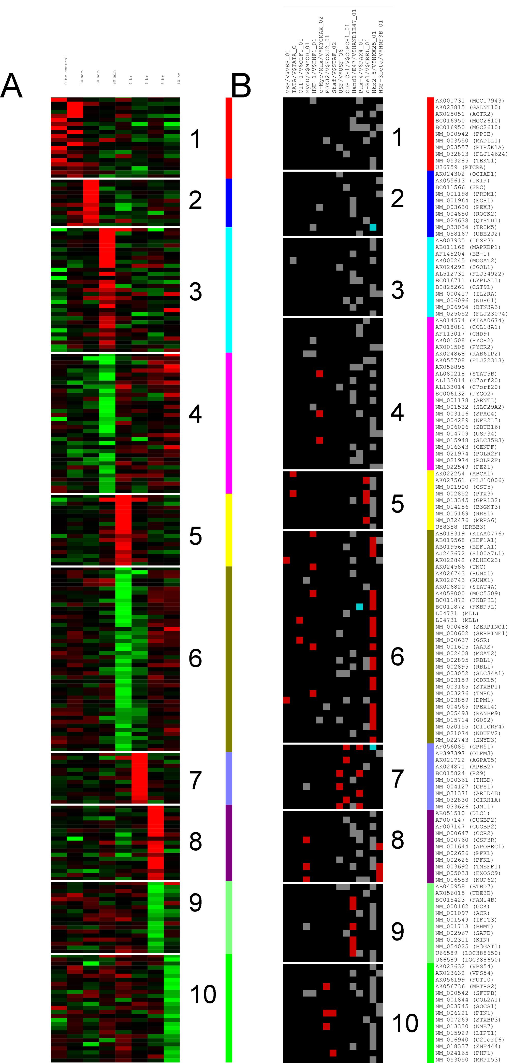
I'd like to be able to plot something like panel A or B on this figure. Let say I have a matrix with 250 rows and 5 columns. I don't want to cluster the columns, just the rows.
m = matrix(rnorm(25), 250, 5)

km = kmeans(m, 10)
Then how do I plot those 10 clusters as a heatmap ? You comments and helps is more than welcome.
Thanks.
Upvotes: 5
Views: 15601
Answers (2)

Reputation: 2369
I think both the two figures should come from two figures combined. the left one is heatmap and the right is colored based on the cluster results. Of course, the data should be reordered by the result of cluster. BTW, the question is not similar with the two questions as commented below the question.
Upvotes: 0

Reputation: 2815
Something like the following should work:
set.seed(100)
m = matrix(rnorm(10), 100, 5)
km = kmeans(m, 10)
m2 <- cbind(m,km$cluster)
o <- order(m2[, 6])
m2 <- m2[o, ]
library(pheatmap) # I like esoteric packages!
library(RColorBrewer)
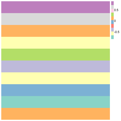
pheatmap(m2[,1:5], cluster_rows=F,cluster_cols=F, col=brewer.pal(10,"Set3"),border_color=NA)
Upvotes: 6
Related Questions
- Plotting heatmap with R and clustering
- how to get a heatmap of agglomerative clustering, in R?
- How to visualize k-means cluster using R?
- Visualize large dimension clusters in R using k-means
- Extracting k-means cluster-specific features
- How to plot clusters of kmeans in R and show centroids?
- plot heatmap of data after clustering in R
- Generating a heatmap that depicts the clusters in a dataset using hierarchical clustering in R
- Clustering and heatmap in R
- clustering the count values