
Reputation: 47
Change colors in r plot
I am currently trying to plot some data and don't manage to obtain a nice result. I have a set of 51 individuals with each a specific value (Pn) and split within 14 groups. The closest thing I end up with is this kind of plot. I obtain it thanks to the simple code bellow, starting by ordering my values for the Individuals :
Individuals <- factor(Individuals,levels=Individuals[order(Pn)])
dotchart(Pn,label=Individuals,color=Groups)
The issue is that I only have 9 colors on this plot (so I lost information somehow) and I can't manage to find a way to apply manually one color per group.
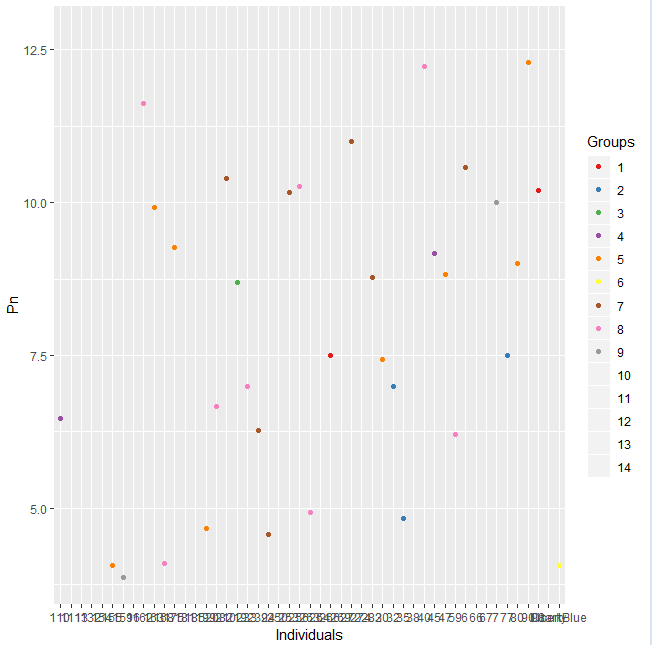
I've also try to use the ggplot2 package by reading it could give nice looking things. In that case I can't manage to order properly the Individuals (the previous sorting doesn't seem to have any effect here), plus I end up with only different type of blue for the group representation which is not an efficient way to represent the information given by my data set. The plot I get is accessible here and I used the following code:
ggplot(data=gps)+geom_point(mapping=aes(x=Individuals, y=Pn, color=Groups))
I apologize if this question seems redundant but I couldn't figure a solution on my own, even following some answer given to others...
Thank you in advance!
EDIT: Using the RColorBrewer as suggested bellow sorted out the issue with the colors when I use the ggplot2 package.
Upvotes: 1
Views: 418
Answers (2)

Reputation: 174
I believe you are looking for the scale_color_manual() function within ggplot2. You didn't provide a reproducible example, but try something along the lines of this:
ggplot(data=gps, mapping=aes(x=Individuals, y=Pn, color=Groups))+
    geom_point() +
    scale_color_manual(values = c('GROUP1' = 'color_value_1',
                                  'GROUP2' = 'color_value_2',
                                  'GROUP3' = 'color_value_3'))
Replace GROUPX with the values inside your Group column, and replace color_value_x with whatever colors you want to use.
A good resource for further learning about ggplot2 is chapter 3 of R For Data Science, which you can read here: http://r4ds.had.co.nz/data-visualisation.html
Upvotes: 1

Reputation: 712
I can't be sure without looking at your data, but it looks like Groups may be a numeric value. Try this:
gps$Groups <- as.factor(gps$Groups)

library(RColorBrewer)
ggplot(data=gps)+
geom_point(mapping=aes(x=Individuals, y=Pn, color=Groups))+
scale_colour_brewer(palette = "Set1")
Upvotes: 1
Related Questions
- Change color of plot in R
- Change colours in ggplot
- Changing Color in ggplot2 Scatterplots
- Change color of one variable in ggplot
- Change colors of raster plot in ggplot2
- ggplot2 change colours how
- Change color on ggplot
- Customise colors of graphs in ggplot
- Changing the color in the legend with ggplot2 in R
- using other colors in ggplot2