
Reputation: 77
How to make a rounded drop shadow on a png image
I am trying to recreate a website template I found on Behance. While I found a great solution and learned something new with filter: dropshadow(); I would really like to just make the drop-shadow on my png rounded. I tried border-radius changes but to no attest maybe blur() but that blurs the image, and I hoped you could do something like drop-shadow(blur()); which would be cheeky.
Here is the codepen an image for clarity below and the code. Thanks.

.weapon-1{

    background: url(../pictor/pistols/360fx360f.png) center center no-repeat;
    background-size: contain;
    width: 100px;
    height: 100px;
    -moz-filter: drop-shadow(0 0 10px #B3135D);
    -webkit-filter: drop-shadow(0 0 10px #B3135D);
    filter: drop-shadow(0 0 10px #B3135D);

}
Upvotes: 2
Views: 662
Answers (2)
Reputation: 77
You can also combine elements for a really unique effect especially with compound colors. Here I am using a blue and a purple.
.weapon-1{
    background: url(https://steamcdn-a.akamaihd.net/apps/730/icons/econ/default_generated/weapon_hkp2000_aq_p2000_boom_light_large.39f01b0b86b795bea56300432fecfbf93415ee58.png) center center no-repeat,  radial-gradient(ellipse at center, #9C08E2 -100%, transparent 40%);
    background-size: contain;
    width: 200px;
    height: 200px;
    -moz-filter: drop-shadow(0 0 10px #2C18AF);
    -webkit-filter: drop-shadow(0 0 10px #2C18AF);
    filter: drop-shadow(0 0 10px #2C18AF);
}
<div class="weapon weapon-1 mx-2"></div>Upvotes: 0

Reputation: 317
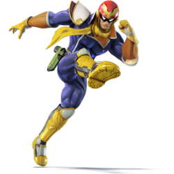
for rounded drop shadow you can use radial-gradient in background with transparent image.
original image used in snippet is original image Please refer snippet.
body{background-color: black}
img {

    /* For browsers that do not support gradients */
    background-image: radial-gradient(circle, white, black, black);
    padding: 50px;
}
<body>
<img src="https://vignette.wikia.nocookie.net/fantendo/images/a/ae/250px-Captain_Falcon_SSB4.png" />
</body>Upvotes: 3
Related Questions
- Drop shadow for PNG image in CSS
- how to set shadow for round image(css)
- How can i convert box shadow to filter drop shadow?
- How to create rounded shadow?
- CSS - How to apply box-shadow to a image rounded
- Round shadow for image with CSS
- How do I add a mouseover drop shadow effect for circular images?
- css create rounded shadow under a square image
- Best way to display a PNG with a drop shadow effect on it?
- Best approach to css drop shadow technique - non image