
Jackson Hogan
Reputation: 83
How to use floats and positioning to create two separate divs side by side?
I am trying to align a div to the left and 4 divs to the right of it. I am not sure if I should be using a table here, but I do not see how a table would work properly. Should I be using absolute positioning?
This is an image of what is occurring...
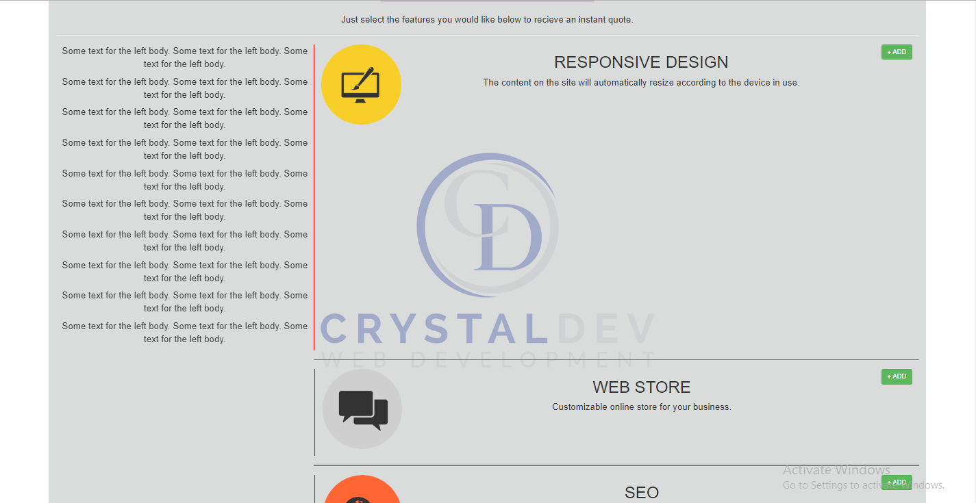 Also, keep in mind that the zoom of the browser was set to 75% to capture the full height and width of the site.
<div class="head">
        <div class="head-title">
            <p>Pricing</p>
        </div>
        <div class="head-subtitle">
            <p>Incredibly low prices!</p>
        </div>
        <div class="head-body">
            <p>Just select the features you would like below to recieve an instant quote.</p>
            <hr>
            <div class="head-body-main">
                <p>Some text for the left body. Some text for the left body. Some text for the left body.</p>
                <p>Some text for the left body. Some text for the left body. Some text for the left body.</p>
                <p>Some text for the left body. Some text for the left body. Some text for the left body.</p>
                <p>Some text for the left body. Some text for the left body. Some text for the left body.</p>
                <p>Some text for the left body. Some text for the left body. Some text for the left body.</p>
                <p>Some text for the left body. Some text for the left body. Some text for the left body.</p>
                <p>Some text for the left body. Some text for the left body. Some text for the left body.</p>
                <p>Some text for the left body. Some text for the left body. Some text for the left body.</p>
                <p>Some text for the left body. Some text for the left body. Some text for the left body.</p>
                <p>Some text for the left body. Some text for the left body. Some text for the left body.</p>
            </div>
            <div class="head-body-responsive">
                <div id="responsive-image">
                    <img alt="Responsive" src="images/features/responsive.png" width="175px" height="175px">
                </div>
                <div id="responsive-content">
                    <h1>RESPONSIVE DESIGN</h1>
                    <p>The content on the site will automatically resize according to the device in use.</p>
                </div>
                <div id="responsive-form">
                    <button class="btn btn-success">+ ADD</button>
                </div>
            </div>
            <hr class="horizontalrule">

            <div class="head-body-ecommerce">
                <div id="ecommerce-image">
                    <img alt="eCommerce" src="images/features/ecommerce.png" width="175px" height="175px">
                </div>
                <div id="ecommerce-content">
                    <h1>WEB STORE</h1>
                    <p>Customizable online store for your business.</p>
                </div>
                <div id="ecommerce-form">
                    <button class="btn btn-success">+ ADD</button>
                </div>
            </div>
            <hr class="horizontalrule">

            <div class="head-body-search">
                <div id="search-image">
                    <img alt="search" src="images/features/searchengineoptimization.png" width="175px" height="175px">
                </div>
                <div id="search-content">
                    <h1>SEO</h1>
                    <p>Customizable online store for your business.</p>
                </div>
                <div id="search-form">
                    <button class="btn btn-success">+ ADD</button>
                </div>
            </div>
            <hr class="horizontalrule">

            <div class="head-body-more">
                <div id="more-image">
                    <img alt="more" src="images/features/extrafeatures.png" width="175px" height="175px">
                </div>
                <div id="more-content">
                    <h1>MORE FEATURES</h1>
                    <p>Customizable online store for your business.</p>
                </div>
                <div id="more-form">
                    <button class="btn btn-success">+ ADD</button>
                </div>
            </div>
            <hr class="horizontalrule">
            <div class="clear"></div>
        </div>
    </div>


.head {
    background-color: rgba(193, 196, 195, .6);
    width: 90%;
    margin: 0 auto;
    text-align: center;
    border-radius: 5px;
}

.head-title {
    background-color: rgba(249, 58, 58, .7);
    text-align: center;
    border-radius: 5px;
    font-size: 35px;
    margin: 0 auto;
    width: 90%;
    color: white;
}

.head-subtitle {
    background-color: rgba(249, 58, 58, .7);
    text-align: center;
    border-radius: 10px;
    margin: 0 auto;
    width: 25%;
    color: white;
    font-size: 20px;
}

.head-body {
    font-size: 20px;
    padding: 15px 15px 15px 15px;
}

.head-body-main {
    width: 30%;
    height: auto;
    float: left;
    border-right: 1px solid red;
    position: relative;
}

.clear {
    clear: both;
}

.head-body-responsive {
    width: 70%;
    height: auto;
    float: right;
    display: flex;
    flex-direction: row;
    justify-content: space-between;
    padding: 0px 15px 15px;
}

.horizontalrule {
    float: right;
    border: 1px solid gray;
    width: 70%;
}

.head-body-ecommerce {
    width: 70%;
    height: auto;
    float: right;
    display: flex;
    flex-direction: row;
    justify-content: space-between;
    padding: 0px 15px 15px;
    border-left: 2px solid red;
}

.head-body-search {
    width: 70%;
    height: auto;
    float: right;
    display: flex;
    flex-direction: row;
    justify-content: space-between;
    padding: 0px 15px 15px;
    border-left: 2px solid red;
}

.head-body-more {
    width: 70%;
    height: auto;
    float: right;
    display: flex;
    flex-direction: row;
    justify-content: space-between;
    padding: 0px 15px 15px;
    border-left: 2px solid red;
}
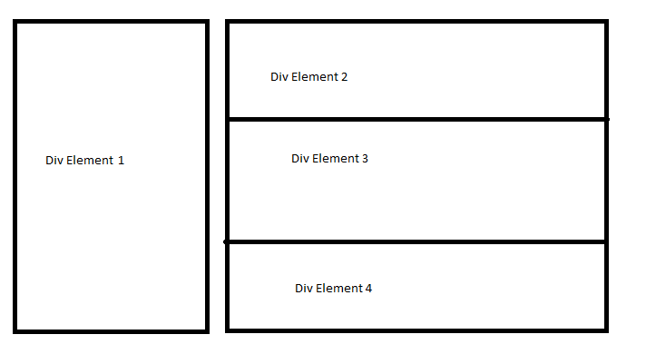
The expected results would look like this...
Upvotes: 0
Views: 33
Answers (2)

Mordecai
Reputation: 1494
For easy solution, use flex-direction option for display:flex elements in your code. (an example below with clean coding)
.left {
  display: flex;
  flex-direction: row;
  width: 100%
}

.left>div:first-child {
  width: 30%;
  border: 1px solid red;
  padding: 15px
}

.right {
  flex-direction: column;
  width: calc(70% - 10px);
  margin-left: 10px;
  border: 1px solid red
}

.right>div {
  padding: 15px;
  border: 1px solid black;
  display: flex;
  flex-direction: row
 }

 .right>div>div:nth-child(2) {
   margin: 0px 10px
 }
<div class="left">
<div>
<p>Some text for the left body. Some text for the left body. Some text for the left body.</p>
<p>Some text for the left body. Some text for the left body. Some text for the left body.</p>
<p>Some text for the left body. Some text for the left body. Some text for the left body.</p>
<p>Some text for the left body. Some text for the left body. Some text for the left body.</p>
<p>Some text for the left body. Some text for the left body. Some text for the left body.</p>
<p>Some text for the left body. Some text for the left body. Some text for the left body.</p>
<p>Some text for the left body. Some text for the left body. Some text for the left body.</p>
<p>Some text for the left body. Some text for the left body. Some text for the left body.</p>
<p>Some text for the left body. Some text for the left body. Some text for the left body.</p>
<p>Some text for the left body. Some text for the left body. Some text for the left body.</p>
</div>
<div class="right">
<div>
<div>
<img alt="Responsive" src="images/features/responsive.png" width="175px" height="175px"/>
</div>
<div>
<h1>RESPONSIVE DESIGN</h1>
<p>The content on the site will automatically resize according to the device in use.</p>
</div>
<div>
<button class="btn btn-success">+ ADD</button>
</div>
</div>
<hr/>
<div>
<div>
<img alt="Responsive" src="images/features/responsive.png" width="175px" height="175px"/>
</div>
<div>
<h1>RESPONSIVE DESIGN</h1>
<p>The content on the site will automatically resize according to the device in use.</p>
</div>
<div>
<button class="btn btn-success">+ ADD</button>
</div>
</div>
</div>
</div>Upvotes: 1

doğukan
Reputation: 27491
very hard with your complex code. but i made.
.head {
    background-color: rgba(193, 196, 195, .6);
    width: 90%;
    margin: 0 auto;
    text-align: center;
    border-radius: 5px;
}

.head-title {
    background-color: rgba(249, 58, 58, .7);
    text-align: center;
    border-radius: 5px;
    font-size: 35px;
    margin: 0 auto;
    width: 90%;
    color: white;
}

.head-subtitle {
    background-color: rgba(249, 58, 58, .7);
    text-align: center;
    border-radius: 10px;
    margin: 0 auto;
    width: 25%;
    color: white;
    font-size: 20px;
}

.head-body {
    font-size: 20px;
    padding: 15px 15px 15px 15px;
}

.head-body-main {
    width: 92%; /* you can do 100% */
    height: auto;
    border-right: 1px solid red;
    position: relative;
  padding:0 15px 0 0;
}

.head-body-responsive {
    width: calc(100% - 30px);
    height: auto;
    float: right;
    display: flex;
    flex-direction: row;
    justify-content: space-between;
    padding: 0px 15px 15px;
}

.horizontalrule {
    border: 1px solid gray;
    width: 100%;
}

.head-body-ecommerce {
    width: calc(100% - 30px);
    height: auto;
    display: flex;
    flex-direction: row;
    justify-content: space-between;
    padding: 0px 15px 15px;
    border-left: 2px solid red;
}

.head-body-search {
    width: calc(100% - 30px);
    height: auto;
    display: flex;
    flex-direction: row;
    justify-content: space-between;
    padding: 0px 15px 15px;
    border-left: 2px solid red;
}

.head-body-more {
    width: calc(100% - 30px);
    height: auto;
    display: flex;
    flex-direction: row;
    justify-content: space-between;
    padding: 0px 15px 15px;
    border-left: 2px solid red;
}

.flex {
  display:flex;
}
<div class="head">
<div class="head-title">
<p>Pricing</p>
</div>
<div class="head-subtitle">
<p>Incredibly low prices!</p>
</div>
<div class="head-body">
<p>Just select the features you would like below to recieve an instant quote.</p>
<hr>
<div class="flex">
<div class="a">
<div class="head-body-main">
<p>Some text for the left body. Some text for the left body. Some text for the left body.</p>
<p>Some text for the left body. Some text for the left body. Some text for the left body.</p>
<p>Some text for the left body. Some text for the left body. Some text for the left body.</p>
<p>Some text for the left body. Some text for the left body. Some text for the left body.</p>
<p>Some text for the left body. Some text for the left body. Some text for the left body.</p>
<p>Some text for the left body. Some text for the left body. Some text for the left body.</p>
<p>Some text for the left body. Some text for the left body. Some text for the left body.</p>
<p>Some text for the left body. Some text for the left body. Some text for the left body.</p>
<p>Some text for the left body. Some text for the left body. Some text for the left body.</p>
<p>Some text for the left body. Some text for the left body. Some text for the left body.</p>
</div>
</div>
<div class="b">
<div class="head-body-responsive">
<div id="responsive-image">
<img alt="Responsive" src="images/features/responsive.png" width="175px" height="175px">
</div>
<div id="responsive-content">
<h1>RESPONSIVE DESIGN</h1>
<p>The content on the site will automatically resize according to the device in use.</p>
</div>
<div id="responsive-form">
<button class="btn btn-success">+ ADD</button>
</div>
</div>
<hr class="horizontalrule">
<div class="head-body-ecommerce">
<div id="ecommerce-image">
<img alt="eCommerce" src="images/features/ecommerce.png" width="175px" height="175px">
</div>
<div id="ecommerce-content">
<h1>WEB STORE</h1>
<p>Customizable online store for your business.</p>
</div>
<div id="ecommerce-form">
<button class="btn btn-success">+ ADD</button>
</div>
</div>
<hr class="horizontalrule">
<div class="head-body-search">
<div id="search-image">
<img alt="search" src="images/features/searchengineoptimization.png" width="175px" height="175px">
</div>
<div id="search-content">
<h1>SEO</h1>
<p>Customizable online store for your business.</p>
</div>
<div id="search-form">
<button class="btn btn-success">+ ADD</button>
</div>
</div>
<hr class="horizontalrule">
<div class="head-body-more">
<div id="more-image">
<img alt="more" src="images/features/extrafeatures.png" width="175px" height="175px">
</div>
<div id="more-content">
<h1>MORE FEATURES</h1>
<p>Customizable online store for your business.</p>
</div>
<div id="more-form">
<button class="btn btn-success">+ ADD</button>
</div>
</div>
<hr class="horizontalrule">
<div class="clear"></div>
</div>
</div></div></div>Upvotes: 1
Related Questions
- HTML and CSS: 2 DIVS on left, 1 independent DIV on right
- How to make two divs float side by side?
- Cannot get my two divs to float side by side
- setting 2 div next to each other
- side by side using float <div>
- CSS: two, divs side-by-side
- setting two divs side by side and third one below that
- Need these two <div>s side by side
- How to put two divs next to each other?
- How can I position multiple divs side by side?