
Reputation: 99
How can I apply an effect to a CSS shape to make it look like a realistic lamp?
I've been trying to build a very simple Javascript/CSS/HTML page/app that can be used as a speech timer. My plan was to build something whereby an amber 'warning light' came on after the speaker had been talking for a certain amount of time and then a red light to follow after a second set time. For example, if speeches are aimed to be 10 mins long, the amber light would show as a warning at around the 7-8 minute mark to encourage the speaker to start wrapping up, and then the red light would come on at 10 minutes to let the speaker know they had gone over the allotted time.
Anyway - I have built the follow (I've done this in one day with a very rudimentary knowledge of CSS/JavaScript so I'm kinda proud of myself...).
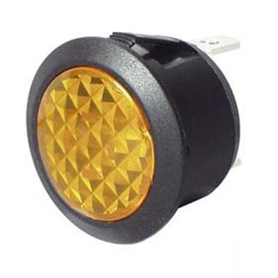
This works (although I've shortened the times to seconds rather than minutes for the purposes of the example) but I started getting ahead of myself and wondered if it was possible to use CSS to apply a lattice/glass/diamond type effect over my shape to make it look more 'lamp-like'. For example: Lamp Image
Thanks in advance and apologies for any poor coding ettiquette - I'm a complete novice.
Thanks!
Codepen Here: Codepen
function timedText() {
    let lbl = document.getElementById('startButton');
    let buttonName = "Running";
    lbl.innerText = buttonName;
    var a = document.getElementById("amberTime");
    var amberT = a.options[a.selectedIndex].value;
    var r = document.getElementById("redTime");
    var redT = r.options[r.selectedIndex].value;
    myVar = setTimeout(myTimeout1, amberT * 1000)
    myVar2 = setTimeout(myTimeout2, redT * 1000)
}

function myTimeout1() {
    //document.getElementById('amberlight').style.background = '#ffbf00';
    document.getElementById("amberlight").style.visibility = "visible";
}
function myTimeout2() {
    //document.getElementById('redlight').style.background = '#ff0000';
    document.getElementById("redlight").style.visibility = "visible";
}


function myStopFunction() {
    let lbl = document.getElementById('startButton');
    let buttonName = "Start";
    lbl.innerText = buttonName;
    document.getElementById('amberlight').style.visibility = 'hidden';
    document.getElementById('redlight').style.visibility = 'hidden';
    clearTimeout(myVar);
    clearTimeout(myVar2);
}
.amberlight {
border-radius: 50%;
padding: 0px;
width: 300px;
height: 300px;
margin:auto;
visibility:hidden;
animation: glowing 2500ms infinite;
}
@keyframes glowing {
0% { background-color: #ff7f00; box-shadow: 0 0 3px #ff7f00; }
50% { background-color: #ff9500; box-shadow: 0 0 40px #ff9500; }
100% { background-color: #ff7f00; box-shadow: 0 0 3px #ff7f00; }
}
.redlight {
border-radius: 50%;
padding: 0px;
width: 300px;
height: 300px;
margin:auto;
visibility:hidden;
animation: glowing2 2500ms infinite;
}
@keyframes glowing2 {
0% { background-color: #cc0000; box-shadow: 0 0 3px #cc0000; }
50% { background-color: #ff0000; box-shadow: 0 0 40px #ff0000; }
100% { background-color: #cc0000; box-shadow: 0 0 3px #cc0000; }
}
table, th, td {
border: 1px solid black;
border-collapse: collapse;
margin: 0 auto;
}
td {
padding: 20px;
text-align: center;
}
.button1 {
background-color: #4CAF50;
border: none;
color: white;
padding: 15px 35px;
text-align: center;
text-decoration: none;
display: inline-block;
font-size: 16px;
margin: 4px 2px;
cursor: pointer;
}
.button2 {
background-color: #4CAF50;
border: none;
color: white;
padding: 15px 15px;
text-align: center;
text-decoration: none;
display: inline-block;
font-size: 16px;
margin: 4px 2px;
cursor: pointer;
}<table style="width:60%">
<tr>
<td colspan="1">
<div id="amberlight" class="amberlight"></div>
</td>
<td colspan="3">
<div id="redlight" class="redlight"></div>
</td>
</tr>
<tr>
<td width="50%">
<button id="startButton" onclick="timedText()" class="button1">Start</button>
<button onclick="myStopFunction()" class="button2">Stop/Reset</button>
</td>
<td width="20%">
<div>Time for Amber Light</div>
<select id="amberTime">
<option value="5" selected="selected">5 Seconds</option>
<option value="10">10 Seconds</option>
<option value="15">15 Seconds</option>
</select>
</td>
<td width="20%">
<div>Time for Red Light</div>
<select id="redTime">
<option value="5">5 Seconds</option>
<option value="10" selected="selected">10 Seconds</option>
<option value="15">15 Seconds</option>
</select>
</td>
<td width="10%">
<div>Test</div>
<button onclick="myTimeout1()">1</button>
<button onclick="myTimeout2()">2</button>
</td>
</tr>
</table>Upvotes: 4
Views: 1195
Answers (3)
Reputation: 99
Thanks to all for the help and advice. 'Finished' product is here:
https://codepen.io/darossi/pen/ywgbwz
function timedText() {

		let lbl = document.getElementById('startButton');
        let buttonName = "Running";
        lbl.innerText = buttonName;

	var a = document.getElementById("amberTime");
	var amberT = a.options[a.selectedIndex].value;
	var r = document.getElementById("redTime");
	var redT = r.options[r.selectedIndex].value;
  myVar = setTimeout(myTimeout1, amberT * 1000)
  myVar2 = setTimeout(myTimeout2, redT * 1000)
}

function myTimeout1() {
  //document.getElementById('amberlight').style.background = '#ffbf00';
  document.getElementById("amberlight").style.visibility = "visible";
}
function myTimeout2() {
  //document.getElementById('redlight').style.background = '#ff0000';
  document.getElementById("redlight").style.visibility = "visible";
}


function myStopFunction() {
		let lbl = document.getElementById('startButton');
        let buttonName = "Start";
        lbl.innerText = buttonName;
  document.getElementById('amberlight').style.visibility = 'hidden';
  document.getElementById('redlight').style.visibility = 'hidden';
  clearTimeout(myVar);
  clearTimeout(myVar2);
}
.amberlight {
border-radius: 50%;
background-image: linear-gradient(45deg, #ff8000, #ffa040);
background-repeat: repeat;
background-size: 20px 20px;
transform: rotate(45deg);
box-shadow: 0 0 20px 2px #ff8000;
padding: 0px;
width: 300px;
height: 300px;
margin:auto;
visibility:hidden;
animation: glow 2000ms linear infinite;
}
.redlight {
border-radius: 50%;
background-image: linear-gradient(45deg, #cc0000, #e74c4c);
background-repeat: repeat;
background-size: 20px 20px;
transform: rotate(45deg);
box-shadow: 0 0 20px 2px #cc0000;
padding: 0px;
width: 300px;
height: 300px;
margin:auto;
visibility:hidden;
animation: glow 2000ms linear infinite;
//animation: glowing2 2500ms infinite;
}
@keyframes glow {
0% { filter: brightness(1); }
25% { filter: brightness(1.1); }
40% { filter: brightness(1.2); }
50% { filter: brightness(1.3); }
60% { filter: brightness(1.2); }
75% { filter: brightness(1.1); }
100% { filter: brightness(1); }
}
table, th, td {
border: 0px solid black;
border-collapse: collapse;
margin: 0 auto;
}
td {
padding: 10px;
text-align: center;
}
.button1 {
background-color: #4CAF50;
border-radius:8px;
border: none;
color: white;
padding: 15px 35px;
text-align: center;
text-decoration: none;
display: inline-block;
font-size: 18px;
margin: 4px 2px;
cursor: pointer;
width:40%;
font-weight:bold;
}
.button2 {
background-color: #4CAF50;
border-radius:8px;
border: none;
color: white;
padding: 15px 15px;
text-align: center;
text-decoration: none;
display: inline-block;
font-size: 18px;
margin: 4px 2px;
cursor: pointer;
width:40%;
height:100%;
font-weight:bold;
}
#amberTime, #redTime {
font-size:24px;
padding: 5px;
}
#amberTime {
background-color: #ff8000;
color:#ffffff;
border:0px solid;
}
#redTime {
background-color: #cc0000;
color:#ffffff;
border:0px solid;
}
.testAmber {
background-color:#ff8000;
border:0px solid;
color:#ff8000;
}
.testRed {
background-color:#cc0000;
border:0px solid;
color:#cc0000;
}
.bottomrow {
border-top:20px solid #ffffff;
background-color:#e5e5e5;
}<table style="width:50%">
<tr>
<td colspan="1"><div id="amberlight" class="amberlight"></div></td>
<td colspan="3"><div id="redlight" class = "redlight"></div></td>
</tr>
<tr class="bottomrow">
<td width="50%">
<button id="startButton" onclick="timedText()" class="button1">Start</button>
<button onclick="myStopFunction()" class = "button2">Stop/Reset</button>
</td>
<td width="20%">
<select id="amberTime">
<option value="5" selected="selected">5 Seconds</option>
<option value="10">10 Seconds</option>
<option value="15">15 Seconds</option>
</select>
</td>
<td width="20%">
<select id="redTime">
<option value="5" >5 Seconds</option>
<option value="10" selected="selected">10 Seconds</option>
<option value="15">15 Seconds</option>
</select>
</td>
<td width="10%">
<!-- <div>Test</div> -->
<button onclick="myTimeout1()" class="testAmber">1</button>
<button onclick="myTimeout2()" class="testRed">2</button>
</td>
</tr>
</table>Upvotes: 0

Reputation: 22188
Realist lamp using image+filters
If you want a realistic look, the easier way is to use CSS filters on a prepared image.
Filter functions:
- hue-rotate() You can use this filter function to make your image appear to change color
- saturate() Change the saturation to make it more or less saturated
- brightness() and contrast() You can fake the exposure by changing these two functions.
- blur() you can also apply a slightly blur, as it is common for overexposed pictures to go out of focus.
Also
For better results crop only the part you want to make it glow.
Slice the other parts and overlay then using
position: absoluteYou can overlay the image using other div's using absolute positioning to compose the effect with gradients and opacity, to make a "glow" effect.
You can use CSS transitions or animations to get a smooth animation.
img {
  animation-duration: 5s;
  animation-name: anim;
  animation-iteration-count: infinite;
  -animation-direction: alternate;
  animation-timing-function: ease-in;
}

@keyframes anim {
  0% {
    filter: blur(0px) hue-rotate(0deg) saturate(0.5) brightness(0.9) contrast(1.2);
  }
  10% {
    filter: blur(1px) hue-rotate(20deg) saturate(1) brightness(3) contrast(2);
  }
  30% {
    filter: blur(0px) hue-rotate(0deg) saturate(0.5) brightness(0.9) contrast(1.2);
  }


  31% {
    filter: blur(0px) hue-rotate(-20deg) saturate(0.5) brightness(0.9) contrast(1.2);
  }
  40% {
    filter: blur(1px) hue-rotate(-20deg) saturate(1) brightness(2) contrast(2);
  }
  60% {
    filter: blur(0px) hue-rotate(-20deg) saturate(0.5) brightness(0.9) contrast(1.2);
  }

  61% {
    filter: blur(0px) hue-rotate(90deg) saturate(0.5) brightness(0.9) contrast(1.2);
  }
  70% {
    filter: blur(1px) hue-rotate(90deg) saturate(1) brightness(2) contrast(2);
  }
  100% {
    filter: blur(0px) hue-rotate(90deg) saturate(0.5) brightness(0.9) contrast(1.2);
  }
}
<img src="http://www.truck-lite.com/DAMRoot/WebLarge/10002/44276YF.jpg" width="200">CSS gradient + shadows + filters
Combining my answer with a improved Gershom's you can archive this effect
body{
  background: gray;
}

.blink {
  animation-duration: 0.5s;
  animation-name: anim;
  animation-iteration-count: infinite;
  animation-direction: alternate;
  animation-timing-function: ease-in;
}

@keyframes anim {
  0% {
    filter: blur(0px) hue-rotate(-10deg) saturate(0.9) brightness(0.5) contrast(1.5);
  }
  100% {
    filter: blur(2px) hue-rotate(20deg) saturate(1) brightness(1.2) contrast(1.5);

      box-shadow:
  inset 3px 0px 10px rgba(255, 255, 255, 0.5),
  inset 10px 10px 50px rgba(255, 255, 255, 0.2),
  inset -10px -10px 50px rgba(0, 0, 0, 0.25),
  0px 0px 10px rgba(0, 0, 0, 0.3),
  0px 0px 50px 10px rgba(255,180,0,1);
  }
}


.light {
  position: absolute;
  width: 200px;
  height: 200px;
  left: 50%;
  top: 50%;
  margin-left: -100px;
  margin-top: -100px;
  border-radius: 100%;
  background-image: linear-gradient(45deg, #ff8000, #ffa040);
  background-repeat: repeat;
  background-size: 20px 20px;
  transform: rotate(45deg);
  /* shadows for 3d effect */
  box-shadow:
  inset 3px 0px 10px rgba(255, 255, 255, 0.5),
  inset 10px 10px 50px rgba(255, 255, 255, 0.2),
  inset -10px -10px 50px rgba(0, 0, 0, 0.25),
  0px 0px 10px rgba(0, 0, 0, 0.3);
}


/* glow */
.light:after {
  position: absolute;
  width: 100%;
  height: 100%;
  content: '';
  border-radius: 100%;
  background:
    radial-gradient(ellipse at center, rgba(255, 255, 100, 0.3) 0%, rgba(0, 0, 0, 0) 100%),
    radial-gradient(ellipse at center, rgba(255, 255, 255, 0.5) 10%, rgba(255, 255, 255, 0) 100%);
}
<div class="light blink"></div>Upvotes: 4

Reputation: 8170
Could try using background-repeat: repeat, making the background-size quite small, and using background-image: linear-gradient(45deg, ...):
.light {
  position: absolute;
  width: 200px;
  height: 200px;
  left: 50%;
  top: 50%;
  margin-left: -100px;
  margin-top: -100px;
  border-radius: 100%;
  background-image: linear-gradient(45deg, #ff8000, #ffa040);
  background-repeat: repeat;
  background-size: 20px 20px;
  transform: rotate(45deg);
  /* shadows for 3d effect */
  box-shadow: inset 3px 0px 10px rgba(255, 255, 255, 0.5), inset 10px 10px 50px rgba(255, 255, 255, 0.2), inset -10px -10px 50px rgba(0, 0, 0, 0.2), 0px 0px 10px rgba(0, 0, 0, 0.3);
}


/* glow */
.light:after {
  position: absolute;
  width: 100%;
  height: 100%;
  content: '';
  border-radius: 100%;
  background:
    radial-gradient(ellipse at center, rgba(255, 255, 100, 0.3) 0%, rgba(0, 0, 0, 0) 100%);
}
<div class="light">
</div>Rotating the whole thing 45 degrees also helps make it look believable, in my opinion!
You could also go really crazy and use keyframes to get a glowing effect:
@keyframes glow {
  0% { filter: brightness(1) contrast(1); }
  50% { filter: brightness(1.1) contrast(1.1); }
  100% { filter: brightness(1) contrast(1); }
}

.light {
  position: absolute; width: 200px; height: 200px;
  left: 50%; top: 50%;
  margin-left: -100px; margin-top: -100px;
  border-radius: 100%;

  background-image: linear-gradient(45deg, #ff8000, #ffa040);
  background-repeat: repeat;
  background-size: 20px 20px;

  animation: glow 3000ms linear infinite;

  transform: rotate(45deg);

  box-shadow: 0 0 20px 2px #ff7f00;
}
<div class="light">
</div>Upvotes: 2
Related Questions
- possible to create 3D lighting effect with CSS?
- How to add an edge highlight to a CSS shape?
- How can I draw a iregular shape of div and apply a shadow to it?
- Adding 3D effect on image with CSS
- Can I make different shape from css?
- How can I implement this shape into my code?
- Create a glossy light effect using CSS
- How to make a blur effect over a shape in CSS?
- How to create custom shape using CSS3 to match this?
- Geometric effect with js/css