Reputation: 431
text conflict with image clip
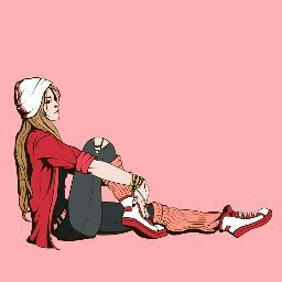
I'm stuck with this part. My image is being clip-path but my class:txt width won't stretch because of the img. I'm sorry if I can't explain it well. English is my 3rd language so I hope you understand the image I attach.
Result

Actual Image

    .item1{
	background: url(../img/bg.png);
	background-size: 100%;
	background-repeat: repeat-y;
	padding-left: 40px;
}

.item1 img{
	float: right;
	-webkit-clip-path: inset(5% 10% 15% 46%);
	clip-path: inset(5% 10% 15% 46%);
	margin-right: -15px;
    margin-top: 20px;
}

.item .txt p{
	text-align: justify;
}

.item .txt h2{
	margin-top: 5px;
	padding-top: 65px;
}
<div class="item1">
<img src="https://i.sstatic.net/YasK2.png">
<div class="txt">
<h2>Lorem ipsum dolor sit amet, consectetur adipiscing elit.</h2>
<p>Lorem ipsum dolor sit amet, consectetur adipiscing elit, sed do eiusmod tempor incididunt ut labore et dolore magna aliqua. Ut enim ad minim veniam, quis nostrud exercitation ullamco laboris nisi ut aliquip ex ea commodo consequat. Duis aute irure dolor in reprehenderit in voluptate velit esse cillum dolore eu fugiat nulla pariatur. Excepteur sint occaecat cupidatat non proident, sunt in culpa qui officia deserunt mollit anim id est laborum.</p>
</div>
</div>Upvotes: 0
Views: 96
Answers (4)

Reputation: 110
Ok so maybe something like this if you want to keep the image cropped:
Set your <div class="item1"> to position: relative and <div class="txt"> to position: absolute, then calculate the width of <div class="txt"> based on the width of the image. (And just in case, maybe set z-index: 1 or higher on your text div, so it will never appear "behind" the image?)
.item1 {
background: url(../img/bg.png);
background-size: 100%;
background-repeat: repeat-y;
padding-left: 40px;
position: relative;
}
.item1 img {
float: right;
-webkit-clip-path: inset(5% 10% 15% 46%);
clip-path: inset(5% 10% 15% 46%);
margin-right: -15px;
margin-top: 20px;
}
.txt {
width: calc(100% - 300px);
margin-top: 20px;
position: absolute;
left: 0;
z-index: 1;
}
.item .txt p {
text-align: justify;
}
.item .txt h2 {
margin-top: 5px;
padding-top: 65px;
}
Upvotes: 1

Reputation: 104
Try this
<!DOCTYPE html>
<html lang="en">
<head>
<meta charset="UTF-8">
<meta http-equiv="X-UA-Compatible" content="IE=edge">
<meta name="viewport" content="width=device-width, initial-scale=1, maximum-scale=1">
<title>Document</title>
<style>
.item1 {
background: url(../img/bg.png);
background-size: 100%;
background-repeat: repeat-y;
padding-left: 40px;
position: relative;
}
.item1 img {
-webkit-clip-path: inset(5% 10% 15% 46%);
clip-path: inset(5% 10% 15% 46%);
margin-right: -15px;
position: absolute;
right: 0;
top: 0;
}
.txt {
padding-right: 280px;
}
.item .txt p{
text-align: justify;
}
.item .txt h2{
margin-top: 5px;
padding-top: 65px;
}
</style>
</head>
<body>
<div class="item1">
	<img src="https://i.sstatic.net/YasK2.png">
	<div class="txt">
		<h2>Lorem ipsum dolor sit amet, consectetur adipiscing elit.</h2>
		<p>Lorem ipsum dolor sit amet, consectetur adipiscing elit, sed do eiusmod tempor incididunt ut labore et dolore magna aliqua. Ut enim ad minim veniam, quis nostrud exercitation ullamco laboris nisi ut aliquip ex ea commodo consequat. Duis aute irure dolor in reprehenderit in voluptate velit esse cillum dolore eu fugiat nulla pariatur. Excepteur sint occaecat cupidatat non proident, sunt in culpa qui officia deserunt mollit anim id est laborum.</p>
	</div>
</div>
</body>
</html>
Upvotes: 1

Reputation: 1541
Instead of clip-path. I suggest you to use width, height & object-fit properties. Which doesn't create a layout issue.
.item1 img{
    float: right;
    width: 20%;
    height: 200px;
    object-fit:cover;
    margin-left: 15px;
    margin-right: 15px;
    margin-top: 20px;
}
https://codepen.io/moorthy-g/pen/NJwomY
Upvotes: 0

Reputation: 2758
is this how want it??.. used flex box to place image next to the text and used
.item1 img{
 object-fit:cover;
 object-position:center;
}
instead of clip-path
https://codepen.io/Xenio/pen/rRYPoR
.item1{
    background: url(../img/bg.png);
    background-size: 100%;
    background-repeat: repeat-y;
    padding-left: 40px;
    display: flex;
}

.item1 img{
 object-fit:cover;
 object-position:center;
}

.item .txt p{
    text-align: justify;
}

.item .txt h2{
    margin-top: 5px;
    padding-top: 65px;
}
<div class="item1">
<div class="txt">
<h2>Lorem ipsum dolor sit amet, consectetur adipiscing elit.</h2>
<p>Lorem ipsum dolor sit amet, consectetur adipiscing elit, sed do eiusmod tempor incididunt ut labore et dolore magna aliqua. Ut enim ad minim veniam, quis nostrud exercitation ullamco laboris nisi ut aliquip ex ea commodo consequat. Duis aute irure dolor in reprehenderit in voluptate velit esse cillum dolore eu fugiat nulla pariatur. Excepteur sint occaecat cupidatat non proident, sunt in culpa qui officia deserunt mollit anim id est laborum.</p>
</div>
<img src="https://images.unsplash.com/photo-1548659979-53d6a343b767?ixlib=rb-1.2.1&ixid=eyJhcHBfaWQiOjEyMDd9&auto=format&fit=crop&w=1350&q=80">
</div>Upvotes: 0