
Reputation: 814
How to plot confusion matrices of different types in Python with minimal code?
I have 2 numpy arrays, y_actual (actual values) and y_pred (ML model predictions), both having binary values, either 0 or 1.
Currently, I am forming a confusion matrix based on the following syntax:-
df_confusion = pd.crosstab(y_actual, y_pred, rownames=['Actual'], colnames=['Predicted'], margins=True)
print('Confusion Matrix:')
print(df_confusion)
However, I checked out SO and other documentation and couldn't find a comprehensive example with minimal code, which can help me accomplish the following:-
- Form a confusion matrix figure (using
matplotliborSeaborn, in which the actual number of samples for each class are displayed, alongside, there is name labels for 0 asClass A, and 1 asClass B. - Plot a similar confusion matrix plot, in which the percentage of samples which lie in each class are displayed (such as true positive rate, false positive rate etc.) within the confusion matrix.
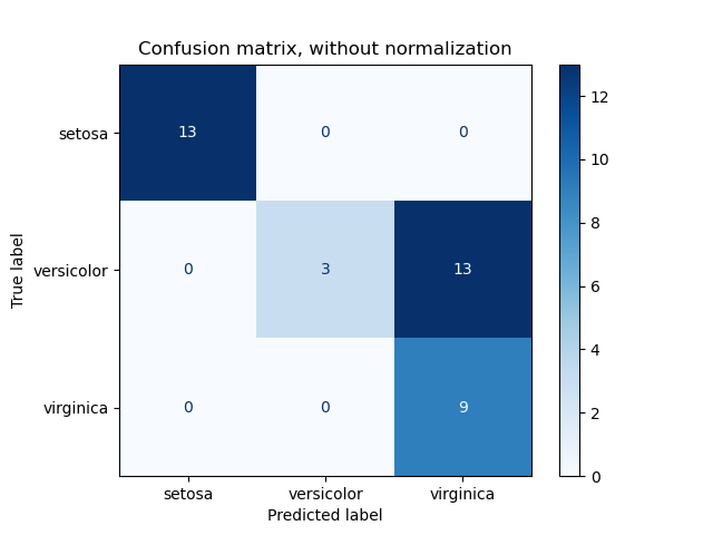
- Plot a further confusion matrix, which shows the confusion matrix, along with a scale on right hand side showing number of samples (like this) https://scikit-learn.org/stable/_images/sphx_glr_plot_confusion_matrix_001.png. Form a similar confusion matrix for normalised case, like https://scikit-learn.org/stable/_images/sphx_glr_plot_confusion_matrix_001.png.
Also, as stated in the question, the aim is to accomplish labelling of Class 0 as Class A and Class 1 as Class B, as presently these show only as 0 and 1, not looking very coherent. I would prefer minimal code to accomplish the same, and generate coherent and nice looking Confusion Matrix plots. Any help in this regard is highly appreciated.
Upvotes: 2
Views: 8004
Answers (1)

Reputation: 3847
I'll point you to Kaggle which has some tremendous resources. You should be able to easily adapt the example below to suit your needs.
from sklearn.svm import SVC
from sklearn.metrics import accuracy_score, confusion_matrix, precision_recall_fscore_support

clf = SVC(kernel = 'linear').fit(x_train,y_train)
clf.predict(x_train)
y_pred = clf.predict(x_test)

# Creates a confusion matrix
cm = confusion_matrix(y_test, y_pred)

# Transform to df for easier plotting
cm_df = pd.DataFrame(cm,
                     index = ['setosa','versicolor','virginica'],
                     columns = ['setosa','versicolor','virginica'])

plt.figure(figsize=(5.5,4))
sns.heatmap(cm_df, annot=True)
plt.title('SVM Linear Kernel \nAccuracy:{0:.3f}'.format(accuracy_score(y_test, y_pred)))
plt.ylabel('True label')
plt.xlabel('Predicted label')
plt.show()

Upvotes: 8
Related Questions
- sklearn plot confusion matrix with labels
- Plot confusion matrix sklearn with multiple labels
- Plot multiple confusion matrices with plot_confusion_matrix
- how to plot confusion matrix without color coding
- Confusion Matrix with different colors
- Plot Confusion Matrix with scikit-learn without a Classifier
- Scikit-learn (sklearn) confusion matrix plot for more than 3 classes
- Save Confusion Matrix in Python SKLEARN
- Confusion matrix in python
- Scikit learn confusion matrix