
Reputation: 8890
Creating a CSS blinking eyelid effect
I am trying to create a wait/countdown screen that shows an eye along with the eyelid, and eyeball with an iris effect. Given that so many of us spend time pointlessly staring at such spinners the effect I am trying to achieve is of the "eye" spinner looking back at the viewer and blinking.
document.getElementById('waitDia').showModal();

var ticks = 300,
    ticker = setInterval(changeTick,1000);

function changeTick()
{
 document.getElementById('spnTick').innerText = --ticks;
 if (0 === ticks) clearInterval(ticker);
}
#waitDia
{
position:absolute;
left:0 !important;
top:0 !important;
width:100vw !important;
height:100vh !important;
padding:0;
min-width:100vw;
min-height:100vh;
background-color:transparent !important;
}
#waitDia::backdrop{background-color:rgba(127,127,127,0.2);}
#spnTick
{
position:absolute;
display:inline-block;
width:100%;
left:0;
top:0;
}
#waitbox
{
left:0 !important;
top:0 !important;
width:100vw !important;
height:100vh !important;
position:absolute;
overflow:hidden;
}
#eyeball
{
position:relative;
top:-10vh;
left:-6px;
width:calc(24vh + 12px);
height:calc(24vh + 12px);
box-sizing:border-box;
background:rgba(0,128,128,0.5);
border-radius:100%;
border:1px solid transparent;
box-shadow:inset 0 0 18px 2px blue;
z-index:99999998;
}
#waitsecs
{
position:absolute;
left:calc(50vw - 12vh);
top:46vh;
width:24vh;
height:24vh;
font-size:8vh;
text-align:center;
display:block;
}
#waitEye
{
position:absolute;
top:27vh;
left:calc(50vw - 23vh);
width: 46vh;
height: 46vh;
background-color: rgba(255,255,255,.9);
border-radius: 100% 0px;
transform: rotate(45deg);
mix-blend-mode:overlay;
z-index:199999999;
box-shadow:0 -0.5vh 0 2px #f1c27d,inset 0 6px 4px 4px black;
}
body,html
{
background:black;
font-family:arial;
}<dialog id='waitDia' class='waitdia'>
<div id='waitbox'>
<div id='waitsecs'><span id='spnTick'>300</span><div id='eyeball'></div></div>
<div id='waitEye'></div>
</div>
</dialog>What I have been able to achieve thus far is shown below - I have set the ticker at 300 seconds here merely by way of illustration so it keeps working for a looong time - in the real application the wait time is likely to be considerably lesser.
While this effect is heading in the right direction it still lacks the eyelid blink effect. I suspect that this is easily doable with the help of correct 'box-shadow' manipulation and a simple animation. However, here I hit the limits of my part time CSS skills. I'd be most grateful to anyone here who might be able to suggest improvements to complete this implementation.
Upvotes: 4
Views: 4030
Answers (4)
Reputation: 1
document.getElementById('waitDia').showModal();

var ticks = 300,
    ticker = setInterval(changeTick,1000);

function changeTick()
{
 document.getElementById('spnTick').innerText = --ticks;
 if (0 === ticks) clearInterval(ticker);
}
#waitDia
{
position:absolute;
left:0 !important;
top:0 !important;
width:100vw !important;
height:100vh !important;
padding:0;
min-width:100vw;
min-height:100vh;
background-color:transparent !important;
}
#waitDia::backdrop{background-color:rgba(127,127,127,0.2);}
#spnTick
{
position:absolute;
display:inline-block;
width:100%;
left:0;
top:0;
}
#waitbox
{
left:0 !important;
top:0 !important;
width:100vw !important;
height:100vh !important;
position:absolute;
overflow:hidden;
}
#eyeball
{
position:relative;
top:-10vh;
left:-6px;
width:calc(24vh + 12px);
height:calc(24vh + 12px);
box-sizing:border-box;
background:rgba(0,128,128,0.5);
border-radius:100%;
border:1px solid transparent;
box-shadow:inset 0 0 18px 2px blue;
z-index:99999998;
}
#waitsecs
{
position:absolute;
left:calc(50vw - 12vh);
top:46vh;
width:24vh;
height:24vh;
font-size:8vh;
text-align:center;
display:block;
}
#waitEye
{
position:absolute;
top:27vh;
left:calc(50vw - 23vh);
width: 46vh;
height: 46vh;
background-color: rgba(255,255,255,.9);
border-radius: 100% 0px;
transform: rotate(45deg);
mix-blend-mode:overlay;
z-index:199999999;
box-shadow:0 -0.5vh 0 2px #f1c27d,inset 0 6px 4px 4px black;
}
body,html
{
background:black;
font-family:arial;
}<dialog id='waitDia' class='waitdia'>
<div id='waitbox'>
<div id='waitsecs'><span id='spnTick'>10</span><div id='eyeball'></div></div>
<div id='waitEye'></div>
</div>
</dialog>Upvotes: -1

Reputation: 3898
SVG + JavaScript version
Main idea is a moving of two control points of bezier curve to forme shape of eyelid depending from delta time between animation frames:
requestAnimationFrame(draw);

function draw(t) {
  circle.setAttribute('cx', Math.sin(t/1000)*2);
  grad.setAttribute('offset', 40 + Math.sin(t/3000)*20 + '%');
  t = Math.max(0, Math.sin(t/300));
  t = (t<.5 ? 16*t*t*t*t*t : 1+16*(--t)*t*t*t*t)*6-3;
  let d = `-7 0C-2 ${t} 2 ${t} 7 0`;
  mask.setAttribute('d', `M-7 -7${d}L7 -7z`)
  eyelid.setAttribute('d', `M${d}`)
  requestAnimationFrame(draw);
}
<svg viewbox="-10 -10 20 20" height="90vh">
<defs><radialGradient id="g1" cx="50%" cy="50%" r="50%">
<stop stop-color="black" offset="0%"/>
<stop id="grad" stop-color="teal" offset="30%"/>
<stop stop-color="white" offset="100%"/>
</radialGradient></defs>
<circle id="circle" r="2.4" stroke="black" fill="url(#g1)" stroke-width="0.2"></circle>
<path id="mask" stroke="none" fill="white"></path>
<path id="eyelid" stroke="black" fill="none"></path>
<svg>Solution with progress and mouse move reaction
let mouse = {x:0, y:0},
    progress = 0;

setInterval(e => progress = (progress + Math.random()/100)%1, 100)
requestAnimationFrame(draw);
addEventListener('pointermove', e => {mouse.x = e.x, mouse.y = e.y})

function draw(t) {

  requestAnimationFrame(draw);

  // двигаем зрачок
  let dx = mouse.x - innerWidth/2,
      dy = mouse.y - innerHeight/2,
      len = Math.sqrt(dx*dx + dy*dy),
      ml = Math.min(len*10/innerHeight, 1),
      a = Math.atan2(dy, dx),
      x = Math.cos(a) * ml,
      y = Math.sin(a)/2 * ml;

  circle1.setAttribute('cx', x);
  circle1.setAttribute('cy', y);
  circle2.setAttribute('cx', x);
  circle2.setAttribute('cy', y);

  // процент загрузки
  let r = 1.8,
      p = progress *2 * Math.PI,
      px = r*Math.cos(p),
      py = r*Math.sin(p),
      arc = 1-Math.round(progress);

  load.setAttribute('d', `M${r},0 A${r},${r},0,${arc},0,${px},${py}L0,0z`)
  load.setAttribute('transform', `translate(${x}, ${y})`)

  // анимируем градиент
  let offset = Math.max(0.2, (0.5 - len/2/innerHeight))*100 + "%";
  grad1.setAttribute('offset', offset);
  grad2.setAttribute('offset', offset);

  // сглаживаем время по формуле easeInOutQuint
  t = Math.max(0, Math.sin(t/300));
  t = (t<.5 ? 16*t*t*t*t*t : 1+16*(--t)*t*t*t*t)*6-3;

  // кривая Безье в зависимости от сглаженного значения времени
  let d = `-7 0C-2 ${t} 2 ${t} 7 0`;
  mask.setAttribute('d', `M-7 -7${d}L7 -7z`);
  eyelid.setAttribute('d', `M${d}`);
}
<body style="margin:0 calc(50vw - 50vh); overflow:hidden;">
<svg viewbox="-10 -10 20 20" height="100vh">
<defs>
<radialGradient id="g1" cx="50%" cy="50%" r="50%">
<stop stop-color="black" offset="0%"/>
<stop id="grad1" stop-color="#4f899d" offset="30%"/>
<stop stop-color="white" offset="100%"/>
</radialGradient>
<radialGradient id="g2" cx="50%" cy="50%" r="50%">
<stop stop-color="black" offset="0%"/>
<stop id="grad2" stop-color="#885d33" offset="30%"/>
<stop stop-color="white" offset="100%"/>
</radialGradient>
<mask id="m1">
<path id="load" fill="#fff"></path>
</mask>
</defs>
<circle id="circle1" r="2" stroke="black" stroke-width="0.2" fill="url(#g2)"></circle>
<circle id="circle2" r="2" fill="url(#g1)" mask="url(#m1)"></circle>
<path id="mask" stroke="none" fill="white"></path>
<path id="eyelid" stroke="black" fill="none"></path>
<svg>Upvotes: 3

Reputation: 14545
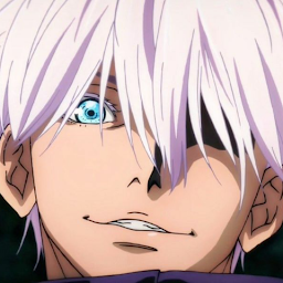
SVG solution
Version without counter
- Animation of the eyelid of the eye is achieved by changing the attribute "d" by moving from the top to the bottom.
- For realistic image of the eyelid (giving volume) radial gradients are used.
- Pause animation in the upper and lower position of the eyelid is
achieved by repeating the positions attribute
d
<svg version="1.1" xmlns="http://www.w3.org/2000/svg"
    xmlns:xlink="http://www.w3.org/1999/xlink"
   width="25%" height="25%"   viewBox="0 0 200 200" preserveAspectRatio="xMinYMin meet">
<defs>
 <radialGradient id="grad1" cx="40%" cy="20%" r="100%" fx="45%" fy="20%">

   <stop stop-color="#B7B3B8" offset="10%"/>
   <stop stop-color="#CDC9D0" offset="65%"/>
   <stop stop-color="#9D90A2" offset="85%"/>
   <stop stop-color="#CDBED3" offset="100%"/>
 </radialGradient>
 </defs>
<image xlink:href="https://i.sstatic.net/gDG2U.jpg" width="100%" height="100%" />

 <path id="veko" fill="url(#grad1)" stroke="#B9B5BB" stroke-width="4" d="m12.7 132c0 0 25.6-19.6 39.8-27.1 11.7-6.2 23.9-11.9 36.9-14.4 10.7-2.1 21.9-2 32.6-0.4 8.5 1.3 16.8 4.3 24.6 7.8 9 4.1 17.1 9.9 25.2 15.5 2.2 1.5 4.9 2.6 6.4 4.9 0.4 0.6 1.1 2.4 0.4 2.1-6.7-2.5-17.2-10.3-26.1-14.8-6.6-3.3-13.1-6.8-20.1-9.1-5.2-1.7-10.6-2.9-16.1-3.4-8.6-0.8-17.5-1.3-26.1 0.4-12.4 2.5-24 8.4-35.4 14-14.6 7.1-42.2 24.6-42.2 24.6z" >
 <animate attributeName="d" dur="4s" repeatCount="indefinite" values="
   m12.7 132c0 0 25.6-19.6 39.8-27.1 11.7-6.2 23.9-11.9 36.9-14.4 10.7-2.1 21.9-2 32.6-0.4 8.5 1.3 16.8 4.3 24.6 7.8 9 4.1 17.1 9.9 25.2 15.5 2.2 1.5 4.9 2.6 6.4 4.9 0.4 0.6 1.1 2.4 0.4 2.1-6.7-2.5-17.2-10.3-26.1-14.8-6.6-3.3-13.1-6.8-20.1-9.1-5.2-1.7-10.6-2.9-16.1-3.4-8.6-0.8-17.5-1.3-26.1 0.4-12.4 2.5-24 8.4-35.4 14-14.6 7.1-42.2 24.6-42.2 24.6z;
   m12.7 132c0 0 25.6-19.6 39.8-27.1 11.7-6.2 23.9-11.9 36.9-14.4 10.7-2.1 21.9-2 32.6-0.4 8.5 1.3 16.8 4.3 24.6 7.8 9 4.1 17.1 9.9 25.2 15.5 2.2 1.5 4.9 2.6 6.4 4.9 0.4 0.6 1.1 2.4 0.4 2.1-6.7-2.5-17.2-10.3-26.1-14.8-6.6-3.3-13.1-6.8-20.1-9.1-5.2-1.7-10.6-2.9-16.1-3.4-8.6-0.8-17.5-1.3-26.1 0.4-12.4 2.5-24 8.4-35.4 14-14.6 7.1-42.2 24.6-42.2 24.6z;

   m12.7 132c0 0 25.6-19.6 39.8-27.1 11.7-6.2 23.9-11.9 36.9-14.4 10.7-2.1 21.9-2 32.6-0.4 8.5 1.3 16.8 4.3 24.6 7.8 9 4.1 17.1 9.9 25.2 15.5 2.2 1.5 6.4 4.9 6.4 4.9-0.1 0.7 2.8-0.5 0.4 2.1-4.7 5.2-11 10.6-17.4 14.6-6 3.8-12.7 6.5-19.5 8.9-6.1 2.1-12.4 3.9-18.9 4.7-8.3 1-16.8 0.5-25.2 0-13-0.8-26-2.3-38.8-4.7-15.6-2.9-46.2-11.9-46.2-11.9z;
   m12.7 132c0 0 25.6-19.6 39.8-27.1 11.7-6.2 23.9-11.9 36.9-14.4 10.7-2.1 21.9-2 32.6-0.4 8.5 1.3 16.8 4.3 24.6 7.8 9 4.1 17.1 9.9 25.2 15.5 2.2 1.5 6.4 4.9 6.4 4.9-0.1 0.7 2.8-0.5 0.4 2.1-4.7 5.2-11 10.6-17.4 14.6-6 3.8-12.7 6.5-19.5 8.9-6.1 2.1-12.4 3.9-18.9 4.7-8.3 1-16.8 0.5-25.2 0-13-0.8-26-2.3-38.8-4.7-15.6-2.9-46.2-11.9-46.2-11.9z;
   m12.7 132c0 0 25.6-19.6 39.8-27.1 11.7-6.2 23.9-11.9 36.9-14.4 10.7-2.1 21.9-2 32.6-0.4 8.5 1.3 16.8 4.3 24.6 7.8 9 4.1 17.1 9.9 25.2 15.5 2.2 1.5 4.9 2.6 6.4 4.9 0.4 0.6 1.1 2.4 0.4 2.1-6.7-2.5-17.2-10.3-26.1-14.8-6.6-3.3-13.1-6.8-20.1-9.1-5.2-1.7-10.6-2.9-16.1-3.4-8.6-0.8-17.5-1.3-26.1 0.4-12.4 2.5-24 8.4-35.4 14-14.6 7.1-42.2 24.6-42.2 24.6z"	   />
 </path>
</svg>
Variant with add countdown
var checks = 100,
    checker = setInterval(Count, 2100);

  function Count() {
    document.getElementById('txt1').textContent = --checks;
    if (0 === checks) clearInterval(checker);
  }
.container {
background:silver;
}
svg {
display:block;
width:15%;
height:23%;
padding-left:0.5em;
padding-bottom:1.5em;
margin:1em;
border-radius:50%;
-webkit-box-shadow: 7px 7px 5px 0px rgba(50, 50, 50, 0.75);
-moz-box-shadow: 7px 7px 5px 0px rgba(50, 50, 50, 0.75);
box-shadow: 7px 7px 5px 0px rgba(50, 50, 50, 0.75);
background:#8C6282;
}
#txt1 {
font-size: 40px;
font-weight:bold;
fill:#FFDD00;
stroke:#917E00;
text-anchor:middle;
}<div class="container">
<svg id="svg1" version="1.1" xmlns="http://www.w3.org/2000/svg"
xmlns:xlink="http://www.w3.org/1999/xlink"
width="50%" height="50%" viewBox="0 0 200 200" preserveAspectRatio="xMinYMin meet">
<defs>
<radialGradient id="grad1" cx="40%" cy="20%" r="100%" fx="45%" fy="20%">
<stop stop-color="#B7B3B8" offset="10%"/>
<stop stop-color="#CDC9D0" offset="65%"/>
<stop stop-color="#9D90A2" offset="85%"/>
<stop stop-color="#CDBED3" offset="100%"/>
</radialGradient>
<mask id="msk1" >
<path fill="white" d="M0.9 129.9C10.6 74.7 114.5 44.3 176.2 88.8c8 5.1 16.2 15.8 16.8 23.4C200 200 1.1 166.8 0.9 129.9" />
</mask>
</defs>
<g mask="url(#msk1)" >
<image xlink:href="https://i.sstatic.net/gDG2U.jpg" width="100%" height="100%" />
<text id="txt1" x="98" y="130" >100</text>
<path id="veko" fill="url(#grad1)" stroke="#B9B5BB" stroke-width="1" d="m12.7 132c0 0 25.6-19.6 39.8-27.1 11.7-6.2 23.9-11.9 36.9-14.4 10.7-2.1 21.9-2 32.6-0.4 8.5 1.3 16.8 4.3 24.6 7.8 9 4.1 17.1 9.9 25.2 15.5 2.2 1.5 4.9 2.6 6.4 4.9 0.4 0.6 1.1 2.4 0.4 2.1-6.7-2.5-17.2-10.3-26.1-14.8-6.6-3.3-13.1-6.8-20.1-9.1-5.2-1.7-10.6-2.9-16.1-3.4-8.6-0.8-17.5-1.3-26.1 0.4-12.4 2.5-24 8.4-35.4 14-14.6 7.1-42.2 24.6-42.2 24.6z" >
<animate attributeName="d" dur="2.4s" repeatCount="indefinite" values="
m12.7 132c0 0 25.6-19.6 39.8-27.1 11.7-6.2 23.9-11.9 36.9-14.4 10.7-2.1 21.9-2 32.6-0.4 8.5 1.3 16.8 4.3 24.6 7.8 9 4.1 17.1 9.9 25.2 15.5 2.2 1.5 4.9 2.6 6.4 4.9 0.4 0.6 1.1 2.4 0.4 2.1-6.7-2.5-17.2-10.3-26.1-14.8-6.6-3.3-13.1-6.8-20.1-9.1-5.2-1.7-10.6-2.9-16.1-3.4-8.6-0.8-17.5-1.3-26.1 0.4-12.4 2.5-24 8.4-35.4 14-14.6 7.1-42.2 24.6-42.2 24.6z;
m12.7 132c0 0 25.6-19.6 39.8-27.1 11.7-6.2 23.9-11.9 36.9-14.4 10.7-2.1 21.9-2 32.6-0.4 8.5 1.3 16.8 4.3 24.6 7.8 9 4.1 17.1 9.9 25.2 15.5 2.2 1.5 4.9 2.6 6.4 4.9 0.4 0.6 1.1 2.4 0.4 2.1-6.7-2.5-17.2-10.3-26.1-14.8-6.6-3.3-13.1-6.8-20.1-9.1-5.2-1.7-10.6-2.9-16.1-3.4-8.6-0.8-17.5-1.3-26.1 0.4-12.4 2.5-24 8.4-35.4 14-14.6 7.1-42.2 24.6-42.2 24.6z;
m12.7 132c0 0 25.6-19.6 39.8-27.1 11.7-6.2 23.9-11.9 36.9-14.4 10.7-2.1 21.9-2 32.6-0.4 8.5 1.3 16.8 4.3 24.6 7.8 9 4.1 17.1 9.9 25.2 15.5 2.2 1.5 6.4 4.9 6.4 4.9-0.1 0.7 2.8-0.5 0.4 2.1-4.7 5.2-11 10.6-17.4 14.6-6 3.8-12.7 6.5-19.5 8.9-6.1 2.1-12.4 3.9-18.9 4.7-8.3 1-16.8 0.5-25.2 0-13-0.8-26-2.3-38.8-4.7-15.6-2.9-46.2-11.9-46.2-11.9z;
m12.7 132c0 0 25.6-19.6 39.8-27.1 11.7-6.2 23.9-11.9 36.9-14.4 10.7-2.1 21.9-2 32.6-0.4 8.5 1.3 16.8 4.3 24.6 7.8 9 4.1 17.1 9.9 25.2 15.5 2.2 1.5 6.4 4.9 6.4 4.9-0.1 0.7 2.8-0.5 0.4 2.1-4.7 5.2-11 10.6-17.4 14.6-6 3.8-12.7 6.5-19.5 8.9-6.1 2.1-12.4 3.9-18.9 4.7-8.3 1-16.8 0.5-25.2 0-13-0.8-26-2.3-38.8-4.7-15.6-2.9-46.2-11.9-46.2-11.9z;
m12.7 132c0 0 25.6-19.6 39.8-27.1 11.7-6.2 23.9-11.9 36.9-14.4 10.7-2.1 21.9-2 32.6-0.4 8.5 1.3 16.8 4.3 24.6 7.8 9 4.1 17.1 9.9 25.2 15.5 2.2 1.5 4.9 2.6 6.4 4.9 0.4 0.6 1.1 2.4 0.4 2.1-6.7-2.5-17.2-10.3-26.1-14.8-6.6-3.3-13.1-6.8-20.1-9.1-5.2-1.7-10.6-2.9-16.1-3.4-8.6-0.8-17.5-1.3-26.1 0.4-12.4 2.5-24 8.4-35.4 14-14.6 7.1-42.2 24.6-42.2 24.6z" />
</path>
</g>
</svg>
</div>Upvotes: 4

Reputation: 272806
I would do this differently and consider rotation for the blink effect. The trick is to create the eye with two elements (the eyelid) to be able to blink it.
Here is the code with only the blink animation:
.eye {
  width: 250px;
  height: 80px;
  margin: 50px;
  display:inline-block;
  perspective: 200px;
  background:
    radial-gradient(circle 100px at 50% 250%,#f1c27d 99% ,transparent 100%) top/100% 50%,
    radial-gradient(circle 100px at 50% -150%,#f1c27d 99% ,transparent 100%) bottom/100% 50%;
  background-repeat:no-repeat
}

.eye>div {
  height: 50%;
  position:relative;
  overflow:hidden;
  transform-origin:bottom;
  animation:b1 0.8s  infinite ease-out alternate;
}
.eye>div:last-child {
  transform-origin:top;
  animation-name:b2;
}
.eye>div:before {
  content: "";
  position: absolute;
  top:0;
  left:10%;
  right:10%;
  padding-top:80%;
  border-radius:50%;
  background:#fff;
  box-shadow:
    -2px 0 0 3px inset #f1c27d,
    inset -5px 5px 2px 4px black;
}
.eye>div:last-child:before {
  bottom:0;
  top:auto;
  box-shadow:
    -2px 0 0 3px inset #f1c27d,
    inset -6px -4px 2px 4px black;
}


body {
 background:#000;
}

@keyframes b1{
  to { transform:rotateX(-88deg);}
}
@keyframes b2{
  to {transform:rotateX(88deg);}
}
<div class="eye">
<div></div>
<div></div>
</div>Here is a more realistic blinking with a full eye:
var ticks = 300,ticker;
setTimeout(function() { ticker = setInterval(changeTick,1600);},500);

function changeTick()
{
 document.querySelector('.eye span').setAttribute('data-text', --ticks);
 if (0 === ticks) clearInterval(ticker);
}
.eye {
width: 250px;
height: 80px;
margin: 50px;
display:inline-block;
perspective: 200px;
background:
radial-gradient(circle 100px at 50% 250%,#f1c27d 99% ,transparent 100%) top/100% 50%,
radial-gradient(circle 100px at 50% -150%,#f1c27d 99% ,transparent 100%) bottom/100% 50%;
background-repeat:no-repeat;
transform-style:preserve-3d;
position:relative;
}
.eye>div {
height: 50%;
position:relative;
overflow:hidden;
transform-origin:bottom;
z-index:1;
animation:b1 0.8s infinite ease-out alternate;
}
.eye>div:last-child {
transform-origin:top;
animation:none;
}
.eye>div:before {
content: "";
position: absolute;
top:0;
left:10%;
right:10%;
padding-top:80%;
border-radius:50%;
background:#fff;
box-shadow:
-2px 0 0 3px inset #f1c27d,
inset -5px 5px 2px 4px black;
animation:inherit;
animation-name:color;
}
.eye>div:last-child:before {
bottom:0;
top:auto;
box-shadow:
-2px 0 0 3px inset #f1c27d,
inset -6px -4px 2px 4px black;
}
.eye > span {
position:absolute;
width:45px;
height:45px;
bottom:18px;
left:50%;
transform:translateX(-50%) translateZ(55px);
overflow:hidden;
border-radius:20% 20% 0 0;
z-index:2;
animation:b2 0.8s infinite ease-out alternate;
}
.eye > span:before {
position:absolute;
left:0;
bottom:0;
height:45px;
width:100%;
content:attr(data-text);
border-radius:50%;
background:#000;
color:#fff;
text-align:center;
line-height:45px;
}
body {
background:#000;
}
@keyframes b1{
to {
transform:rotateX(-170deg);
}
}
@keyframes b2{
50% {
height:20px;
}
60%,100% {
height:0px;
}
}
@keyframes color{
0%,40% {
background:#fff;
box-shadow:
-2px 0 0 3px inset #f1c27d,
inset -5px 5px 2px 4px black;
}
40.1%,100% {
background:#f1c27d;
box-shadow:none;
}
}<div class="eye">
<div></div>
<span data-text="300"></span>
<div></div>
</div>Upvotes: 7
Related Questions
- Imitating a blink tag with CSS3 animations
- Style for blinking div
- css typing blink animation
- spin glowing image using css
- How do I draw a spinner with pure CSS?
- Alternate blinking with CSS3 animation
- JavaScript blinking eye animation
- How to create spin effect using HTML & CSS?
- how to make a blinking image in CSS3
- CSS3-Animations - infinite rotate high-res image, box-shadow pulsing glow