
Reputation: 1619
Possible to use border-radius together with a border-image which has a gradient?
I'm styling an input field which has a rounded border (border-radius), and attempting to add a gradient to said border. I can successfully make the gradient and the rounded border, however neither work together. It's either rounded with no gradient, or a border with a gradient, but no rounded corners.
-webkit-border-radius: 5px;
-webkit-border-image: -webkit-gradient(linear, 0 0, 0 100%, from(#b0bbc4), to(#ced9de)) 1 100%;
Is there anyway to have both CSS properties work together, or is this not possible?
Upvotes: 157
Views: 264473
Answers (12)

Reputation: 1087
for me this one help me quickly,
.border_linear_btn {
    width: 300px;
    height: 100px;
    margin: 2rem;
    border: solid 5px transparent;
    border-radius: 50px;
    background:
        linear-gradient( #050C35, #050C35) padding-box,
        linear-gradient(92.7deg, #0064fb, red) border-box;
}
<div class="border_linear_btn"> </div>Upvotes: 5

Reputation: 38
According to this page, you can use 「clip-path」
#example-card{
  width: 200px;
  height: 200px;
  border: 20px solid hsl(80 100% 50%);
  border-image-slice: 1;

  border-image-source: conic-gradient(
    from 0deg,
    hsl(80 100% 50%),
    hsl(200 100% 60%),
    hsl(80 100% 50%)
  );

  clip-path: inset(0 round 24px);
}
<div id="example-card">EXAMPLE</div>Upvotes: -1

Reputation: 419
You could use the CSS clip-path property.
.rounded-border-image {
    --border-image: linear-gradient(to bottom, orange, skyblue, magenta);
    --border-radius: 4px;
    background-image: var(--border-image);
    background-origin: border-box;
    border-color: transparent;
    border-radius: var(--border-radius);
    border-style: solid;
    border-width: 4px;
    clip-path: inset(0% 0% 0% 0% round var(--border-radius));
}
Which looks something like this when used around an img element of a plain, red, 40x40 image.
.rounded-border-image {
    --border-image: linear-gradient(to bottom, orange, skyblue, magenta);
    --border-radius: 4px;
    background-image: var(--border-image);
    background-origin: border-box;
    border-color: transparent;
    border-radius: var(--border-radius);
    border-style: solid;
    border-width: 4px;
    clip-path: inset(0% 0% 0% 0% round var(--border-radius));
}
<img src="data:image/png;base64,iVBORw0KGgoAAAANSUhEUgAAACgAAAAoCAYAAACM/rhtAAAAN0lEQVR42u3OQQ0AAAjEMM6/aMAECY8uE9B01f63AAICAgICAgICAgICAgICAgICAgICAgIC3jTyeE/ZxiLJ7wAAAABJRU5ErkJggg==" class="rounded-border-image">
<img src="data:image/png;base64,iVBORw0KGgoAAAANSUhEUgAAACgAAAAoCAYAAACM/rhtAAAAN0lEQVR42u3OQQ0AAAjEMM6/aMAECY8uE9B01f63AAICAgICAgICAgICAgICAgICAgICAgIC3jTyeE/ZxiLJ7wAAAABJRU5ErkJggg==" class="rounded-border-image" style="--border-radius: 16px;">
<img src="data:image/png;base64,iVBORw0KGgoAAAANSUhEUgAAACgAAAAoCAYAAACM/rhtAAAAN0lEQVR42u3OQQ0AAAjEMM6/aMAECY8uE9B01f63AAICAgICAgICAgICAgICAgICAgICAgIC3jTyeE/ZxiLJ7wAAAABJRU5ErkJggg==" class="rounded-border-image" style="--border-radius: 40px;">Hope this helps!
Upvotes: -1

Reputation: 9
Solution for Gradient Border.
This code work fine for me!
div#id123::after {
    content: "";
    position: absolute;
    inset: 0;
    border-radius: 31px;
    padding: 3px;
    width: 100%;
    height: 100px;
    background: linear-gradient(90deg, rgba(235,163,225,1) 0%, rgba(228,161,228,1) 13%, rgba(163,99,233,1) 47%, rgba(212,129,166,1) 62%, rgba(237,172,70,1) 89%, rgba(255,57,250,0.8733377659574468) 100%);
    -webkit-mask: linear-gradient(#fff 0 0) content-box, linear-gradient(#fff 0 0);
    -webkit-mask-composite: xor;
    mask-composite: exclude;
    pointer-events: none;
}
<div id = "id123">
<div class="" id="" data-de-type="input" data-title="input" data-delay="500" type="name" style="margin-top: 10px; outline: none; cursor: pointer; font-family: Nunito, Helvetica, sans-serif !important;" aria-disabled="false" data-google-font="Nunito">
<input type="name" placeholder="Enter Full Name" name="name" class="" data-type="extra">
</div>
</div>Upvotes: -2

Reputation: 272608
Now we can use mask to easily achieve this while having transparency and responsiveness
.box {
  position: relative;
  padding: 20px 30px;
  margin: 5px;
  display: inline-block;
  font-size: 30px;
}

.box::before {
  content: "";
  position: absolute;
  inset: 0;
  border-radius: 50px;
  padding: 10px; /* control the border thickness */
  background: linear-gradient(45deg, red, blue);
  -webkit-mask:
    linear-gradient(#fff 0 0) content-box,
    linear-gradient(#fff 0 0);
  -webkit-mask-composite: xor;
          mask-composite: exclude;
  pointer-events: none;
}
<div class="box">
Hello World
</div>
<div class="box">
Hello World again
</div>
<div class="box">
Hello World <br> two lines
</div>More details: https://dev.to/afif/border-with-gradient-and-radius-387f
Upvotes: 62

Reputation: 4450
Working on this same problem. Came across a non-svg solution which is more succinct than others here:
div{
  width: 300px;
  height: 80px;
  border: double 1em transparent;
  border-radius: 30px;
  background-image: linear-gradient(white, white),
                    linear-gradient(to right, green, gold);
  background-origin: border-box;
  background-clip: content-box, border-box;
}<div></div>This is not my own solution and has been taken from here: https://gist.github.com/stereokai/36dc0095b9d24ce93b045e2ddc60d7a0
Upvotes: 172

Reputation: 27
Solutions for transparent elements: working at least in Firefox.
There is actually one way I found without pseudo classes - but it only works for radial gradients:
body {
  background: linear-gradient(white, black), -moz-linear-gradient(white, black), -webkit-linear-gradient(white, black);
  height: 300px;

  }

div{
text-align: center;
  width: 100px;
  height: 100px;
  font-size:30px;
  color: lightgrey;
  border-radius: 80px;
  color: transparent;
  background-clip: border-box, text;
  -moz-background-clip: border-box, text;
  -webkit-background-clip: border-box, text;
  background-image: radial-gradient(circle,
      transparent, transparent 57%, yellow 58%, red 100%), repeating-linear-gradient(-40deg, yellow,
  yellow 10%, orange 21%, orange 30%, yellow 41%);
  line-height: 100px;
}
<body>
<div class="radial-gradient"> OK </div>
</body>Getting a transparent element with pseudo classes I only found this way - ok it is not a gradient, but it is at least a multicolored striped border (looking like life-rings):
body {
  background: linear-gradient(white, black, white);
  height: 600px;
  }

div{
  position: absolute;
  width: 100px;
  height: 100px;
  font-size:30px;
  background-color:transparent;
  border-radius:80px;
  border: 10px dashed orange;
  color: transparent;
  background-clip: text;
  -moz-background-clip: text;
  -webkit-background-clip: text;
  background-image: repeating-linear-gradient(-40deg, yellow,
  yellow 10%, orange 11%, orange 20%, yellow 21%);
  text-align:center;
  line-height:100px;
}


div::after {
    position: absolute;
    top: -10px; bottom: -10px;
    left: -10px; right: -10px;
    border: 10px solid yellow;
    content: '';
    z-index: -1;
    border-radius: 80px;
    }
<body>
<div class="gradient"> OK </div>
</body>with a svg (most satisfying in terms of variability but needs most codelines too):
body{
  margin: 0;
  padding: 0;
}

div {
  position: absolute;
  display: flex;
  align-items: center;
  left: 50%;
  transform: translateX(-50%);
  text-align: center;
}

span {
  position: absolute;
  left: 50%;
  transform: translateX(-50%);
  width: 100px;
  height: 100px;
  line-height: 105px;
  font-size:40px;
  background-clip: text;
  -moz-background-clip: text;
  -webkit-background-clip: text;
  background-image: repeating-linear-gradient(-40deg, yellow,
  yellow 10%, orange 11%, orange 20%, yellow 21%);
  color: transparent;
}

svg {
  fill: transparent;
  stroke-width: 10px;
  stroke:url(#gradient);

}
<head>
</head>
<body>
<div>
<span>OK</span>
<svg>
<circle class="stroke-1" cx="50%" cy="50%" r="50"/>
<defs>
<linearGradient id="gradient" x1="0%" y1="0%" x2="0%" y2="15%" gradientTransform="rotate(-40)" spreadMethod="reflect">
<stop offset="0%" stop-color="orange" />
<stop offset="49%" stop-color="orange" />
<stop offset="50%" stop-color="yellow" />
<stop offset="99%" stop-color="yellow" />
</linearGradient>
</defs>
</svg>
</div>
</body>Upvotes: 1

Reputation: 14012
I would use SVG for this:
<svg xmlns="http://www.w3.org/2000/svg" viewBox="0 0 220 220" width="100%" height="100%" preserveAspectRatio="none">
  <defs>
    <linearGradient id="gradient">
      <stop offset="0" style="stop-color:#0070d8" />
      <stop offset="0.5" style="stop-color:#2cdbf1" />
      <stop offset="1" style="stop-color:#83eb8a" />
    </linearGradient>
  </defs>
  <ellipse ry="100" rx="100" cy="110" cx="110" style="fill:none;stroke:url(#gradient);stroke-width:6;" />
</svg>
SVG can be used as separate file (preferred way) or like part of value of background (code below will work only in webkit-browsers):
div {
  width: 250px;
  height: 250px;
  background: url('data:image/svg+xml;utf8,<svg xmlns="http://www.w3.org/2000/svg" viewBox="0 0 220 220" width="100%" height="100%" preserveAspectRatio="none"><defs><linearGradient id="gradient"><stop offset="0" style="stop-color:#0070d8" /><stop offset="0.5" style="stop-color:#2cdbf1" /><stop offset="1" style="stop-color:#83eb8a" /></linearGradient></defs><ellipse ry="100" rx="100" cy="110" cx="110" style="fill:none;stroke:url(#gradient);stroke-width:6;" /></svg>');
}<div></div>For this to work in MS Edge and Firefox we should escape our markup after utf8, so we will be replacing double quotes " with single quotes ', # with %23 and % with %25:
div {
  width: 250px;
  height: 250px;
  background: url("data:image/svg+xml;utf8,<svg xmlns='http://www.w3.org/2000/svg' viewBox='0 0 220 220' width='100%25' height='100%25' preserveAspectRatio='none'><defs><linearGradient id='gradient'><stop offset='0' style='stop-color:%230070d8' /><stop offset='0.5' style='stop-color:%232cdbf1' /><stop offset='1' style='stop-color:%2383eb8a' /></linearGradient></defs><ellipse ry='100' rx='100' cy='110' cx='110' style='fill:none;stroke:url(%23gradient);stroke-width:6;' /></svg>");
  background-size: 100% 100%; /* Fix for Fifefox image scaling */
}<div></div>Upvotes: 6

Reputation: 37898
This is possible, and it does not require extra markup, but uses an ::after pseudo-element.
It involves putting a pseudo-element with a gradient background below and clipping that. This works in all current browsers without vendor prefixes or hacks (even IE), but if you want to support vintage versions of IE, you should either consider solid color fallbacks, javascript, and/or custom MSIE CSS extensions (i.e., filter, CSSPie-like vector trickery, etc).
Here's a live example (jsfiddle version):
@import url('//raw.githubusercontent.com/necolas/normalize.css/master/normalize.css');
html {
/* just for showing that background doesn't need to be solid */
background: linear-gradient(to right, #DDD 0%, #FFF 50%, #DDD 100%);
padding: 10px;
}
.grounded-radiants {
position: relative;
border: 4px solid transparent;
border-radius: 16px;
background: linear-gradient(orange, violet);
background-clip: padding-box;
padding: 10px;
/* just to show box-shadow still works fine */
box-shadow: 0 3px 9px black, inset 0 0 9px white;
}
.grounded-radiants::after {
position: absolute;
top: -4px; bottom: -4px;
left: -4px; right: -4px;
background: linear-gradient(red, blue);
content: '';
z-index: -1;
border-radius: 16px;
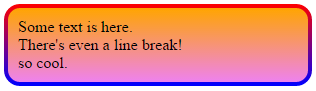
}<p class="grounded-radiants">
Some text is here.<br/>
There's even a line break!<br/>
so cool.
</p>The extra styling above is to show:
- This works with any background
- It works just fine with
box-shadow,insetor not - Does not require you to add the shadow to the pseudo-element
Again, this works with IE, Firefox and Webkit/Blink browsers.
Upvotes: 133
Reputation: 135
This always works for me in WebKit, although its a bit tricky!
Basically you just make the border bigger then mask it out with bigger and smaller pseudo-element's borders : ).
.thing {
  display: block;
  position: absolute;
  left: 50px;
  top: 50px;
  margin-top: 18pt;
  padding-left: 50pt;
  padding-right: 50pt;
  padding-top: 25pt;
  padding-bottom: 25pt;
  border-radius: 6px;
  font-size: 18pt;
  background-color: transparent;
  border-width: 3pt;
  border-image: linear-gradient(#D9421C, #E8A22F) 14% stretch;
}
.thing::after {
  content: '';
  border-radius: 8px;
  border: 3pt solid #fff;
  width: calc(100% + 6pt);
  height: calc(100% + 6pt);
  position: absolute;
  top: -6pt;
  left: -6pt;
  z-index: 900;
}
.thing::before {
  content: '';
  border-radius: 2px;
  border: 1.5pt solid #fff;
  width: calc(100%);
  height: calc(100% + 0.25pt);
  position: absolute;
  top: -1.5pt;
  left: -1.5pt;
  z-index: 900;
}
http://plnkr.co/edit/luO6G95GtxdywZF0Qxf7?p=preview
Upvotes: 1

Reputation: 16825
What if you apply the gradient to the background. Than and add an extra div inside, with margin set to the old border-width and with a white background, and of course a borderradius. That way you have the effect of a border, but are actually using background, which is clipped correctly.
Upvotes: 0

Reputation: 9596
Probably not possible, as per the W3C spec:
A box's backgrounds, but not its border-image, are clipped to the appropriate curve (as determined by ‘background-clip’). Other effects that clip to the border or padding edge (such as ‘overflow’ other than ‘visible’) also must clip to the curve. The content of replaced elements is always trimmed to the content edge curve. Also, the area outside the curve of the border edge does not accept mouse events on behalf of the element.
This is likely because border-image can take some potentially complicated patterns. If you want a rounded, image border, you'll need to create one yourself.
Upvotes: 35
Related Questions
- Border Gradient with Border Radius
- Border gradient with radius and transparency
- Border-image, border-radius
- Gradient border with border radius and gradient text
- How to get a partial rounded border with border-radius using CSS?
- CSS - Border Radius on Background Color with linear gradient 50% width
- How to add border radius with gradient and trasparent background for content inside container
- How to add gradient to border that contains border radius and has a transparent background?
- How to use a radial gradient with a border-image
- border-radius gradient with transparent background