Reputation: 1138
Paneling barplot from pivot table
I have a table like this:
ID var1. var2. var3. var4. var5. var6. var7 var8 var9 ... var22 ...
A.  1.   1.    7.    0.     0.6.   0.   7.  2.    2,4.   ....
B   9.   1.    7.    0.     0.6.   0.   7.  2.    2,4.   ....
C   0.   1.    0.    8.     0.5.   5.   7.  2.9.  2,8.   ....
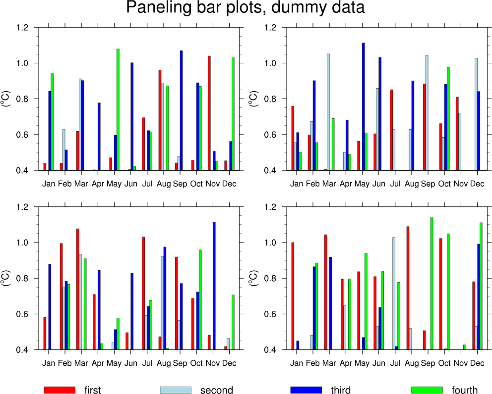
And I want to build a bar plot for each ID and bind them all on a panel, my idea of panel is like here.
So, 'x' will be the variables (that are columns names) and the 'y' the values that are the values of the columns in this data frame.
One important thing is that I don't want to show on the graph the variables that have zero value for a given ID, so, for example: for ID 'A', var4 and var6 won't be on the graph of ID 'A', but they will be on the graph of ID 'C', for example.
So far I have:
The transposition of the columns:
df_melted = res.melt(id_vars='ID')
Then I remove all the zeros:
df_melted_no_zeros = df_melted[df_melted.value != 0]
Then as I could not manage to build the panel, I filter by one ID:
ID_A = df_melted_no_zeros[(df_melted_no_zeros.ID == "A")]
Then on the plot that are so many variables and I can't find how can I put them on a plot to be readable, since there are so many names (like 20 for each graph on the x axis). For me it will work to show just the legend of top 5 values, but I couldn't manage how to do it. Als my variables are mostly between 0.004 and 0.009 but then there are always two variables that are value 4 or 5, so the rest is like irrelevant on the plot.
fig = plt.figure()
ax = fig.add_axes([0,0,1,1])
variables = ID_A['variable']
values = ID_A['value']
ax.bar(variables,values)
plt.show()
Upvotes: 1
Views: 65
Answers (1)

Reputation: 169274
With this subset of your DataFrame:
ID var1. var2. var3. var4. var5. var6. var7 var8 var9
A.  1.   1.    7.    0.     0.6   0.   7.  2.    2.4
B   9.   1.    7.    0.     0.6   0.   7.  2.    2.4
C   0.   1.    0.    8.     0.    5.   7.  2.9   2.8
From wide to long:
df_melted = df.melt(id_vars='ID')
Get just top several:
df_top5 = df_melted[df_melted['value'].isin(
                    df_melted.groupby('ID')['value'].nlargest(5).unique())]
Plot with seaborn:
import seaborn as sns

g = sns.FacetGrid(df_top5,col="ID",sharex=False,sharey=False,col_wrap=2)
g.map(sns.barplot,'variable','value',order=None,hue=df_top5['variable'],
      dodge=False,palette='deep')
plt.show()
Result:

Upvotes: 1
Related Questions
- Stacked Bar Chart Python from pivot/groupby table
- Make bar plot aggregating smaller values
- Plot Bar and Line Charts from Pivot Table
- Create a plot from a pandas dataframe pivot table
- How Plot a bar Graph in python from Pivot Table() result?
- pandas pivot table to stacked bar chart
- Pandas bar charts groups together
- pivot all the columns of a dataframe
- Pandas using pivot_table to achieve barplot with overlay bars and groups of bars
- Pandas Pivot Table and Matplotlib bar