
Reputation: 335
Material UI Autocomplete: Unable to populate nested array data as seperate label options
I have data coming in from API in the following format:
const companies = [
  { type: "Banks", names: ["CIBC", "RBC", "BMO"] },
  { type: "E-Banks", names: ["Oaken", "XYZ", "EQ"] },
  { type: "Credit Unions", names: ["ABC", "TTB"] }
];
In Material UI's autocomplete I want to be able to populate 'type' property as the groupBy heading which is working but I am unable to figure out how to populate these 'names' within options.
Sandbox is here: https://codesandbox.io/s/material-demo-forked-oo3td?file=/demo.js
My autocomplete component looks like this:
<Autocomplete
          open
          onClose={handleClose}
          multiple
          value={pendingValue}
          onChange={(event, newValue) => {
            setPendingValue(newValue);
          }}
          disableCloseOnSelect
          disablePortal
          //renderTags={() => null}
          noOptionsText="No labels"
          renderOption={(option, { selected }) => (
            <>
              <DoneIcon
                //className={classes.iconSelected}
                style={{ visibility: selected ? "visible" : "hidden" }}
              />
              {/* how to map below */}
              <div className={classes.text}>{[...option.names]}</div>
              <CloseIcon
                //className={classes.close}
                style={{ visibility: selected ? "visible" : "hidden" }}
              />
            </>
          )}
          options={[...companies].sort((a, b) => {
            // Display the selected labels first.
            let ai = value.indexOf(a);
            ai = ai === -1 ? value.length + companies.indexOf(a) : ai;
            let bi = value.indexOf(b);
            bi = bi === -1 ? value.length + companies.indexOf(b) : bi;
            return ai - bi;
          })}
          groupBy={(option) => option.type}
          getOptionLabel={(option) => option.names[0]} //how to map here
          renderInput={(params) => (
            <InputBase
              ref={params.InputProps.ref}
              inputProps={params.inputProps}
              autoFocus
              className={classes.inputBase}
            />
          )}
        />
I tried spreading the names in renderOption prop but then in the autocompelte it just populates all options in one line which makes sense since its part of one option. I am unable to figure out how I could have it in seperate lines along with being able to individually select them.
Upvotes: 4
Views: 5493
Answers (1)

Reputation: 4706
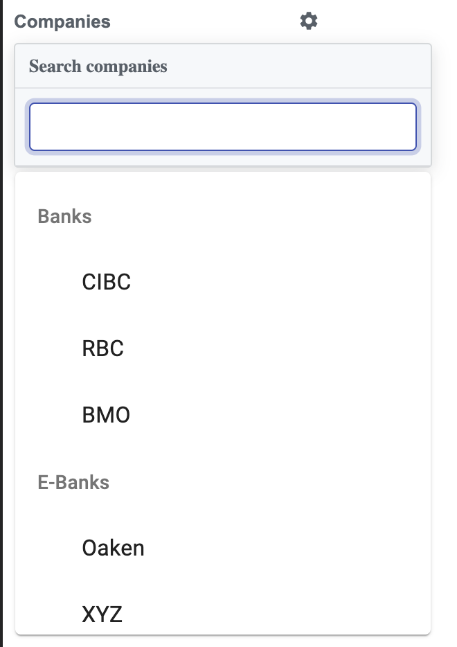 Why don`t you reformat API response in appropriate format (just clean the code, put in separate function..)?
/* eslint-disable no-use-before-define */
import React from "react";
import { fade, makeStyles } from "@material-ui/core/styles";
import Popper from "@material-ui/core/Popper";
import SettingsIcon from "@material-ui/icons/Settings";
import CloseIcon from "@material-ui/icons/Close";
import DoneIcon from "@material-ui/icons/Done";
import Autocomplete from "@material-ui/lab/Autocomplete";
import ButtonBase from "@material-ui/core/ButtonBase";
import InputBase from "@material-ui/core/InputBase";
import Chip from "@material-ui/core/Chip";

const useStyles = makeStyles((theme) => ({
  root: {
    width: 221,
    fontSize: 13
  },
  button: {
    fontSize: 13,
    width: "100%",
    textAlign: "left",
    paddingBottom: 8,
    color: "#586069",
    fontWeight: 600,
    "&:hover,&:focus": {
      color: "#0366d6"
    },
    "& span": {
      width: "100%"
    },
    "& svg": {
      width: 16,
      height: 16
    }
  },
  tag: {
    marginTop: 3
  },
  popper: {
    border: "1px solid rgba(27,31,35,.15)",
    boxShadow: "0 3px 12px rgba(27,31,35,.15)",
    borderRadius: 3,
    width: 300,
    zIndex: 1,
    fontSize: 13,
    color: "#586069",
    backgroundColor: "#f6f8fa"
  },
  header: {
    borderBottom: "1px solid #e1e4e8",
    padding: "8px 10px",
    fontWeight: 600
  },
  inputBase: {
    padding: 10,
    width: "100%",
    borderBottom: "1px solid #dfe2e5",
    "& input": {
      borderRadius: 4,
      backgroundColor: theme.palette.common.white,
      padding: 8,
      transition: theme.transitions.create(["border-color", "box-shadow"]),
      border: "1px solid #ced4da",
      fontSize: 14,
      "&:focus": {
        boxShadow: `${fade(theme.palette.primary.main, 0.25)} 0 0 0 0.2rem`,
        borderColor: theme.palette.primary.main
      }
    }
  },
  paper: {
    boxShadow: "none",
    margin: 0,
    color: "#586069",
    fontSize: 13
  },
  option: {
    minHeight: "auto",
    alignItems: "flex-start",
    padding: 8,
    '&[aria-selected="true"]': {
      backgroundColor: "transparent"
    },
    '&[data-focus="true"]': {
      backgroundColor: theme.palette.action.hover
    }
  },
  popperDisablePortal: {
    position: "relative"
  },
  iconSelected: {
    width: 17,
    height: 17,
    marginRight: 5,
    marginLeft: -2
  },
  color: {
    width: 14,
    height: 14,
    flexShrink: 0,
    borderRadius: 3,
    marginRight: 8,
    marginTop: 2
  },
  text: {
    flexGrow: 1
  },
  close: {
    opacity: 0.6,
    width: 18,
    height: 18
  }
}));

export default function GitHubLabel() {
  const classes = useStyles();
  const [anchorEl, setAnchorEl] = React.useState(null);
  const [value, setValue] = React.useState([]);
  const [pendingValue, setPendingValue] = React.useState([]);

  const handleClick = (event) => {
    setPendingValue(value);
    setAnchorEl(event.currentTarget);
  };

  // Reformat API response JSON
  const reformatedCompanies = companies.reduce((akku, row) => {
    const companyRows = [];
    row.names.map((name) => {
      companyRows.push({
        type: row.type,
        name: name
      });
    });
    akku = akku.concat(companyRows);
    return akku;
  }, []);
  // Till here

  const handleDelete = (name) => {
    const newValue = value.filter((company) => company.name !== name);
    setValue(newValue);
  };

  const handleClose = (event, reason) => {
    if (reason === "toggleInput") {
      return;
    }
    setValue(pendingValue);
    if (anchorEl) {
      anchorEl.focus();
    }
    setAnchorEl(null);
  };

  const open = Boolean(anchorEl);

  return (
    <React.Fragment>
      <div className={classes.root}>
        <ButtonBase
          disableRipple
          className={classes.button}
          //aria-describedby={id}
          onClick={handleClick}
        >
          <span>Companies</span>
          <SettingsIcon />
        </ButtonBase>
        {value.map((company, index) => (
          <Chip
            key={company.name}
            label={company.name}
            onDelete={() => handleDelete(company.name)}
            color="primary"
            className={classes.tag}
          />
        ))}
      </div>
      <Popper
        //id={id}
        open={open}
        anchorEl={anchorEl}
        placement="bottom-start"
        className={classes.popper}
      >
        <div className={classes.header}>Search companies</div>
        <Autocomplete
          open
          onClose={handleClose}
          multiple
          value={pendingValue}
          onChange={(event, newValue) => {
            setPendingValue(newValue);
          }}
          disableCloseOnSelect
          disablePortal
          //renderTags={() => null}
          noOptionsText="No labels"
          renderOption={(option, { selected }) => (
            <>
              <DoneIcon
                //className={classes.iconSelected}
                style={{ visibility: selected ? "visible" : "hidden" }}
              />
              {/* how to map below */}
              <div className={classes.text}>{[...option.name]}</div>
              <CloseIcon
                //className={classes.close}
                style={{ visibility: selected ? "visible" : "hidden" }}
              />
            </>
          )}
          options={reformatedCompanies}
          groupBy={(option) => option.type}
          getOptionLabel={(option) => option.name} //how to map here
          renderInput={(params) => (
            <InputBase
              ref={params.InputProps.ref}
              inputProps={params.inputProps}
              autoFocus
              className={classes.inputBase}
            />
          )}
        />
      </Popper>
    </React.Fragment>
  );
}

const companies = [
  { type: "Banks", names: ["CIBC", "RBC", "BMO"] },
  { type: "E-Banks", names: ["Oaken", "XYZ", "EQ"] },
  { type: "Credit Unions", names: ["ABC", "TTB"] }
];
Upvotes: 5
Related Questions
- Material UI Autocomplete implementation with options containing array of objects (ID and label)
- Add autocomplete with multiple and creatable reactjs material ui
- MUI Autocomplete single array
- material ui autocomplete doesn't recognize options parameter as array
- Autocomplete not rendering as expected Material UI
- how to populate values of nested array in Auto Complete Material UI
- Getting error as 'Objects are not valid as React child' in Autocomplete when selected desired input
- Material-UI Autocomplete rendered values
- React Material UI Autocomplete show options with issue
- Material UI Autocomplete