
Reputation: 1721
Javascript - Drawing Circle with Arrows
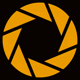
I am trying to draw something like shown below with Javascript and wondering how I can accomplish this.

Obviously to draw a circle, I can do:
<!DOCTYPE html>
<html lang="en">
<head>
<meta charset="UTF-8" />
<title>shapes demo</title>
</head>
<body>
<canvas class="canvas" width="400" height="200"></canvas><br />
<button class="btn">draw</button>
<script>
   let canvas = document.querySelector(".canvas");
   let btn = document.querySelector(".btn");
   btn.addEventListener("click", () => {
      var circle = canvas.getContext("2d");
      circle.beginPath();
      circle.arc(180, 100, 90, 0, 2 * Math.PI);
      circle.stroke();
   });
</script>
</body>
</html>
I am wondering maybe there is some existing drawing library, etc. which would make this easier. Any advice would be helpful. Thanks!
*I want to write some code for visualizing a few data structures. If you are wondering why anyone would want to do this 😜
Edit
I think actually, just having a way to draw a curved arrow joining two strings is enough. It is easy to draw a partial circle, but I am not sure how to add text at the end of the partial circle or add an arrow tip to the end of the partial circle.
Upvotes: 0
Views: 860
Answers (2)
Reputation: 1359
Interested in CSS arrows? ...you just need to add some more modifiers to position/rotate them well to your needs - I did three of them ready for you - all pointing the position which you state in style="left:0px;top:0px" next to the html tags:
.content {
  position:relative;
  width: 100%;
  height: 800px;
  border:1px solid red;
}

/* modifiers */
.arrow.left-from-up {
  margin: -160px 0 0 120px;
  transform: rotate(90deg);
}
.arrow.left-from-bottom {
  margin: -160px 0 0 120px;
  transform: rotate(90deg) scaleX(-1);
}
.arrow.up-from-left {
  transform: rotate(180deg);
  margin: 0 0 0 -20px;
}

/* Arrow */

.arrow {
    position: absolute;
  transform-origin: 50% 50%;
  margin: 0;
  width: 100px;
  pointer-events:none;
}

.arrow .curve {
    border: 2px solid #BE5F4B;
    border-color: transparent transparent transparent #BE5F4B;
    height: 360px;
    width: 1200px;
    border-radius: 230px 0 0 150px;
}

.arrow .point {
    position: absolute;
    left: 40px;
    top: 315px;
}

.arrow .point:before, .arrow .point:after {
    border: 1px solid #BE5F4B;
    height: 25px;
    content: "";
    position: absolute;
}

.arrow .point:before {
    top: -11px;
    left: -11px;
    transform:rotate(-74deg);
    -webkit-transform:rotate(-74deg);
  -moz-transform:rotate(-74deg);
  -ms-transform: rotate(-74deg);
}

.arrow .point:after {
  top: -20px;
    left: 5px;
    transform:rotate(12deg);
    -webkit-transform: rotate(12deg);
  -moz-transform:rotate(12deg);
  -ms-transform: rotate(12deg);
}
<div class="content">
<div class="arrow left-from-up" style="left:0;top:50px;">
<div class="curve"></div>
<div class="point"></div>
</div>
<div class="arrow left-from-bottom" style="left:0;top:90px">
<div class="curve"></div>
<div class="point"></div>
</div>
<div class="arrow up-from-left" style="left:0;top:110px">
<div class="curve"></div>
<div class="point"></div>
</div>
</div>original code found here: https://codepen.io/zomgbre/pen/kmCsp
Upvotes: 1
Reputation: 170
First, I separated the circle into 4 different arcs. Second, I added the numbers. And third, using some trig, added an “arrow” function to create an arrow at a certain angle around the circle.
And here’s the finished product:
<!DOCTYPE html>
<html lang="en">
<head>
<meta charset="UTF-8" />
<title>shapes demo</title>
</head>
<body>
<canvas class="canvas" width="400" height="200"></canvas><br />
<button class="btn">draw</button>
<script>
   function arrow (ang) {
       circle.save();
       circle.translate(180+70*Math.cos(ang), 100+70*Math.sin(ang));
       circle.rotate(ang);
       circle.beginPath();
       circle.moveTo(-5, -5);
       circle.lineTo(0, 0);
       circle.lineTo(5, -5);
       circle.stroke();
       circle.restore();
   }
   let canvas = document.querySelector(".canvas");
   var circle = canvas.getContext("2d");
   let btn = document.querySelector(".btn");
   btn.addEventListener("click", () => {

      circle.beginPath();
      circle.arc(180, 100, 70, Math.PI*7/12, Math.PI*11/12); // bottom left
      circle.stroke();

      circle.beginPath();
      circle.arc(180, 100, 70, Math.PI*13/12, Math.PI*17/12); // top left
      circle.stroke();

      circle.beginPath();
      circle.arc(180, 100, 70, Math.PI*19/12, Math.PI*23/12); // top right
      circle.stroke();

      circle.beginPath();
      circle.arc(180, 100, 70, Math.PI*1/12, Math.PI*5/12); // bottom right
      circle.stroke();

      circle.beginPath();
      circle.textAlign = 'center';
      circle.textBaseline = 'middle';
      circle.font = '20px Arial';
      circle.fillText('1', 180, 30);
      circle.fillText('2', 250, 100);
      circle.fillText('3', 180, 170);
      circle.fillText('4', 110, 100);

      arrow(Math.PI*11/12);
      arrow(Math.PI*17/12);
      arrow(Math.PI*23/12);
      arrow(Math.PI*5/12);
   });
</script>
</body>
</html>
Upvotes: 2
Related Questions
- html5 canvas draw lines in a circle
- JS drawing a line from the edge of a circle to another circle edge
- Draw points on a circle's edge
- How to draw a circle in HTML5 Canvas using JavaScript?
- HTML JS Circle Drawing Line
- I wanted to draw a circle in javascript
- Draw arrows between two circles using svg
- how to generate circle using javascript
- canvas draw circle
- JavaScript - Drawing a Circle