
Reputation: 28853
HTML5 Canvas pie chart
I'm attempting to create a simple pie chart like shown in the graphic below:
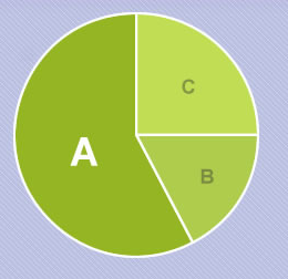
The chart will show the results for a quiz where a user can choose either a, b or c. They're 10 questions and the user can only choose one option per question.
What I want to do is show the pie chart with each segment being a percentage of 100% by passing in the values for either a,b, or c.
I have the following so far:
var greenOne = "#95B524";
var greenTwo = "#AFCC4C";
var greenThree = "#C1DD54";
function CreatePieChart() {
var chart = document.getElementById('piechart');
var canvas = chart.getContext('2d');
canvas.clearRect(0, 0, chart.width, chart.height);
var total = 100;
var a = 3;
var b = 4;
var c = 3;
for (var i = 0; i < 3; i++) {
canvas.fillStyle = "#95B524";
canvas.beginPath();
canvas.strokeStyle = "#fff";
canvas.lineWidth = 3;
canvas.arc(100, 100, 100, 0, Math.PI * 2, true);
canvas.closePath();
canvas.stroke();
canvas.fill();
}
}
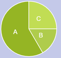
CreatePieChart();<canvas id="piechart" width="200" height="200"></canvas>The colors are specific to the size of the segment, so green one is used for the largest and green three for the smallest.
Upvotes: 32
Views: 68221
Answers (4)

Reputation: 38253
Even after searching Google and triple-checking my radians values, etc. I was still having trouble with this, so I have created a jsFiddle for people to play with as a live example and will post the code below as well. (Update: in the fiddle v2, stroke and labels are added also.)
var canvas = document.getElementById("can");
var ctx = canvas.getContext("2d");
var lastend = 0;
var data = [200, 60, 15]; // If you add more data values make sure you add more colors
var myTotal = 0; // Automatically calculated so don't touch
var myColor = ["red", "green", "blue"]; // Colors of each slice

for (var e = 0; e < data.length; e++) {
  myTotal += data[e];
}

for (var i = 0; i < data.length; i++) {
  ctx.fillStyle = myColor[i];
  ctx.beginPath();
  ctx.moveTo(canvas.width / 2, canvas.height / 2);
  ctx.arc(
    canvas.width / 2,  // x
    canvas.height / 2, // y
    canvas.height / 2, // radius
    lastend,           // startingAngle (radians)
    lastend + Math.PI * 2 * (data[i] / myTotal), // endingAngle (radians)
    false // antiClockwise (boolean)
  );
  ctx.lineTo(canvas.width / 2, canvas.height / 2);
  ctx.fill();
  lastend += Math.PI * 2 * (data[i] / myTotal);
}
<canvas id="can" width="200" height="200" />Upvotes: 49

Reputation: 8670
I like the previous answer, but I felt it was lacking in code clarity and it didn't really cover how to utilize labels.
I moved the values into a data object array for easy declaration. Other values, like percentage, I explicitly declared as a property on the data object, or as a separate variable. This, I think, makes it easier to read.
The refactoring also made it easier to tie the values to input boxes if that's something you're interested in.
To see what I mean and play with the values check out this CodePen: http://codepen.io/zfrisch/pen/pRbZeb
var data = [
  {
    label: "one",
    value: 100,
    color: "white",
  },
  {
    label: "two",
    value: 100,
    color: "skyBlue",
  },
  {
    label: "three",
    value: 100,
    color: "yellow",
  },
];

var total = 0;
for (obj of data) {
  total += obj.value;
}

var canvas = document.getElementById("myCanvas");
var ctx = canvas.getContext("2d");
var previousRadian;
var middle = {
  x: canvas.width / 2,
  y: canvas.height / 2,
  radius: canvas.height / 2,
};

//background
ctx.beginPath();
ctx.arc(middle.x, middle.y, middle.radius, 0, 2 * Math.PI);
ctx.closePath();
ctx.stroke();
ctx.fillStyle = "black";
ctx.fill();
//end of background

for (obj of data) {
  previousRadian = previousRadian || 0;
  obj.percentage = parseInt((obj.value / total) * 100);

  ctx.beginPath();
  ctx.fillStyle = obj.color;
  obj.radian = Math.PI * 2 * (obj.value / total);
  ctx.moveTo(middle.x, middle.y);
  //middle.radius - 2 is to add border between the background and the pie chart
  ctx.arc(
    middle.x,
    middle.y,
    middle.radius - 2,
    previousRadian,
    previousRadian + obj.radian,
    false
  );
  ctx.closePath();
  ctx.fill();
  ctx.save();
  ctx.translate(middle.x, middle.y);
  ctx.fillStyle = "black";
  ctx.font = middle.radius / 10 + "px Arial";
  ctx.rotate(previousRadian + obj.radian);
  var labelText = "'" + obj.label + "' " + obj.percentage + "%";
  ctx.fillText(labelText, ctx.measureText(labelText).width / 2, 0);
  ctx.restore();

  previousRadian += obj.radian;
}
<canvas id="myCanvas" width="500" height="500"></canvas>Upvotes: 6

Reputation: 8263
Here is a pie chart without using external libraries, using html5 canvas :
But it's better to use libraries for drawing charts. in apex-charts there is an option called sparkline, which helps you to remove the extra stuffs and draw a minimal and clean chart.
Here is a clean donut chart using apex-charts library. (Extra stuffs are removed with sparkline option):
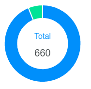
var options = {
  series: [620, 40],
  labels: ['Finished', 'Unfinished'],
  chart: {
    type: 'donut',
    sparkline: {
      enabled: true,
    }
  },
  plotOptions: {
    pie: {
      donut: {
        labels: {
          show: true,
          total: {
            showAlways: false,
            show: true,
            label: 'Total'
          }
        }
      }
    }
  },
};
var chart = new ApexCharts(document.querySelector("#chart"), options);
chart.render();
Upvotes: 1
Reputation: 33
I had the same problem before but I was able to solve this problem later.
What I was missing was I was drawing an arch in context and was trying to fill it, due to which the color was spreading all across the circle because now the context was bound only between a radius line from center to the starting point of arch and the arch to bound the context.
But there was no other boundary the line from the end of arch to the center, as soon as I draw that line using the following:
ctx.lineTo(center coordinates of circle);
I have a complete boundary of a pie, so now if I fill the color in context it will not get spread inside the whole circle but will be limited to that pie.
Upvotes: -1
Related Questions
- HTML/JS Multiple Pie Chart Issue
- Pie chart using chart.js
- Drawing pie chart with chart.js
- Labels inside canvas pie charts
- Graphic-rich Javascript pie chart library
- HTML5 and canvas to plot Pie Chart
- Plotting animated pie chart using javascript
- Creating PIE chart using javascript
- pie chart in javascript?
- Dynamic Pie Charts