
Reputation: 19
WordPress - Elementor - Sticky ElementsKit Nav Menu - Mobile View not showing
I am working with the ElementsKit Nav Menu in Elementor. I just added a Sticky Header or technicly two since one will stay on top without being sticky and one will appear after an fixed offset.
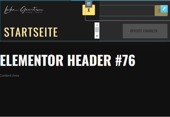
The Problem is, the one that is fixed with an Offset doesn't show the Mobile Menu fully when opened. It only goes as far as the Header Element. I attached some Pictures and the used CSS. Can someone provide a simple solution? Thanks
CSS USED:
.header-2 {
 transform: translatey(-80px);
 -moz-transition: all .3s ease!important;
 -webkit-transition: all .3s ease!important;
 transition: all .3s ease!important;
}


.elementor-sticky--effects.header-2  {
 height: auto!important;
 transform: translatey(0px);
}

.elementor-sticky--effects.header-1 {
 display: none!important;
}
https://i.gyazo.com/e86f901c7f8117eef2ec0f2f4100ecf6.png https://i.gyazo.com/83a276a2727ce04c52ea78122ef5f20f.png
Upvotes: 1
Views: 2094
Answers (1)

Reputation: 13
It sounds like the header is being covered by the elements further down in the page. You should increase the z-index of the element like so, and also make sure that there are no other elements with a z-index as high as .header-2.
.header-2 {
 transform: translatey(-80px);
 -moz-transition: all .3s ease!important;
 -webkit-transition: all .3s ease!important;
 transition: all .3s ease!important;
 z-index:9999;
}
Upvotes: 1
Related Questions
- Elementor Navigation Mobile View
- Navigation toggle icon for phone/email issue
- Position Relative Is Making Sticky Menu Not Work
- Sticky position not working with safari mobile
- sticky responsive mobile hamburger menu wont display
- Sticky navbar has a bug on mobile
- CSS navigation menu not nesting in mobile version
- Bootstrap wordpress mobile menu not working
- Mobile menu doesn't scroll
- CSS error on a custom mobile menu for Wordpress