
Saha_1994
Reputation: 111
Suggestion for getting a type of plot
I am planning to use python to get a plot like this 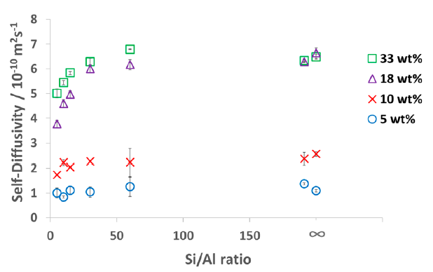 .
.
But, I am only able to get this, 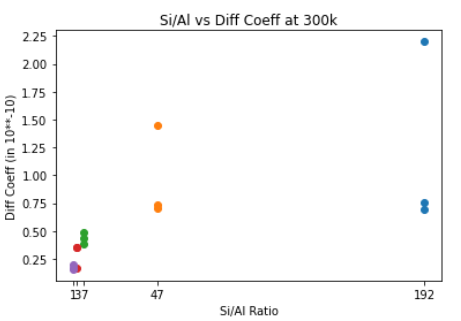
So, I would appreciate it if someone helps me with these issues, (Maybe how to format the data)
How to have lower X-axis values highlighted like in the original plot
Also, how to add the info to the legends. Please check the code below and looking forward to your suggestions. Numpy and Matplotlib are being used.
x = [192, 188/4, 168/24, 144/48, 96/96]
ys = [[2.20, 0.758, 0.691], [1.44, 0.708, 0.733], [0.491, 0.379, 0.440], [0.349, 0.350, 0.165], [0.199, 0.157, 0.163]]

print(len(x), len(ys))
colors = [["r", "y", "g"], ["r", "y", "g"], ["r", "y", "g"], ["r", "y", "g"], ["r", "y", "g"]]
print(colors)

for y, x, c in zip(ys, x, colors):
#     print(y, [x])
#     print([x]*len(y))
    plt.scatter([x]*len(y), y, color = c)


plt.xticks([192, 188/4, 168/24, 144/48, 96/96])
plt.xlabel("Si/Al Ratio")
plt.ylabel("Diff Coeff (Ang**2)")
# plt.legend(['Water_Cubic{}'.format(i) for i in [12, 24, 48]], loc=2, bbox_to_anchor=(1.05, 1), borderaxespad=0., fontsize=11)
plt.title("Si/Al vs Diff Coeff at 300k for Water Content (12, 24, 48)")
Upvotes: 0
Views: 73
Answers (1)
Chris Seeling
Reputation: 656
Charged you code a bit to hopefully get you closer:
import numpy as np

X = [192, 188/4, 168/24, 144/48, 96/96]
Ys = [[2.20, 0.758, 0.691], [1.44, 0.708, 0.733], [0.491, 0.379, 0.440], [0.349, 0.350, 0.165], [0.199, 0.157, 0.163]]
colors = ['r','y','g']

# convert to 2D numpy array
Ys_ = np.asarray(Ys).T

for i, y in enumerate(Ys_):
    plt.scatter(X, y, color=colors[i])


plt.xticks([192, 188/4, 168/24, 144/48, 96/96])
plt.xlabel("Si/Al Ratio")
plt.ylabel("Diff Coeff (Ang**2)")
# plt.legend(['Water_Cubic{}'.format(i) for i in [12, 24, 48]], loc=2, bbox_to_anchor=(1.05, 1), borderaxespad=0., fontsize=11)
plt.title("Si/Al vs Diff Coeff at 300k for Water Content (12, 24, 48)")

Upvotes: 1
Related Questions
- Plot a graph for the data types of a DataFrame
- How can I get such a plot? Do not know the type of plot it is
- Matplotlib plotting dataframe
- What type of plot would create this in python
- Plotting in Python, (with numpy, pandas and matplotlib)
- How to plot this type of graph in Python Pandas
- Finding certain plotting style
- Python: plot panda dataframe of type series
- Python, create plot from DataFrame
- Plotting Pandas Dataframe by Type