
Reputation: 1731
How to create a CSS border surrounding an input box?
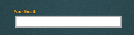
I cannot seem to Google my way out of this one. I am trying to re-create the input box shown below. I would like to create a subtle transparent border outside the input box (will be a bit less transparent, kind of hard to see in mock-up.)
It seems to be making the border inside of the text box, not outside it. Also it is making a sharp highlight on the bottom of the border (possibly the bottom of the input box itself.)
Mock-up Images

My CSS for the input box
#merchantForm>form>input.inputValue {
    border-radius: 3px;
    height: 30px; width: 350px;
    margin-top: 5px;
    font-family: Helvetica,sans-serif; font-weight: bold; font-size: 19px; color: #333;
    -moz-box-shadow: 0px 1px 0px #f2f2f2;-webkit-box-shadow: 0px 1px 0px #f2f2f2;
    border-style: solid;
    border-width: 5px;
    border-color: rgba(0,0,0,0.3);
}
Any ideas? I'm kind of new to CSS, so any suggestions to improve my CSS is welcomed as well.
Upvotes: 3
Views: 11027
Answers (3)

Reputation: 8734
The background of an element extends underneath the border by default. To change this behaviour use the following:
-webkit-background-clip: content-box;
   -moz-background-clip: content-box;
        background-clip: content-box;
Another, simpler option is to use the spread property of CSS box-shadows:
-webkit-box-shadow: 0 0 0 10px hsla(0, 0%, 0%, 0.5);
   -moz-box-shadow: 0 0 0 10px hsla(0, 0%, 0%, 0.5);
        box-shadow: 0 0 0 10px hsla(0, 0%, 0%, 0.5);
Upvotes: 5

Reputation: 1177
you could just add an input background-image: to your field in your css image sprite and call it a day and have consistency in all browsers.
Upvotes: 0

Reputation: 1302
This should do the trick. =) (Rough sample: http://d.pr/nDaN)
input.custom-input {
    width: 250px;
    font-size: 20px;
    padding: 15px;
    border: none;
    border: 5px solid rgba(0,0,0,0.75);
    border-radius: 5px;
    box-shadow: inset 5px 5px 5px #CCC;
}
Upvotes: -1
Related Questions
- Input border CSS
- How do I put a border around my form using CSS?
- How to add a border to a form?
- Add border to the form
- remove input box border using CSS?
- border around text input in a html form
- How to set the border per side for an input box?
- Draw border around input without affecting style, layout or spacing
- How can I create a border around an input button?
- How to set <input> border