
Reputation: 31
Responsive CSS Text Frame Decoration
Im Trying to create a paragraph that is inside a two divs and where there is a decoration on each side. I can get this to work with absolute pixel Values but trying to make it responsive with relative (percentual) values is not working for me. It should look like this:
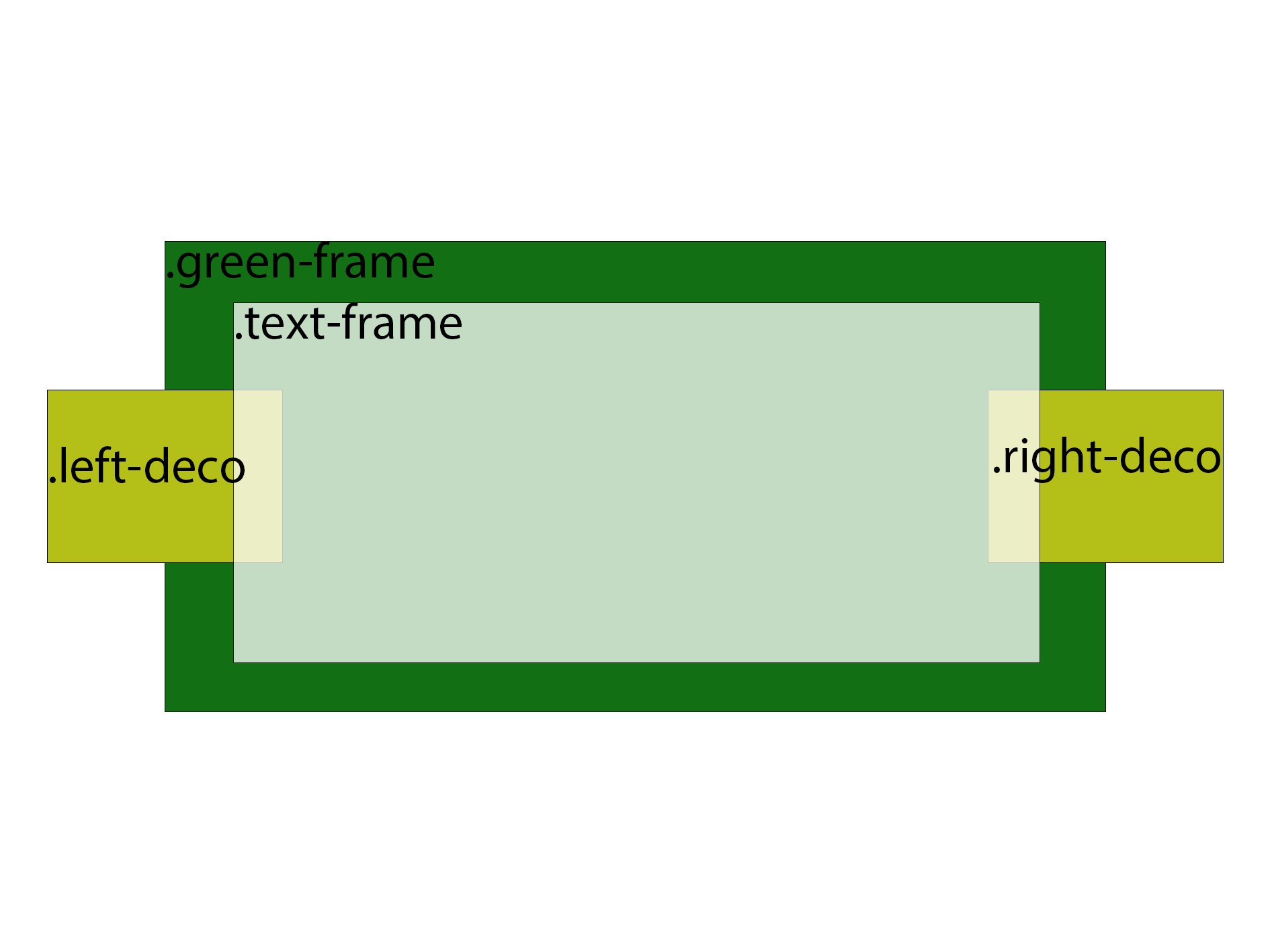
I am trying to have a green div as background with a padding, a white div where the paragraph element will be and and between that the same picture left and right, one rotated. Im using the .green-frame as relative container to position the decoration absolute. I wanna have the decoration fixed to the side of the white div.
From my understanding it should work with top: 50% and left/right: ~10% to position the images in the middle and ~10% under the white div. But in practices it works totally different then i expected. To position the image in the middle it takes 20%-25% and left/right is 0. When i change the screen size the images moves more under or over the white div. I am trying to get it stick to the side.
I tried with sticky and ::before and ::after with background-image of the div, i made a fiddle where i show my code. somehow i had to flip the right image in the element since putting it in .righ-deco puts the image at the top. How can i have the deco elements to keep in the middle an allways at a fraction under the .text-frame?
.green-frame {
  position: relative;
  width: 100%;
  padding: 1rem;
  margin: 0 auto;
  background-color: #228B22;
  z-index: 0;
}

.text-frame {
  position: relative;
  background-color: #FFF;
  width: 90%;
  margin: 0 auto;
  z-index: 2;
}

.left-deco {
  position: absolute;
  left: 0;
  top: 20%;
  z-index: 1;

}

.right-deco {
  position: absolute;
  right: 0;
  top: 20%;
  z-index: 1;


}

p {
  padding: 1rem;
}
<div class="green-frame">
<div class="left-deco">
<img src="https://cdn-icons-png.flaticon.com/128/4380/4380600.png" alt="decoration" class="left-deco">
</div>
<div class="text-frame">
<p>Lorem ipsum dolor sit amet, consetetur sadipscing elitr, sed diam nonumy eirmod tempor invidunt ut labore et dolore magna aliquyam erat, sed diam voluptua. At vero eos et accusam et justo duo dolores et ea rebum. Stet clita kasd gubergren, no sea
takimata sanctus est Lorem ipsum dolor sit amet. Lorem ipsum dolor sit amet, consetetur sadipscing elitr, sed diam nonumy eirmod tempor invidunt ut labore et dolore magna aliquyam erat, sed diam voluptua. At vero eos et accusam et justo duo dolores
et ea rebum. Stet clita kasd gubergren, no sea takimata sanctus est Lorem ipsum dolor sit amet.</p>
</div>
<div class="right-deco">
<img src="https://cdn-icons-png.flaticon.com/128/4380/4380600.png" alt="decoration" class="right-deco" style="transform: scalex(-1);">
</div>
</div>Upvotes: 0
Views: 60
Answers (3)
Reputation: 31
Thank you all very much! With a combination of the Information of the posts and a better understanding of the box model and its corners i found this solution, somehow the text in the paragraph with z-index: 5 still stays under the image with z-index: 3 where it should in my mind be on top.
.hide-overflow {
  overflow: hidden;
}
.green-frame {
  position: relative;
    background-color: #ECF8E3;
    padding: 2rem;
    z-index: 0;
}

.green-text {
    position: relative;
    margin: 1rem;
  padding: 1rem;
    background-color: #FFF;
    box-shadow: 0px 0px 10px black;
    border: 3px solid gold;
    z-index: 2;

}

p{
    font: 1rem "Segoe UI";
    z-index: 5;
}

.green-deco {
    position: absolute;
    object-fit: contain;
    object-position: center;
    z-index: 1;
}
.left-deco{
    top: 50%;
    left: 0;
    translate: -50% -50%;
}
.right-deco {
    top: 50%;
    right: 0;
    translate: 50% -50%;

}

.flip-deco {
    transform: scaleX(-1);
}
.inward-deco {
    z-index: 3;
}

.center {text-align: center}
<div class="hide-overflow">
<h1 class="center">Frame Outward Decoration</h1>
<div class="green-frame">
<div class="green-deco left-deco flip-deco"><img src="https://static.vecteezy.com/system/resources/thumbnails/009/307/514/small/green-leaves-of-palm-tree-isolated-on-tranaparent-background-file-png.png"></div>
<div class="green-text">
<p>
Lorem ipsum dolor sit amet, consetetur sadipscing elitr, sed diam nonumy eirmod tempor invidunt ut labore et dolore magna aliquyam erat, sed diam voluptua. At vero eos et accusam et justo duo dolores et ea rebum. Stet clita kasd gubergren, no sea takimata sanctus est Lorem ipsum dolor sit amet. Lorem ipsum dolor sit amet, consetetur sadipscing elitr, sed diam nonumy eirmod tempor invidunt ut labore et dolore magna aliquyam erat, sed diam voluptua. At vero eos et accusam et justo duo dolores et ea rebum. Stet clita kasd gubergren, no sea takimata sanctus est Lorem ipsum dolor sit amet.
</p>
</div>
<div class="green-deco right-deco"><img src="https://static.vecteezy.com/system/resources/thumbnails/009/307/514/small/green-leaves-of-palm-tree-isolated-on-tranaparent-background-file-png.png"></div>
</div>
</article>
<p>
Lorem ipsum dolor sit amet, consetetur sadipscing elitr, sed diam nonumy eirmod tempor invidunt ut labore et dolore magna aliquyam erat, sed diam voluptua. At vero eos et accusam et justo duo dolores et ea rebum. Stet clita kasd gubergren, no sea takimata sanctus est Lorem ipsum dolor sit amet. Lorem ipsum dolor sit amet, consetetur sadipscing elitr, sed diam nonumy eirmod tempor invidunt ut labore et dolore magna aliquyam erat, sed diam voluptua. At vero eos et accusam et justo duo dolores et ea rebum. Stet clita kasd gubergren, no sea takimata sanctus est Lorem ipsum dolor sit amet.
</p>
<article>
<h1 class="center">Frame Inward Decoration</h1>
<div class="green-frame">
<div class="green-deco left-deco inward-deco"><img src="https://static.vecteezy.com/system/resources/thumbnails/009/307/514/small/green-leaves-of-palm-tree-isolated-on-tranaparent-background-file-png.png"></div>
<div class="green-text">
<p>
Lorem ipsum dolor sit amet, consetetur sadipscing elitr, sed diam nonumy eirmod tempor invidunt ut labore et dolore magna aliquyam erat, sed diam voluptua. At vero eos et accusam et justo duo dolores et ea rebum. Stet clita kasd gubergren, no sea takimata sanctus est Lorem ipsum dolor sit amet. Lorem ipsum dolor sit amet, consetetur sadipscing elitr, sed diam nonumy eirmod tempor invidunt ut labore et dolore magna aliquyam erat, sed diam voluptua. At vero eos et accusam et justo duo dolores et ea rebum. Stet clita kasd gubergren, no sea takimata sanctus est Lorem ipsum dolor sit amet.
</p>
</div>
<div class="green-deco right-deco flip-deco inward-deco"><img src="https://static.vecteezy.com/system/resources/thumbnails/009/307/514/small/green-leaves-of-palm-tree-isolated-on-tranaparent-background-file-png.png"></div>
</div>
</div>Upvotes: 1

Reputation: 44088
Two background-images
The HTML is simplified down to a
<p>nested within an<article>which is nested within the<main>.The
<p>is centered vertically and horizontally as a flex-item as is<article>being the flex-container for<p>and the flex-item of<main>.There are two
image-backgrounds in<main>. One is positioned left and center and the other is positioned right and center.<article>floats above<main>withz-index: 1.box-shadowwas applied to<article>for depth (optional).The
font-sizeof:root(aka<html>) is3vmaxwhich is either 3/100th of the viewport width if the viewport width is larger than viewport height and vice versa. Allremunits are relative to the:rootfont-size. So whenever the window is resized, all lengths inremwill scale automatically. In the comments there is an alternativefont-sizethat uses the CSS functionclamp().
View in Full page mode and resize the window.
/**
 * As an alternative replace `font` with:
 *   font-size: clamp(1rem, 8vw - 2rem, 3rem);
 *   line-height: 1.2;
 *   font-family: "Segoe UI";
 */
:root {
  font: 3vmax/1.2 "Segoe UI"
}

*,
*::before,
*::after {
  margin: 0;
  padding: 0;
  box-sizing: inherit;
}

body {
  background: #228B22;
}

main {
  display: flex;
  justify-content: center;
  align-items: center;
  width: 92%;
  height: max-content;
  margin: 0 auto;
  padding: 1rem;
  background:
  url(https://i.ibb.co/qrZ26xR/4380600.png)
  left center no-repeat,
  url(https://i.ibb.co/GMqjRZF/0060834.png)
  right center no-repeat #228B22;
  background-size: 7.5rem 7.5rem;
}

article {
  position: relative;
  z-index: 1;
  display: flex;
  justify-content: center;
  align-items: center;
  width: calc(100% - 7.5rem);
  background-color: #FFF;
  box-shadow:
  rgba(0, 0, 0, 0.45) 0 0.75rem 1.75rem,
  rgba(0, 0, 0, 0.42) 0 0.6rem 0.6rem;
}

p {
  padding: 1.25rem 1rem 1.5rem 1.5rem;
}
<main>
<article>
<p>Lorem ipsum dolor sit amet, consetetur sadipscing elitr, sed diam nonumy eirmod tempor invidunt ut labore et dolore magna aliquyam erat, sed diam voluptua. At vero eos et accusam et justo duo dolores et ea rebum. Stet clita kasd gubergren, no sea
takimata sanctus est Lorem ipsum dolor sit amet. Lorem ipsum dolor sit amet, consetetur sadipscing elitr, sed diam nonumy eirmod tempor invidunt ut labore et dolore magna aliquyam erat, sed diam voluptua. At vero eos et accusam et justo duo dolores
et ea rebum. Stet clita kasd gubergren, no sea takimata sanctus est Lorem ipsum dolor sit amet.</p>
</article>
</main>Upvotes: 1

Reputation: 106038
You can use object-fit and eventually object-position and make each img 100% of height's container and around 120px of width.
take a look at https://developer.mozilla.org/en-US/docs/Web/CSS/object-fit
Idea in the snippet below:
.green-frame {
  position: relative;
  padding: 1rem;
  margin: 0 auto;
  background-color: #228b22;
  z-index: 0;
}

.text-frame {
  position: relative;
  background-color: #fff;
  margin: 0 60px;
  z-index: 2;
}

.left-deco {
  position: absolute;
  left: 0;
  top: 0;
  height: 100%;
  width: 120px;
  object-fit: contain;
  object-position: center;
  z-index: 1;
}

.right-deco {
  position: absolute;
  right: 0;
  top: 0;
  height: 100%;
  width: 120px;
  object-fit: contain;
  z-index: 1;
}

p {
  padding: 1rem;
}
<div class="green-frame">
<div class="left-deco">
<img src="https://cdn-icons-png.flaticon.com/128/4380/4380600.png" alt="decoration" class="left-deco">
</div>
<div class="text-frame">
<p>Lorem ipsum dolor sit amet, consetetur sadipscing elitr, sed diam nonumy eirmod tempor invidunt ut labore et dolore magna aliquyam erat, sed diam voluptua. At vero eos et accusam et justo duo dolores et ea rebum. Stet clita kasd gubergren, no sea
takimata sanctus est Lorem ipsum dolor sit amet. Lorem ipsum dolor sit amet, consetetur sadipscing elitr, sed diam nonumy eirmod tempor invidunt ut labore et dolore magna aliquyam erat, sed diam voluptua. At vero eos et accusam et justo duo dolores
et ea rebum. Stet clita kasd gubergren, no sea takimata sanctus est Lorem ipsum dolor sit amet.</p>
</div>
<div class="right-deco">
<img src="https://cdn-icons-png.flaticon.com/128/4380/4380600.png" alt="decoration" class="right-deco" style="transform: scalex(-1);">
</div>
</div>Upvotes: 1
Related Questions
- Change an HTML input's placeholder color with CSS
- Is there a CSS parent selector?
- Is it possible to apply CSS to half of a character?
- Set cellpadding and cellspacing in CSS?
- How to disable text selection highlighting
- form: doesn't send input - submit won't work (html/php)
- TYPO 7.6 Display Content
- Text file - define Placeholder, read out via PHP - generate HTML/CSS on Webside
- Mark words that blend in to the mark up perfectly and keep mark up valid