
Reputation: 10709
How to produce a heatmap with ggplot2?
I am trying to produce a heat map using ggplot2. I found this example, which I am essentially trying to replicate with my data, but I am having difficulty. My data is a simple .csv file that looks like this:
people,apple,orange,peach
mike,1,0,6
sue,0,0,1
bill,3,3,1
ted,1,1,0
I would like to produce a simple heat map where the name of the fruit is on the x-axis and the person is on the y-axis. The graph should depict squares where the color of each square is a representation of the number of fruit consumed. The square corresponding to mike:peach should be the darkest.
Here is the code I am using to try to produce the heatmap:
data <- read.csv("/Users/bunsen/Desktop/fruit.txt", head=TRUE, sep=",")
fruit <- c(apple,orange,peach)
people <- data[,1]
(p <- ggplot(data, aes(fruit, people)) + geom_tile(aes(fill = rescale), colour = "white") +    scale_fill_gradient(low = "white", high = "steelblue"))
When I plot this data I get the number of fruit on the x-axis and people on the y-axis. I also do not get color gradients representing number of fruit. How can I get the names of the fruits on the x-axis with the number of fruit eaten by a person displayed as a heat map? The current output I am getting in R looks like this:

Upvotes: 16
Views: 31033
Answers (3)

Reputation: 305
I have developed a package called ggalign. This package extends ggplot2 by providing advanced tools for aligning and organizing multiple plots, particularly those that automatically reorder observations, such as dendrogram. It offers fine control over layout adjustment and plot annotations, enabling you to create complex, publication-quality visualizations while still using the familiar grammar of ggplot2.
Why use ggalign?
ggalign focuses on aligning observations across multiple plots. It leverages
the "number of observations" in the
vctrs package or NROW()
function to maintain consistency in plot organization.
If you've ever struggled with aligning plots with self-contained ordering (like
dendrogram), or applying consistent grouping or ordering across multiple plots
(e.g., with k-means clustering), ggalign is designed to make this easier. The
package integrates seamlessly with ggplot2, providing the flexibility to use its
geoms, scales, and other components for complex visualizations.
Installation
You can install ggalign from CRAN using:
install.packages("ggalign")
The latest version has modified a lot, try to use the development version now.
Alternatively, install the development version from GitHub with:
# install.packages("remotes")
remotes::install_github("Yunuuuu/ggalign")
Getting Started
The usage of ggalign is simple if you're familiar with ggplot2 syntax,
ggalign works with a simple workflow:
- Initialize the layout using
ggheatmap()orggstack(). - Customize the layout with:
align_group(): Group layout axis into panel with a group variable.align_kmeans(): Group layout axis into panel by kmeansalign_reorder(): Reorder layout observations based on statistical weights or allows for manual reordering based on user-defined criteria.align_dendro(): Reorder or Group layout based on hierarchical clustering
- Adding plots with
ggalign()orggpanel(), then add ggplot2 elements like geoms, stats, scales.
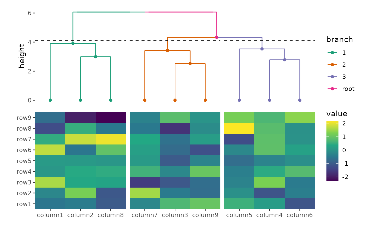
Basic example
Below, we'll walk through a basic example of using ggalign to create a heatmap
with a dendrogram.
library(ggalign)
set.seed(123)
small_mat <- matrix(rnorm(81), nrow = 9)
rownames(small_mat) <- paste0("row", seq_len(nrow(small_mat)))
colnames(small_mat) <- paste0("column", seq_len(ncol(small_mat)))

# initialize the heatmap layout, we can regard it as a normal ggplot object
ggheatmap(small_mat) +
    # we can directly modify geoms, scales and other ggplot2 components
    scale_fill_viridis_c() +
    # add annotation in the top
    hmanno("top") +
    # in the top annotation, we add a dendrogram, and split observations into 3 groups
    align_dendro(aes(color = branch), k = 3) +
    # in the dendrogram we add a point geom
    geom_point(aes(color = branch, y = y)) +
    # change color mapping for the dendrogram
    scale_color_brewer(palette = "Dark2")
Compare with other ggplot2 heatmap extension
The main advantage of ggalign over other extensions like
ggheatmap is its full compatibility
with the ggplot2 grammar. You can seamlessly use any ggplot2 geoms, stats, and
scales to build complex layouts, including multiple heatmaps arranged vertically
or horizontally.
Compare with ComplexHeatmap
Pros
- Full integration with the
ggplot2ecosystem. - Heatmap annotation axes and legends are automatically generated.
- Dendrogram can be easily customized and colored.
- Flexible control over plot size and spacing.
- Can easily align with other
ggplot2plots by panel area.
Cons
Fewer Built-In Annotations: May require additional coding for specific annotations or customization compared to the extensive built-in annotation function in ComplexHeatmap.
More Complex Examples
Here are some more advanced visualizations using ggalign:
Upvotes: 1

Reputation: 6921
Seven (!) years later, the best way to format your data correctly is to use tidyr rather than reshape
Using gather from tidyr, it is very easy to reformat your data to get the expected 3 columns (person for the y-axis, fruit for the x-axis and count for the values):
library("dplyr")
library("tidyr")

hm <- readr::read_csv("people,apple,orange,peach
mike,1,0,6
sue,0,0,1
bill,3,3,1
ted,1,1,0")

hm <- hm %>%
  gather(fruit, count, apple:peach)
  #syntax: key column (to create), value column (to create), columns to gather (will become (key, value) pairs)
The data now looks like:
# A tibble: 12 x 3
   people fruit  count
   <chr>  <chr>  <dbl>
 1 mike   apple      1
 2 sue    apple      0
 3 bill   apple      3
 4 ted    apple      1
 5 mike   orange     0
 6 sue    orange     0
 7 bill   orange     3
 8 ted    orange     1
 9 mike   peach      6
10 sue    peach      1
11 bill   peach      1
12 ted    peach      0
Perfect! Let's get plotting. The basic geom to do a heatmap with ggplot2 is geom_tile to which we'll provide aesthetic x, y and fill.
library("ggplot2")
ggplot(hm, aes(x=x, y=y, fill=value)) + geom_tile()

OK not too bad but we can do much better.
- For heatmaps, I like the black & white theme
theme_bw()which gets rid of the grey background. I also like to use a palette from
RColorBrewer(withdirection = 1to get the darker colors for higher values, or -1 otherwise). There is a lot of available palettes: Reds, Blues, Spectral, RdYlBu (red-yellow-blue), RdBu (red-blue), etc. Below I use "Greens". RunRColorBrewer::display.brewer.all()to see what the palettes look like.If you want the tiles to be squared, simply use
coord_equal().I often find the legend is not useful but it depends on your particular use case. You can hide the
filllegend withguides(fill=F).You can print the values on top of the tiles using
geom_text(orgeom_label). It takes aestheticsx,yandlabelbut in our case,xandyare inherited. You can also print higher values bigger by passingsize=countas an aesthetic -- in that case you will also want to passsize=Ftoguidesto hide the size legend.You can draw lines around the tiles by passing a
colortogeom_tile.
Putting it all together:
ggplot(hm, aes(x=fruit, y=people, fill=count)) +
  # tile with black contour
  geom_tile(color="black") +
  # B&W theme, no grey background
  theme_bw() +
  # square tiles
  coord_equal() +
  # Green color theme for `fill`
  scale_fill_distiller(palette="Greens", direction=1) +
  # printing values in black
  geom_text(aes(label=count), color="black") +
  # removing legend for `fill` since we're already printing values
  guides(fill=F) +
  # since there is no legend, adding a title
  labs(title = "Count of fruits per person")

To remove anything, simply remove the corresponding line.
Upvotes: 1

Reputation: 6410
To be honest @dr.bunsen - your example above was poorly reproducable and you didn't read the first part of the tutorial that you linked. Here is probably what you are looking for:
 library(reshape)
 library(ggplot2)
 library(scales)

 data <- structure(list(people = structure(c(2L, 3L, 1L, 4L),
                                           .Label = c("bill", "mike", "sue", "ted"),
                                           class = "factor"),
                        apple = c(1L, 0L, 3L, 1L),
                        orange = c(0L, 0L, 3L, 1L),
                        peach = c(6L, 1L, 1L, 0L)),
                    .Names = c("people", "apple", "orange", "peach"),
                    class = "data.frame",
                    row.names = c(NA, -4L))
 data.m <- melt(data)
 data.m <- ddply(data.m, .(variable), transform, rescale = rescale(value))
 p <- ggplot(data.m, aes(variable, people)) +
         geom_tile(aes(fill = rescale), colour = "white")
 p + scale_fill_gradient(low = "white", high = "steelblue")

Upvotes: 33
Related Questions
- Create a heatmap with ggplot seen as on fivethirtyeight
- Creating a heatmap in R
- R: how to create a heatmap with half colours and half numbers using ggplot2?
- Creating a heatmap using R
- preparing data frame in r for heatmap with ggplot2
- Heatmap in R with ggplot2
- Creating a HeatMap in R with 2 Variables
- Creating custom heatmap
- heat maps in R with heatmap.2
- R, ggplot2, heat map