
Reputation: 970
R - ggplot2 - plot regions as lines
I have a dataframe with regions and values. Here's a toy example.
Start    End    Value
1        100     2
100      200     3
300      400     2
400      500     1
What I'd like to do is create a plot where each region (in line 1, that is Start=1, End=100) is plotted on the x, and the Value is on the y. And preferably, I'd like to use ggplot2. I have many different applications for this, but they all boil down to this one question.
What I'd end up with is a plot with flat (slope=0) lines for each region. Here's an example of the type of plot if you ignore the points, and just focus on the lines.
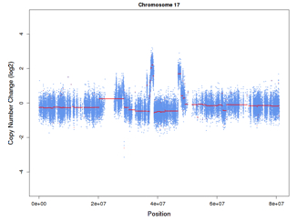
In words, you would have one plot, with (for the toy data) a line from x=1-100 with a y value of 2, then lines (x,y): (100-200, 3)(300-400, 2)(400-500, 1)
Upvotes: 0
Views: 156
Answers (1)

Reputation: 146110
You can use geom_segment to draw line segments. See ?geom_segment for details.
ggplot(df) +
    geom_segment(aes(x = Start, xend = End, y = Value, yend = Value))

Using this data:
df = structure(list(Start = c(1L, 100L, 300L, 400L), End = c(100L,
200L, 400L, 500L), Value = c(2L, 3L, 2L, 1L)), .Names = c("Start",
"End", "Value"), class = "data.frame", row.names = c(NA, -4L))
You should probably check out some introductory ggplot2 resources. There are lots of suggestions in the ggplot2 tag wiki.
Upvotes: 1
Related Questions
- Rotating and spacing axis labels in ggplot2
- making line legends for geom_density in ggplot2 in R
- Center Plot title in ggplot2
- Plot two graphs in a same plot
- Plotting two variables as lines using ggplot2 on the same graph
- Side-by-side plots with ggplot2
- Plotting multiple lines from a data frame with ggplot2
- Add separate shaded regions around multiple lines in ggplot2 object
- Displaying the slopes of multiple models by a factor in a faceted geom_line plot in R's ggplot2?